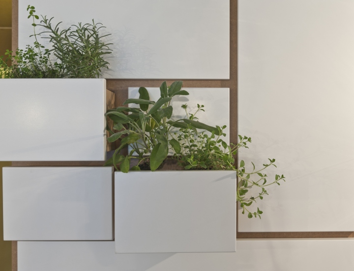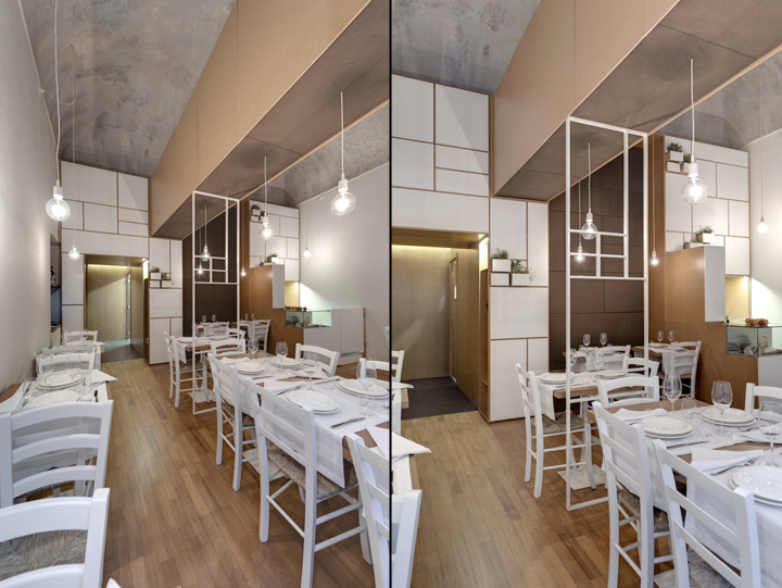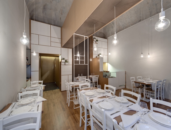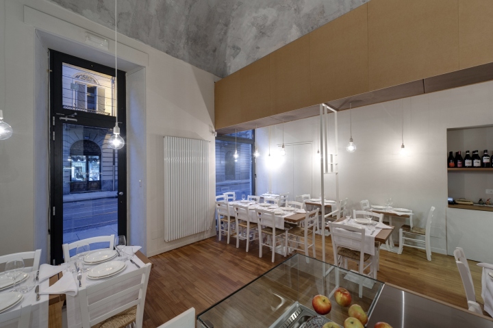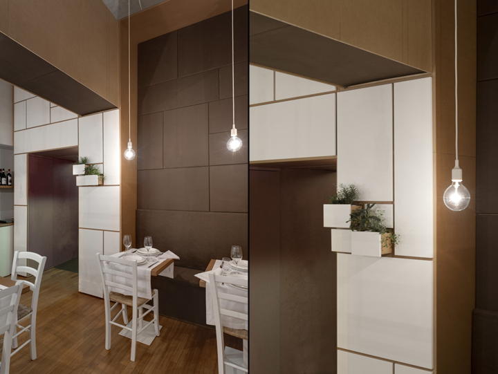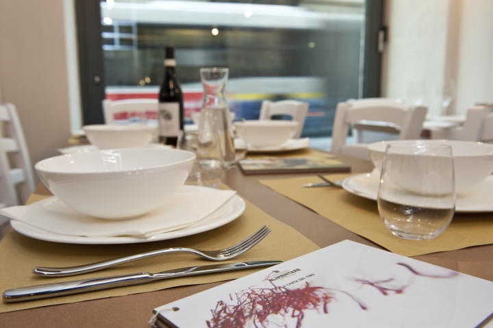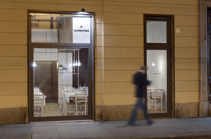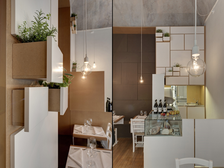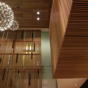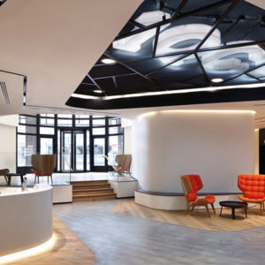
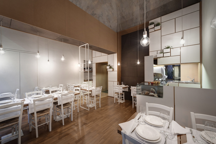

Take the welcome of an old Italian tavern. Decompose it. Splash it everywhere. This is what we have done. A modern re-working of old-time simplicity. The central focus of the space is a large cupboard placed opposite the entrance. Made of white lacquered and natural matte medium density wood, this object is both a functional element (it accommodates a wardrobe, shelves, seating and counter space) and the only decorative piece in the room.

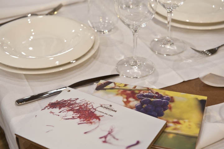
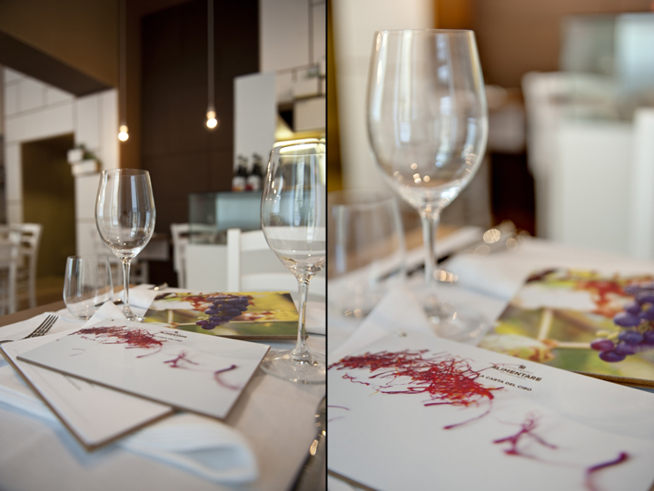
It was designed around the idea of open and closed drawers and as such contextualizes the rest of the space including the large crossbeam that extends right up to the exterior. The purposefully oversize and plump sofa adds that cosy and welcoming touch for the guests. The office also developed the corporate identity project related to this design. In a minimalist style the brand recalls the gates of the old taverns while the lettering resumes in a modern style typical signs of the last century. Brown is the main color of this graphic project having been used also for the architectural design details (wood, sofas, walls).
Designed by POINT.ARCHITECTS
