
Liebherr is one of the world’s largest manufacturer of construction machines. The Liebherr group is also successfully involved in many other product areas. The eleven divisions of the group and wide product range are the result of decades of experience and in-depth expert knowledge. The group being based in Germany, founded its first sales and service company in India in the 1980’s. In 2006, Liebherr India Pvt. Ltd. was established with headquarters in Mumbai.

The office project for Liebherr involved complete re-location and expansion of the entire office space of the company from its current location in Turbhe MIDC to the new address at Vashi. The company being a global market leader wanted the office to resonate with their business philosophy of being innovative, yet very simplistic and functional.

The programmatic planning as per their brief was achieved keeping in mind optimum space utilization and catering to European standards of office staff density. We have strived to maintain a dynamic flow across both the levels in order to experience the office space as consolidated environment. The southern façade is glassed and oriented to the view of the vast expanse of mangroves and the Vashi creek beyond. We took advantage of the favourable orientation that allowed us to work with natural light during almost all of the day. We have planned all of the staff workstations along this façade.

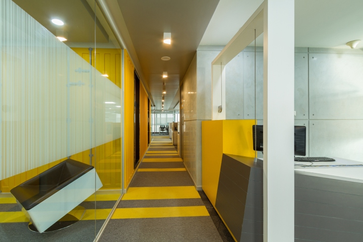
The physical connection between the 2 floors is made by common elevators and stairs that allow one to access each level through a long lobby. Upon arrival at the lobby the office is accessed through a wall of cabinets that archive records and data. This wall gives the glimpses of the colour palette used within the office space in the form of random pixels that are carefully juxtaposed to break visual monotony. We have used Yellow as an accent extensively across all surfaces being walls, floor and furniture.
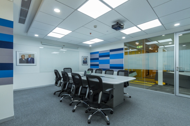
We coped with a large number of structural walls and their dead surfaces by artificially cladding them with extruded fluting strips to make them appear as cargo containers which are placed as volumes in the space. These function as closed meeting rooms and toilet blocks. Graphic flooring solution signifies the flow of movement over dynamic and static zones.

The design of the false ceiling informs the selected scale and composition of each frame and the overall perspective. Majority of the furniture is white so as to maintain a contrast with all other surfaces which are treated in materials that create a feeling of something industrial, like a warehouse, the use of timeless exposed concrete walls that inspire great engineering innovations that embody the company’s philosophy.
Designed by Defacto Architects
Photography by Ajay Gaikwad


Add to collection
