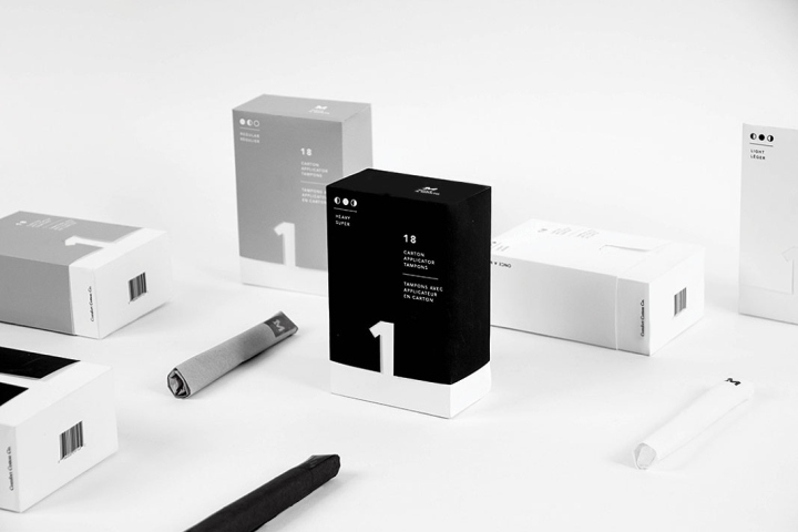

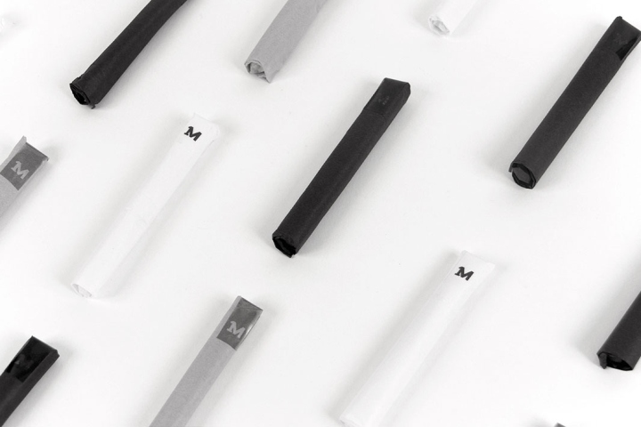
A tampon packaging for an organic menstrual care company, Once A Month. They find importance in the environment as much as the female body. Once A Month aims to produce high quality products while taking the presentation of the most “taboo” product into detail as well. A minimalistic approach was used to create a luxurious feel because many women are still embarrassed to carry such product.
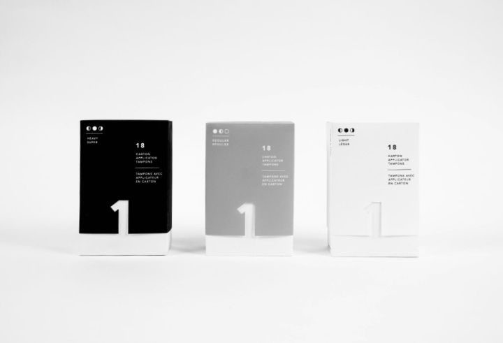
In fact, in some countries tampons are considered as an actual luxury product because it is not accessible to all. Some women are able to synchronize their menstrual cycle to determine their next period, which is why little symbols of the moon are used to illustrate the heaviness of the flow of the packaging.
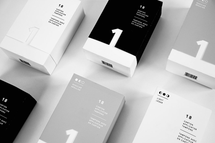
Once A Month also wishes to create a community among women as one to share insight and tips for health and environment care. Hence the reason for the “1” in the front of the packaging, representing all these women as one big community and each and every one of the women to hopefully make a difference.
(Student Project)
Designed by Olivia Chan
http://www.packagingoftheworld.com/2016/09/once-month-tampon-packaging-student.html


Add to collection

