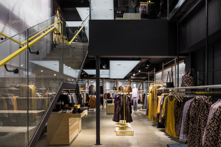

In collaboration with Warehouse Brand Consultant Alasdhair Willis, esteemed designers Checkland Kindleysides have re-imagined how Warehouse behaves at retail, as part of the iconic re-launch that is taking place. The new concept has been unveiled at the London Argyll Street store, and will be rolled out to further locations and different formats both in the UK and internationally.
A campaign in the run up to launch allowed passers-by to look into the store via innovative augmented reality app BlippAR. This virtual journey showcases the ground floor interior, a link to Warehouse’s latest look book and a series of short films that sees Design Director Emma Cook introducing her debut collection for the brand.

“The store interiors will reflect the new brand mission which is ‘Warehouse curates the city,’ using the urban environment and experience as our brands palette with the collision of materials, textures, façade and discovered spaces for all that we do. This will engage our customers with a rich and unique experience that is truly reflective of the new Warehouse proposition,” says Warehouse Brand Consultant Alasdhair Willis.

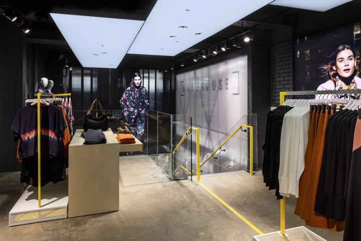
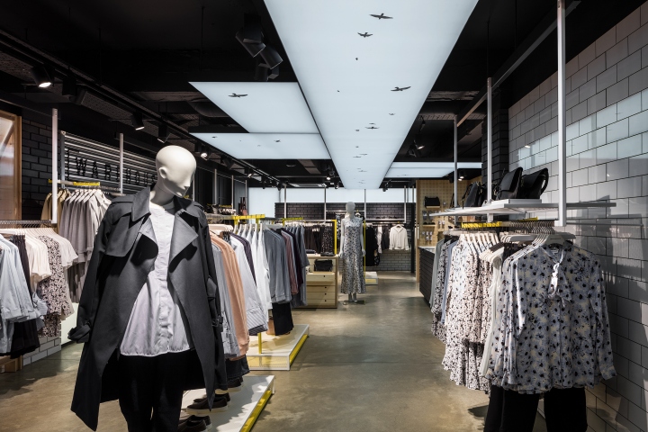
The 251 square-metre store is designed to feel like a continuation of the street, as though one is walking between buildings in a raw representation of the city that is spread across two floors and balances modernity with a gritty urban character. Joe Evans, Creative Director at Checkland Kindleysides says “The design is defined by the ‘spaces between spaces’. Channelling the energy of the city, we bring the outside in to create an interior that is totally dynamic and new”.

The in-store experience is enhanced by multiple key elements that come together to create a compelling brand experience:
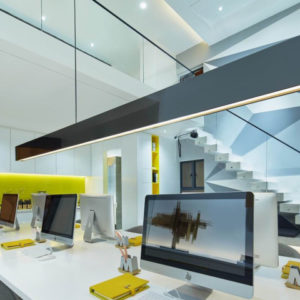
Customer Journey: The journey through the store is an exploration of the city; navigating tall architectural buildings that open up to the bright sky. The product is merchandised against building façades that are created from authentic materials and the sky is created from a narrow light-box that is suspended from the ceiling and runs down the middle of the store. From the entrance on the ground floor (68 square-metres) you are guided through the space by bold accent yellow street markings on the concrete floor, that eventually run into the staircase handrail and down to the lower floor. A single run cast concrete staircase descends into the 183 square-metre basement and lands to face the back focal point of the store. This positioning subtly encourages a journey around the space, allowing you to fully explore key collections before arriving at the fitting rooms.

Digital: Checkland Kindleysides created a series of digital content to be showcased on screens located at the entrance and back of the store. This moving graphical representation of the sky features birds that flock from the first screen to the back, encouraging the consumer to follow them and transition around the space. This content will be interwoven with seasonal brand campaigns from Warehouse. In addition, light-boxes are scattered around the space providing visual backdrops of city scenery and skylines to break up the merchandising and to reinforce the sense of being between spaces.

Innovative Materials: The store uses a variety of materials to create a dynamic and layered environment. In order to heighten the urban vibe, materials were selected based on their industrial uses and incorporated into the retail environment in an innovative way. Polycarbonate sheets that are set against a timber structure and illuminated from within, line the building façade that sits alongside the staircase. These materials are also used to create distinctive visual merchandising devices throughout the store.

Static, galvanised roller shutters sit in front of white light boxes that line the walls at multiple intervals. These eye catching materials give the sense of bright light flooding into the space.
Colour Palette: A primarily urban and moody colour palette is lifted by the use of bright accent colours including the yellow of street markings and blue of the sky. These contrasted colours reinforce the sensation of walking in the shadows between high rise buildings in the city, whilst providing the perfect backdrop to best showcase the new Warehouse collection by Emma Cook.
Photography by Marcus Peel


