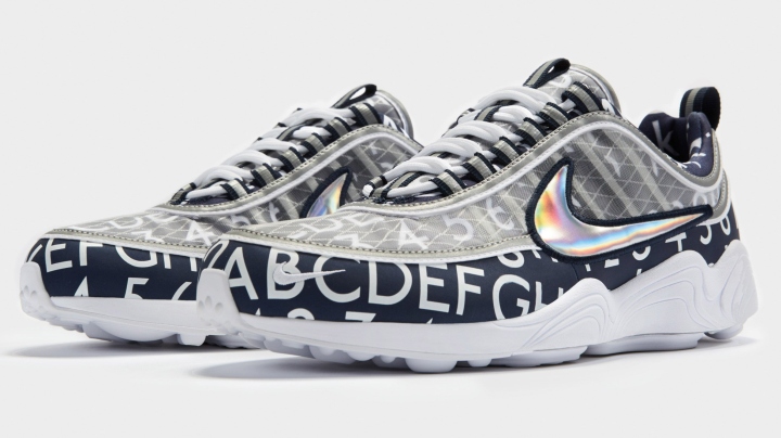


Nike has released a pair of trainers patterned with the Johnston100 typeface – the font used by Transport for London. The Nike Zoom Spiridons, which were first released in 1997, are inspired by the 90s garage rave fashion scene. This iteration repurposes the century-old font as a bold pattern.
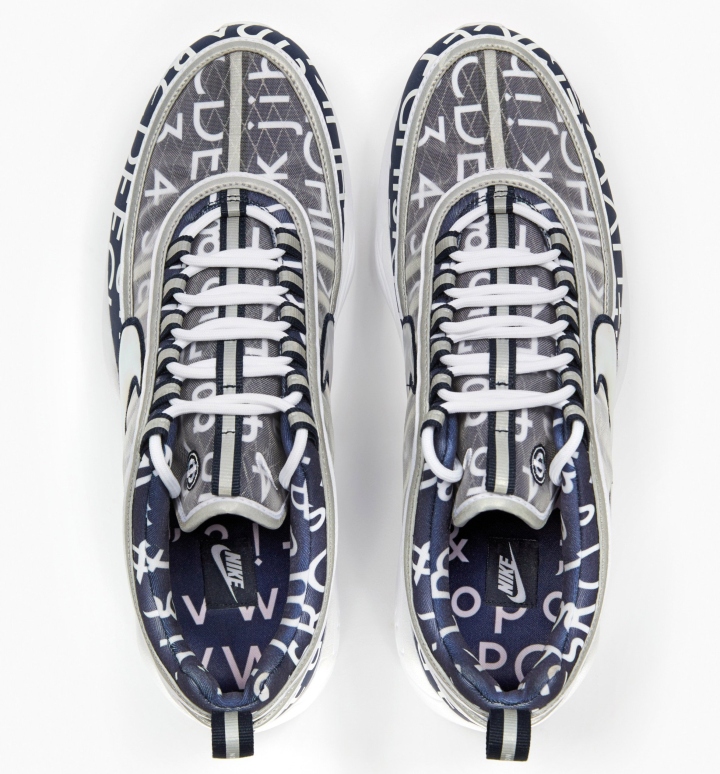
The shoes are available in two colours, white and navy, with the upper featuring the Johnston100 font characters and numbers. The Swoosh is applied in silver, while the iconic Transport for London (TfL) roundel is embroidered on the tongue of each pair. A transparent mesh covers a section of the print on the shoe’s vamp, and reflective 3M taping is used around the seams and eyelets. “Like many things, this collaboration was born out of pre-existing relationships,” Jupiter Desphy, a designer with Nike special projects, told It’s Nice That. “With 2016 being the 100th anniversary year of the TfL font, it seemed like the perfect time to work together again. We simply wanted to share the font in its basic format, applying a clean alphabetical depiction on the shoe,” he added.
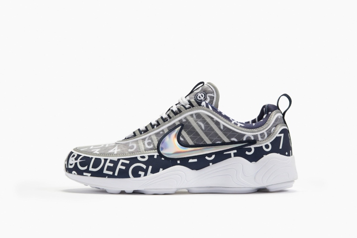
“We didn’t want to disrupt the much-loved design of the Spiridon or well-known look of the Johnston font.” The Nike Zoom Spiridons are the second release from the Nike x Roundel collection. In 2013, Nike used the roundel on a pair of Air Max models to celebrate of the 150th anniversary of the London Underground. The shoes were patterned with a rectangular woven Jacquard reminiscent of the seat upholstery found in the railway cars on the District Line.
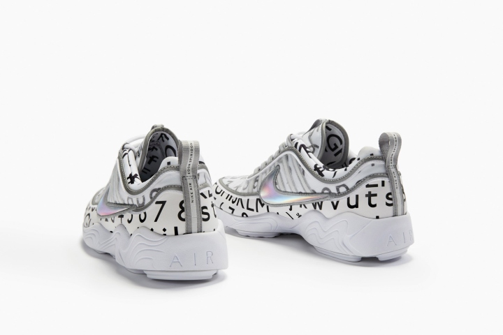
The updated pair of Nike Zoom Spiridon trainers celebrates the 100th anniversary of the TfL font, which was originally designed by calligrapher Edward Johnston in 1916. Earlier this year, international font company Monotype brought the 100-year-old typeface into the 21st century, adding the hashtag, at sign and lighter weights more suitable for digital use.
Design: Nike


Add to collection
