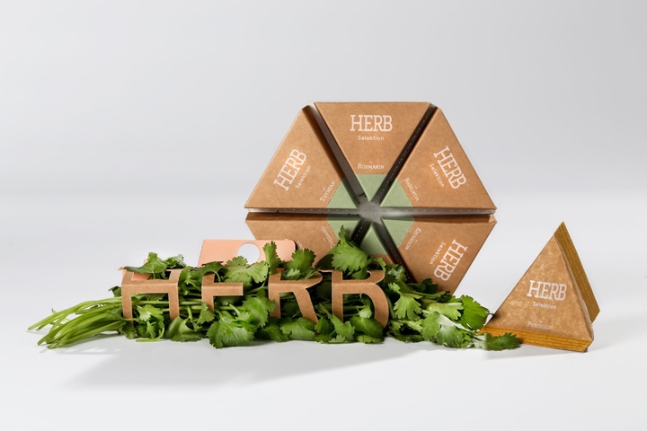

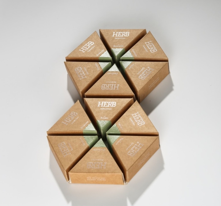
Herb is a packaging series meant to be used by farmers who are selling their freshly plucked or dried herbs at markets or in local stores. It is less like a brand but more of a trademark for organic farming and high quality products. The series is supposed to help vendors to present their product in an appealing way.
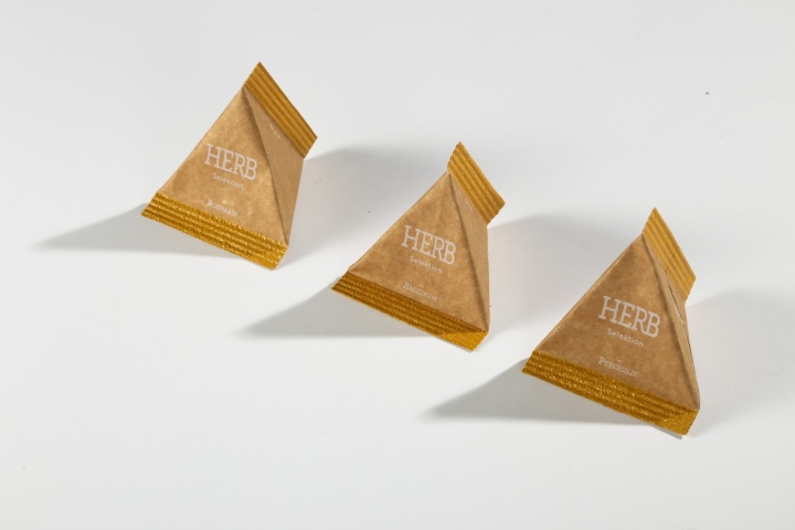
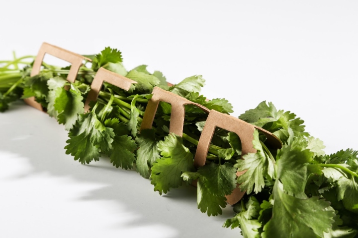
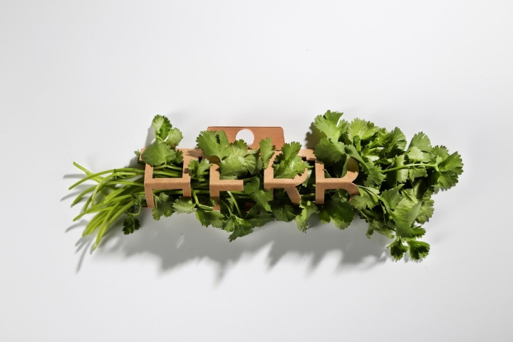
It consist of three different packages. A sleeve for fresh herbs, a small triangular pouch for dried herbs and a hexagon shaped, separable packaging that can contain different kinds of dried herbs.
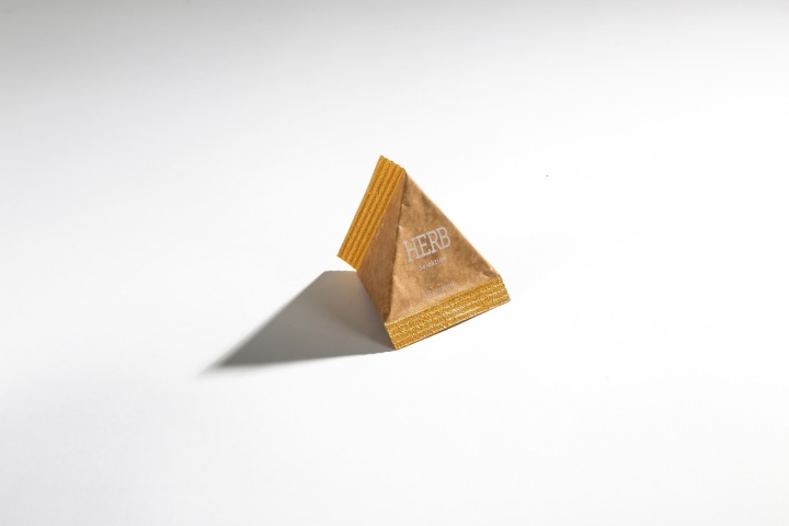
Each kind of package from the series has it’s unique geometric shape, but together they look like a product family. The unusual shapes of the packages are complemented by the clean and intuitive graphic design. The colored parts indicate where to rip open each packaging.
Design: Carolin Dufner
http://www.packagingoftheworld.com/2016/11/herb-student-project.html


Add to collection


