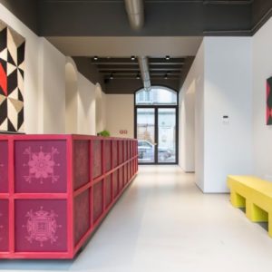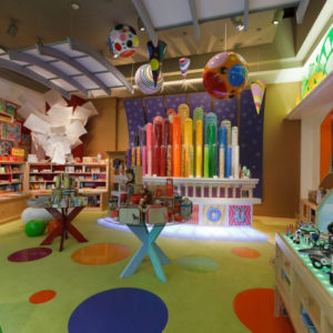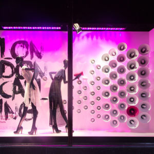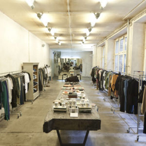
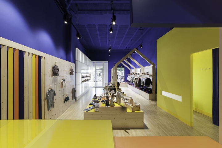

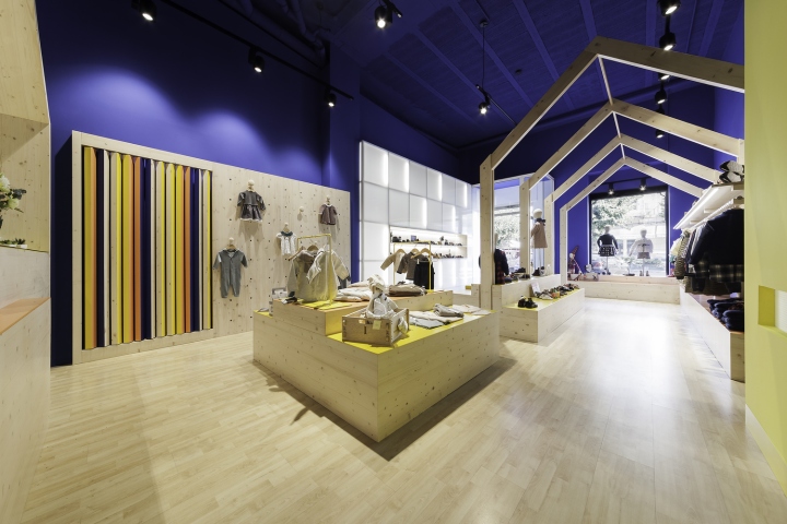
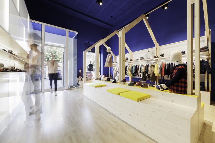
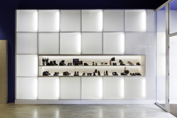
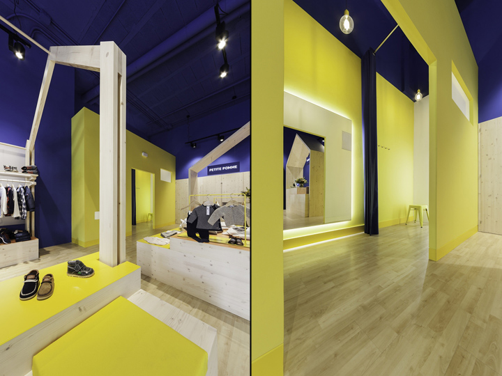
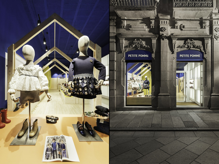
Petite Pomme is a clothing and shoes retail’s child store located in the centre of a small town, which also aims to boost local trade through careful design and by adding value to the shopping experience. The brand image intends to move away from the historical style of the building. Therefore walls and ceiling blur boundaries to create an unlinked proposal from its shell. At the entrance, a backlit polycarbonate wall contrasts sharply with the granite facade, generating a rift between exterior and interior and also providing guidance for the customer.
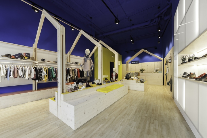
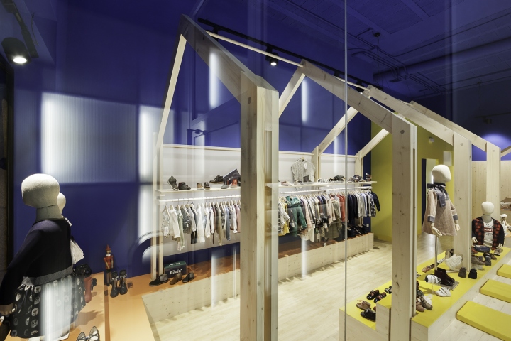
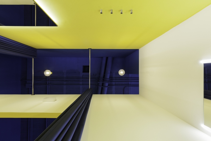
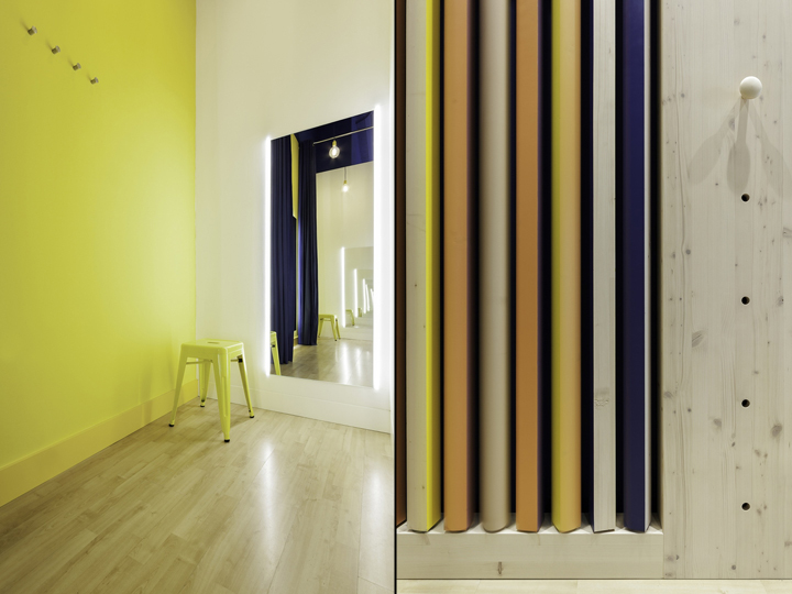
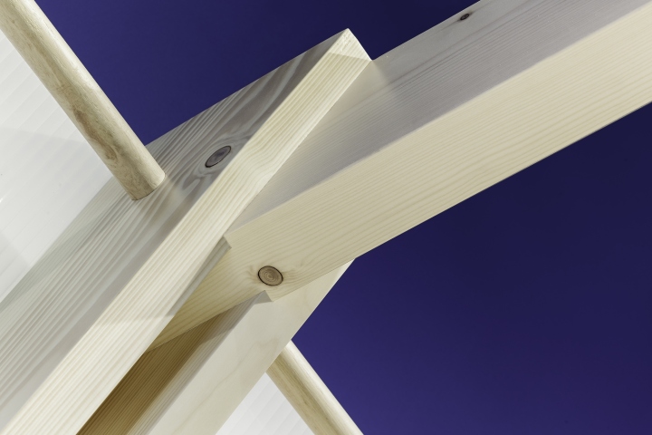
The first major decision was removing the dropped ceiling, getting back the original height of the retail unit. This movement allows us to establish the strategy of the new design. An open plan space contains the different components such as light walls, counter and fitting rooms, which create a pathway through the store and organise the products. This elements provide a set of different scales that offers access to the display products and also allows entertainment for children. Vibrant colours, scenographic lighting and contrasted materials as wood and polycarbonates draws attention to the passerby, enhancing a contemporary design to the neighbourhood.
Designed by Erbalunga estudio
Photography by Iván Casal Nieto
http://www.archdaily.com/799166/petite-pomme-erbalunga-estudio


Add to collection


