
When it comes to an exclusive space of hair styling, the first word come to people’s mind is “fashion”. Today we define fashion from many different aspects. In some sense, the essence of fashion is not following the trend, but emphasizing your individuality. Do not follow the trends, being different and impressive is the best interpretation for fashion. In the design of Savour Dalang Store, what the designer strives to achieve is: to impress the customers and make them repeat customers.
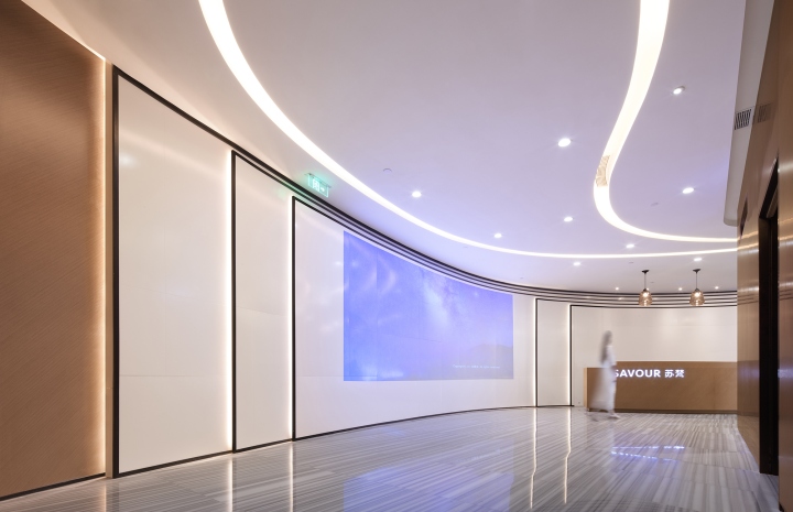
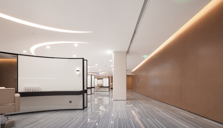
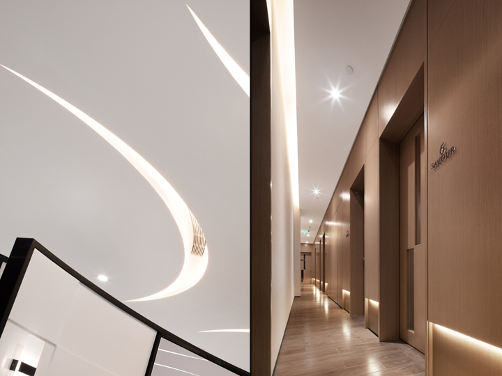
In fashion industry, from VS Sassoon’s curve to Issey Miyake’s cutting, every cutting is about accuracy, absoluteness and decisiveness; this might be the destined fate for fashion industry. Similarly, in the space design of Savour Dalang store, the highlight of curve is the first impact the plane layout gives to visitors. Getting out of the elevator, a quiet floor plan cut off by a curve is unfolded; the trumpet-shaped opening has attracted all kinds of customers.

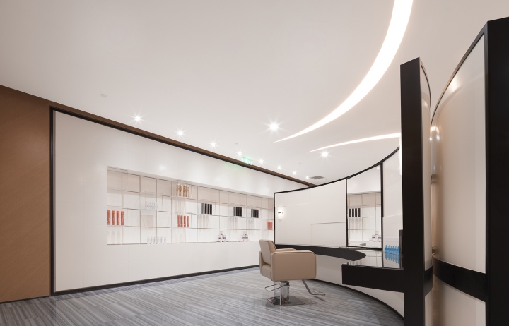
If we consider art a science, then design is a technology. Technology is based on science, yet it has more functions. Similarly, design inspiration always comes from works of art, “designs derive from practice” always make an impression. The curve used in the design of operating area is inspired by the work of minimalism sculptor – Richard Serra.
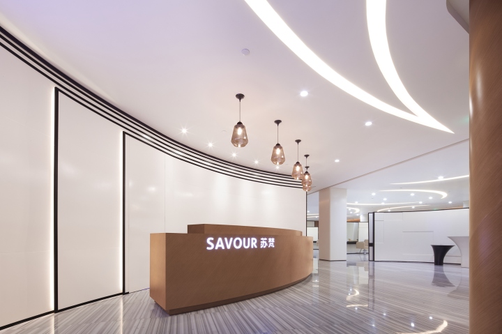
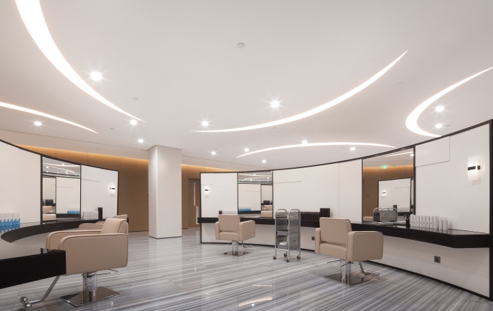
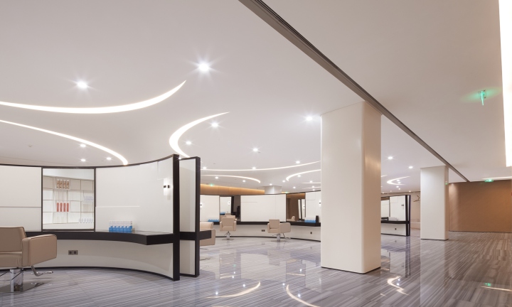
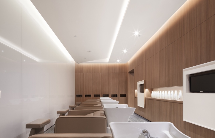
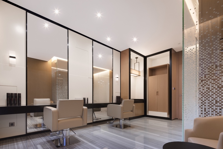
The operating area which pays tribute to the master gets rid of constrain of square space. Together with the use of column grid, three Y-shaped hair dressing area are set. The placement of three Y-shaped nodes makes this space flowing. Three soft film arc lights hide in the ceiling and anchor with the floor layout.
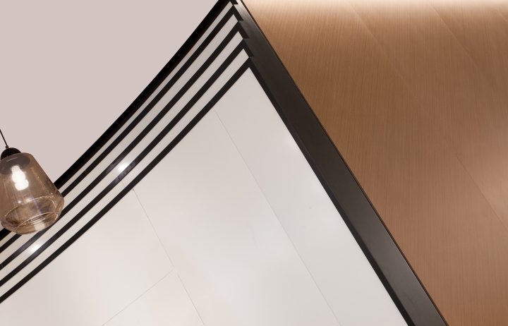
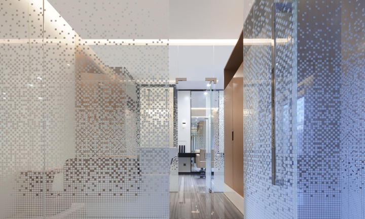
In modern design, many fashion brands pay great attention to the permeability and transparency of the space, take Dior flagship store designed by Kazuyo Sejima for an example, the space conveys a flowing, lightsome and fashionable sense of transparency and characteristic of romance through the use of transparent glass. How to make a space vivid, flexible and have a feeling of spaciousness? It is the key issue for fashion store designers to focus on.
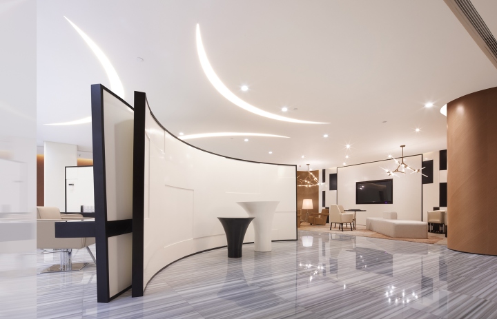
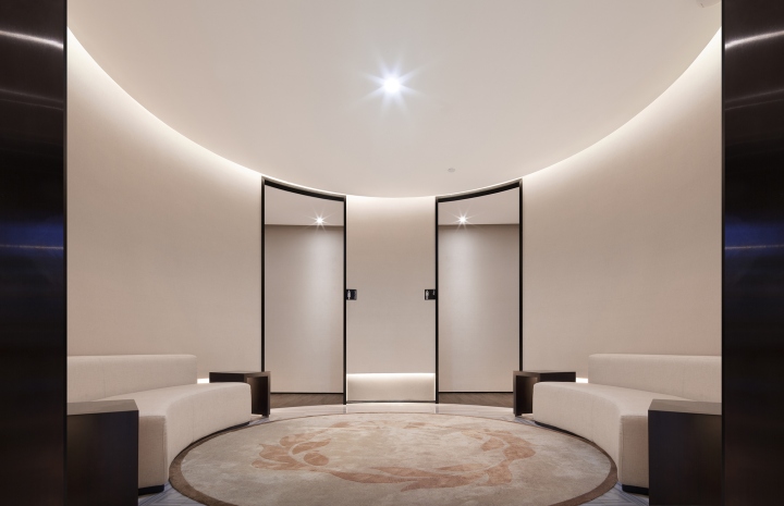
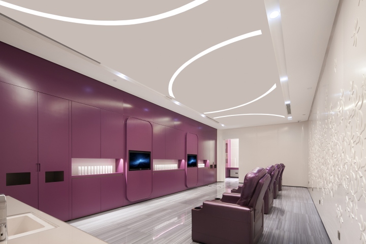
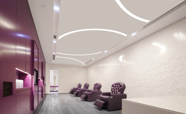
In today’s industrial design, round corner is all the rage and has gained millions of fans. This organic modernism trend will keep hitting space design industry, and in the future, industrial-grade interior design will become a trend. Materials will be processed in the factory, and being assembled at site, no connecting node or seam will be seen. This requires designer’s superb skill in dealing with construction drawings, and it is also a challenge for the factory’s crafts. Round corner design has an industrial sense, while the back wall of the sofa is decorative with baking finished and carvings.
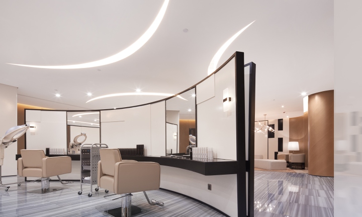
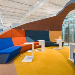
What modern sales space attaches great importance to is not direct sales, but offering customers nice experience through comfortable and cozy space design, so as to make them repeat customers. Therefore, it might seem a waste of operating area to build experience area and recreational area, yet, in fact, it is an essential part in the design. Make it a bright spot and it would be a plus to the design, which promotes sales naturally.
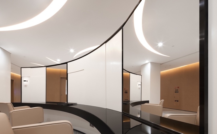
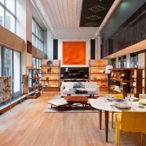
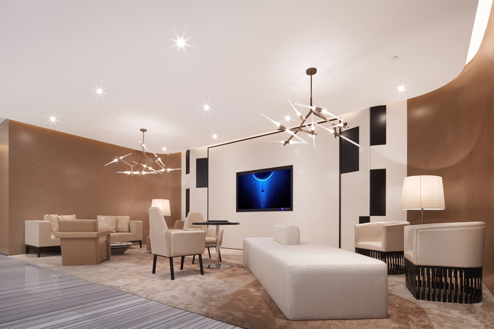
A few kinds of seats are used in the recreational area; small tables with seats placed face to face are quite formal, while the couch in Lounge area is casual. The surrounding audio-visual system increases interactivity of the space, in combination with Agnes14 chandelier of Roll&Hill, the space becomes concise and efficient. In the design of Dalang store, designer creates all kinds of “illusive wall” by using mirror and transparent acrylic (glass). These walls might add function of display, or interactivity brought by the mirror reflection; which is a very nice try.
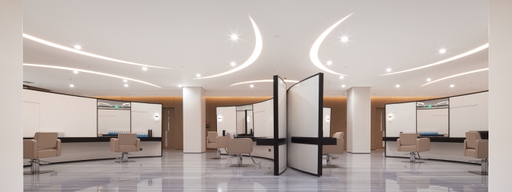
The consciousness of experience economy not only shows in the recreational area, but also hides under the surface of the whole design of Dalang store. To better meet customers’ demands, better serve the customers and guide them to consume are not only the top priorities for businesses, but also the most critical issues for commercial space designers to think about.
Chief designers: Jiang Xiao-Lin, Min Yao
Design Company: Co-Direction Interior Design
Photographer: Jing Xu-Feng



Add to collection
