
OPUS branding by Sheridan&Co
posted by retail design blog on 2016-12-02
Add to collection


Global retail design agency Sheridan&Co reveals its latest work in creating the new brand identity for OPUS – a boutique fitness studio in London’s Notting Hill founded by renowned personal trainer David Kingsbury. Formerly known as DKPT, the studio’s coaching philosophy of “respect, empowerment and excellence” has led the outfit to become one of the most reputable within the fitness space. To facilitate the business’ future growth, DKPT believed a brand overhaul was needed to not only position the offering as less eponymous and more inclusive, but to also differentiate its service from competitors in the City and, more specifically, the Notting Hill area – a key location for a number of high profile fitness studios already targeting the well-heeled and health-conscious local demographic.

Ultimately, the new iteration of DKPT needed to become an umbrella brand of sorts, designed to reflect beyond ‘the face behind the brand’ to champion a wider team of fitness experts and a more integrated offering of services including classes and the brand’s own clothing and product lines. Sheridan&Co were tasked with renaming DKPT as well as conceiving the new look and feel of the new brand mark, brand assets and website. Kingsbury sought to create a solution that resonated the brand’s passion and philosophy for inspirational fitness, with a real departure from the existing corporate messaging and clinical look and feel that previously defined the brand.

Michael Sheridan, founder and chairman of Sheridan&Co commented: “Our initial challenge was to create a brand identity that clearly communicated DKPT’s market leading expertise. It needed to appeal to a high-end audience while, at the same time, presenting itself as more of a contemporary, aspirational and fun lifestyle brand.” As part of the creative process, Sheridan&Co delved deep into the brand’s current market position, analysed its competitor landscape and identified trends within the burgeoning boutique fitness scene to devise a strategy that strongly defined DKPT’s core point of difference.

Given the brand’s vision for creating a community that allowed individuals to positively feed off one another’s inspirational and motivational energies, the name “OPUS” was conceived along with the strapline “Fitness To Inspire”. The thinking was that, by visualising personal motives and inspirations, new and existing clients can be encouraged to express what inspires them to train – for example, “OPUS for the mind’, “OPUS for strength” or ‘OPUS for the buzz”. It underscores a feeling of inclusivity and a sense of individual and bespoke personal progression.

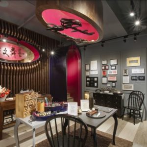
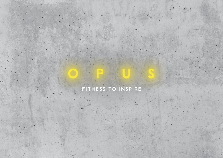
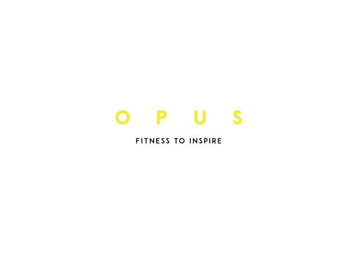
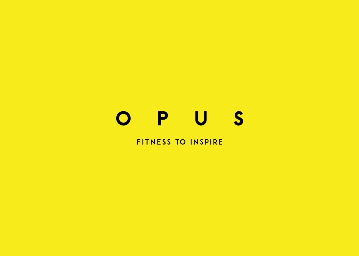
Next was the brand identity. Eager to step away from the unengaging scientific tone of voice and hardline clinical aesthetic of the original DKPT brand, Sheridan&Co developed a visual mechanic that would appeal to a contemporary, cosmopolitan and affluent health-conscious market while also complementing the existing industrial-chic interior design of the studio’s space. The Sans Serif font used for the brand mark and slogan is clean, bold and modern, delineated in uplifting yellow. The visual language has been applied to core touch points in the interior space, with the brand mark set up against a concrete wall of the studio, exuding an ambience of simplicity and natural, positive energy.

The same aesthetic continues on both marketing collateral and the OPUS website, with energetic lifestyle photography of people running in an urban or natural setting. The OPUS brand mark and slogan together with a linear graphic transposed on the body is akin to the marking out of the constellations in our universe’s stars, but in this context, it signifies human energy, vitality and movement. It seems to allude to both the body’s physical and mental capabilities and its untapped potential, which – it suggests – can be unleashed through expertly guided exercise. The overall effect is a stripped-back yet human-centric brand identity that is bold, accessible, adaptable and reflects OPUS’ purpose and reason “to be”.

Michael Sheridan commented: “Consumers are seeking brands that marry positive, aspirational yet realistic messaging with services that help us deliver our most “optimised self”. OPUS is one of those brands that has the clout and a great service offering that enables people to achieve their fitness goals. Where the previous brand identity and name failed to reflect this vision and capture something bigger beyond the “face behind the brand”, OPUS acknowledges both the various components of its service that make it market-leading, while recognising the very personal and individual drivers that lead people to exercise. Through visual mechanics, we have helped them create a brand identity that has longevity and will resonate with contemporary audiences.”
Design: Sheridan&Co


Add to collection