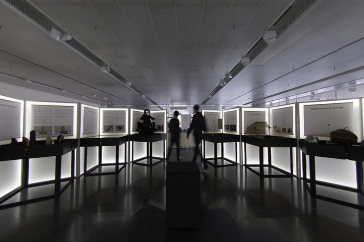

This project is simultaneously an idea for a product and an element of scenography for an exhibition. The exhibition titled Tradition and High Technology took place at Maison de la Culture du Japon in Paris between the 22nd of November and the 3rd of December 2016. The exhibition displayed artisanal products selected from 13 different prefectures in Japan. We were asked by the Japanese public organizer Claire Paris to exhibit the products of each prefecture separately and equally. We consequently designed a showcase and an explanation panel for each prefecture. Being in the entrance hall of Maison de la Culture du Japon, we decided to create an intimate internal space, sheltered from the public noise, in order to provide the viewer a calm atmosphere.

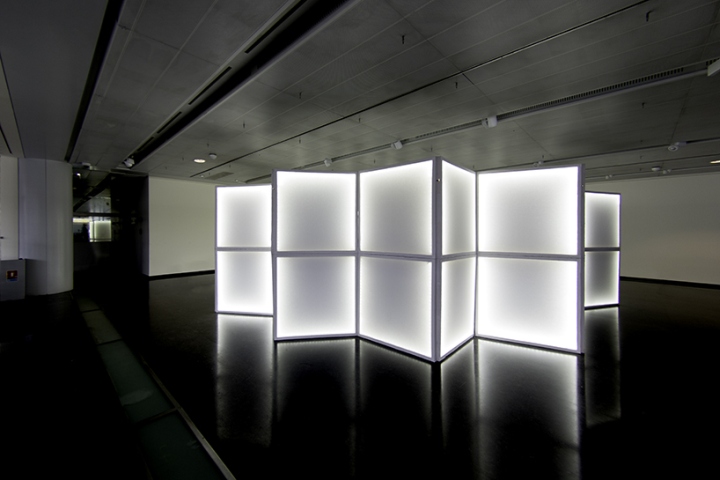
This was achieved by composing each booth in a circle, but also served as a way of giving the viewer with a panoramic overview of the exhibition. As the scenography needed to be set up within three hours, our challenge was to design a system that was compact to transport and quick to set up. This led us to design the scenography with folding screens, referring to the traditional Japanese byobu. Traditional byobu is composed of two panels with a vertical junction and is opened to form a V-shape in plan in order for it to be stable. Our innovation was to divide this composition into 4 panels including horizontal junctions to allow them to be more compact when folded.
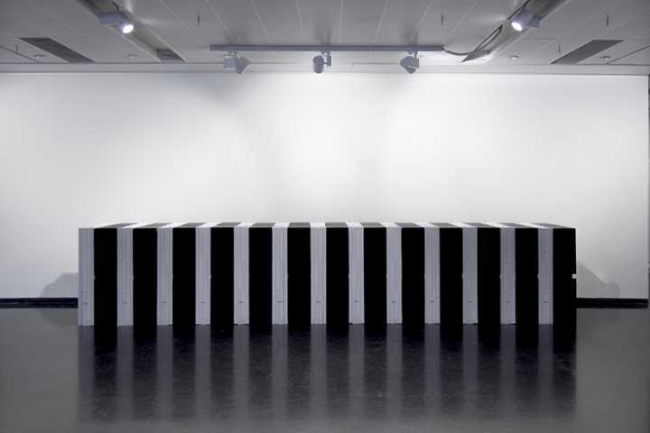
When the structure is folded, all elements fit 900 x 900 mm modules, corresponding to the Japanese traditional space unit. We developed this byobu system to provide all the required elements for the exhibition; including partitions, information panels, showcases and integrated lighting. We called this foldable product Pleat Luster and it became a product of the exhibition with the theme of tradition and high technology. This folding idea is applied to both the white screens and the black showcases. Deciding to further divide the screens horizontally gave us more flexibility in using and storing, but also resulted in a challenge when it came to stability.

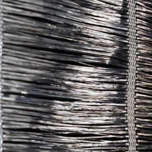
In order to allow the screen panels to rotate 360 degrees, a necessary function given the screens are divided into 4 panels, we further developed the traditional paper hinge system. By using fabric instead of paper for the hinges, we were able to create enough stability. The second challenge was to integrate lighting inside the product. As a strong expression of the theme of combining tradition and high-technology, we we decided to use LEDs directly inside folding screens. That is why we called them Pleat Lusters. As the cabling for the LEDs became possible thanks to the fabric hinges, we covered every surface with the same fabric to give an elegant lighting effect. The fabric allowed many delicate movements and gave a soft texture, which would not be possible with hard materials like metal, wood, or plastic.

With two technical developments, namely the fabric hinge and using foldable lighting, we were able to merge tradition and technology, and do so in a simple expression by using only fabric, wood frame and LED lighting. With Pleat Luster we achieved to merge tradition and high technology just by using wood frame, led lighting and fabric hinge and surface. We hope that this design will not only bring a comfortable space for this exhibition but also meet the needs of modern life all over the world. As the modern life becomes more and more nomadic, moving around by carrying our laptops and smartphones, we hope Pleat Luster will be able to provide a small private space, with a light, partition and desk.
Design: ARCHIEE
Photography: Jun Yasui




Add to collection
