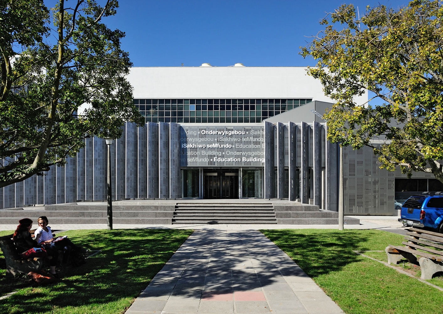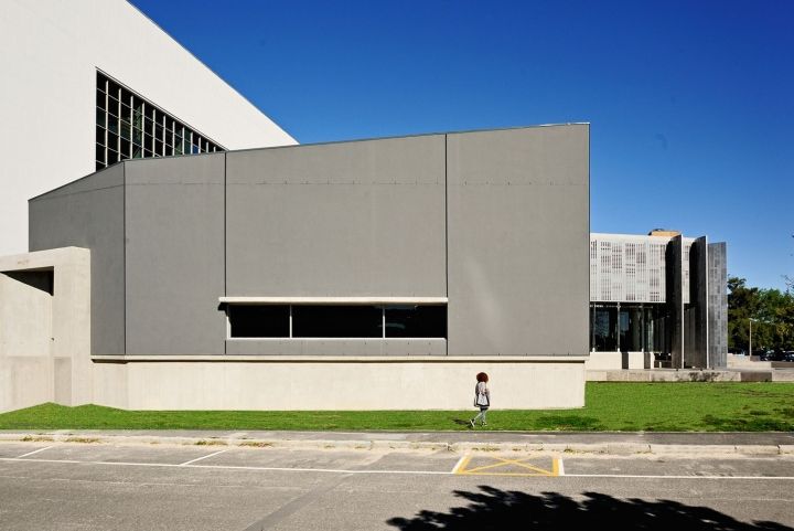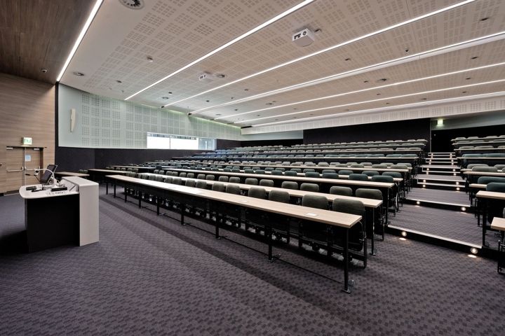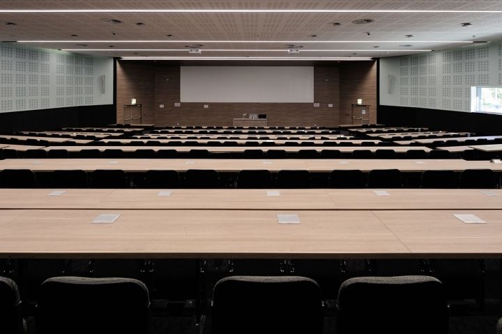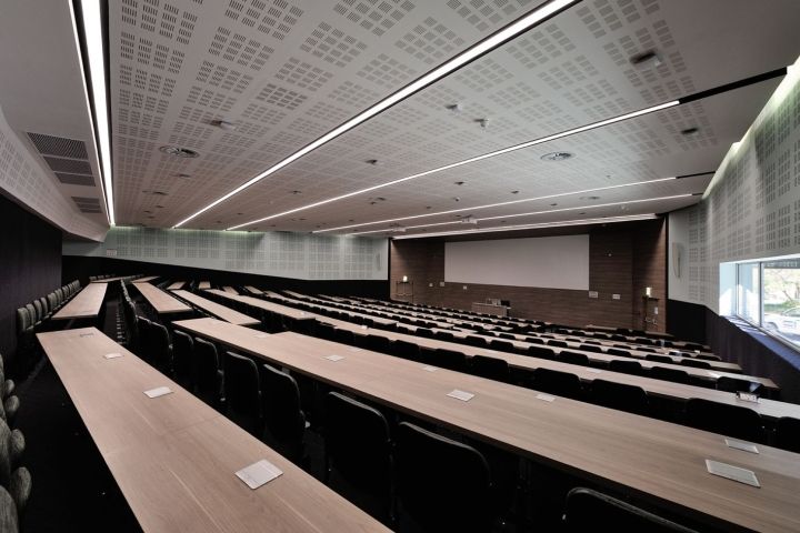


The client for this project was SU’s Facilities Management,with the end user being SU’s Faculty of Medicine. The brief called for two 450 seater auditoriums, with break out areas. The budget was tight, the program fast-tracked and siting crucial. This building had to be located close to the existing Teaching Hub, while not affecting campus parking & landscaping. Of the three potential sites identified, this one was selected for its ability to comply with the above prerequisites, while offering more.

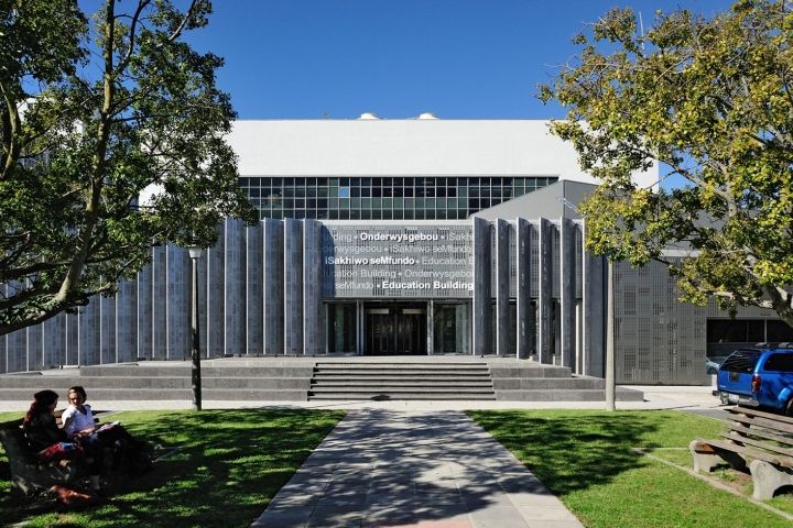
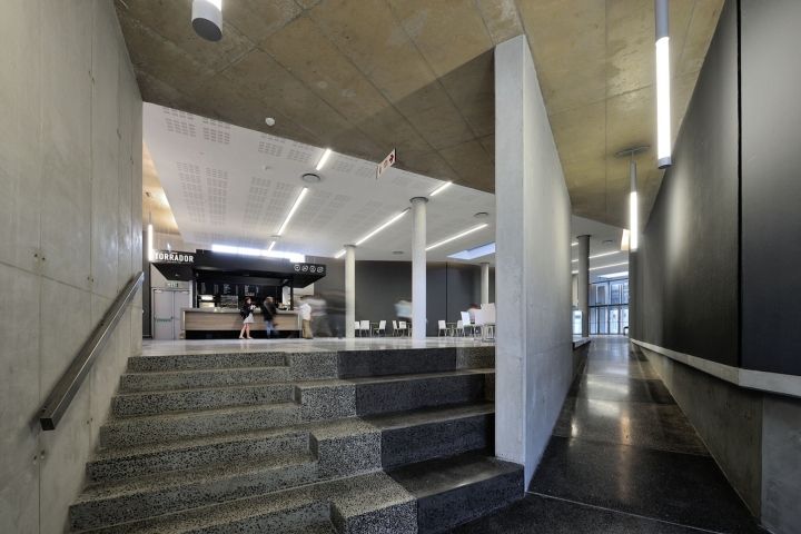
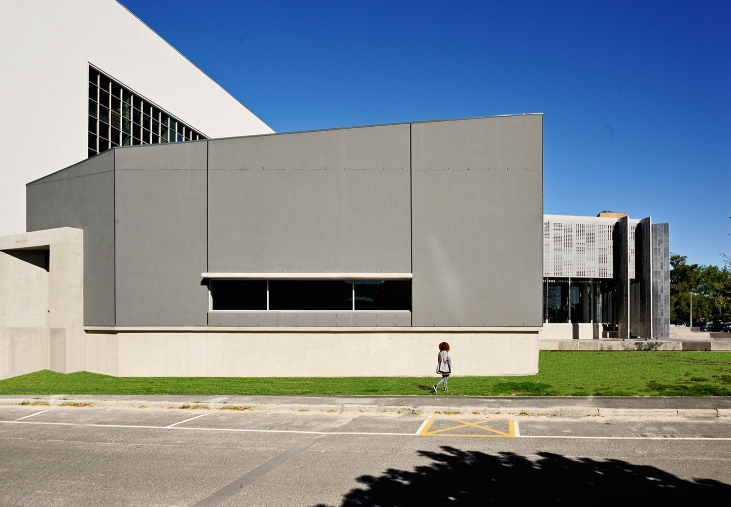
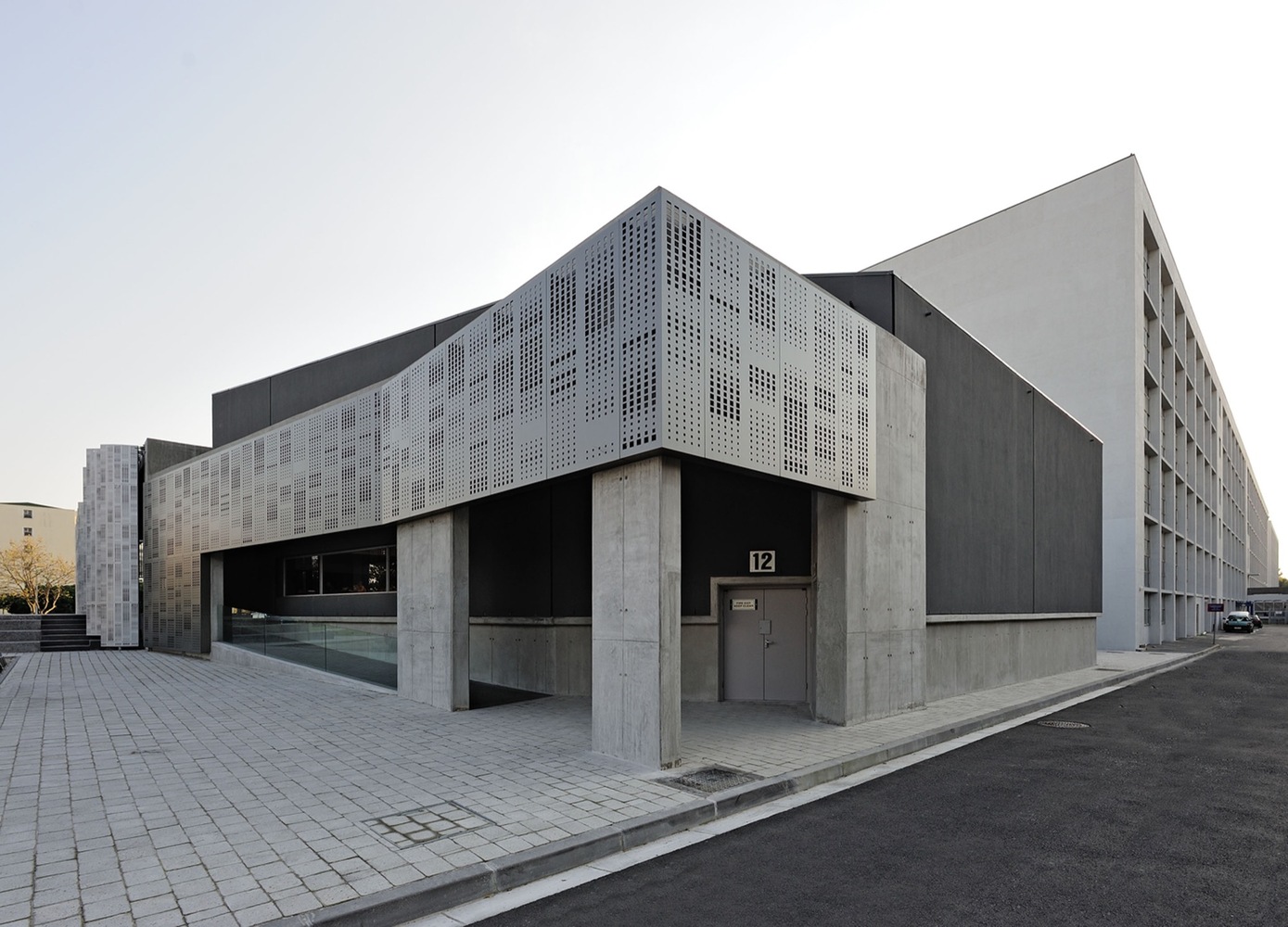
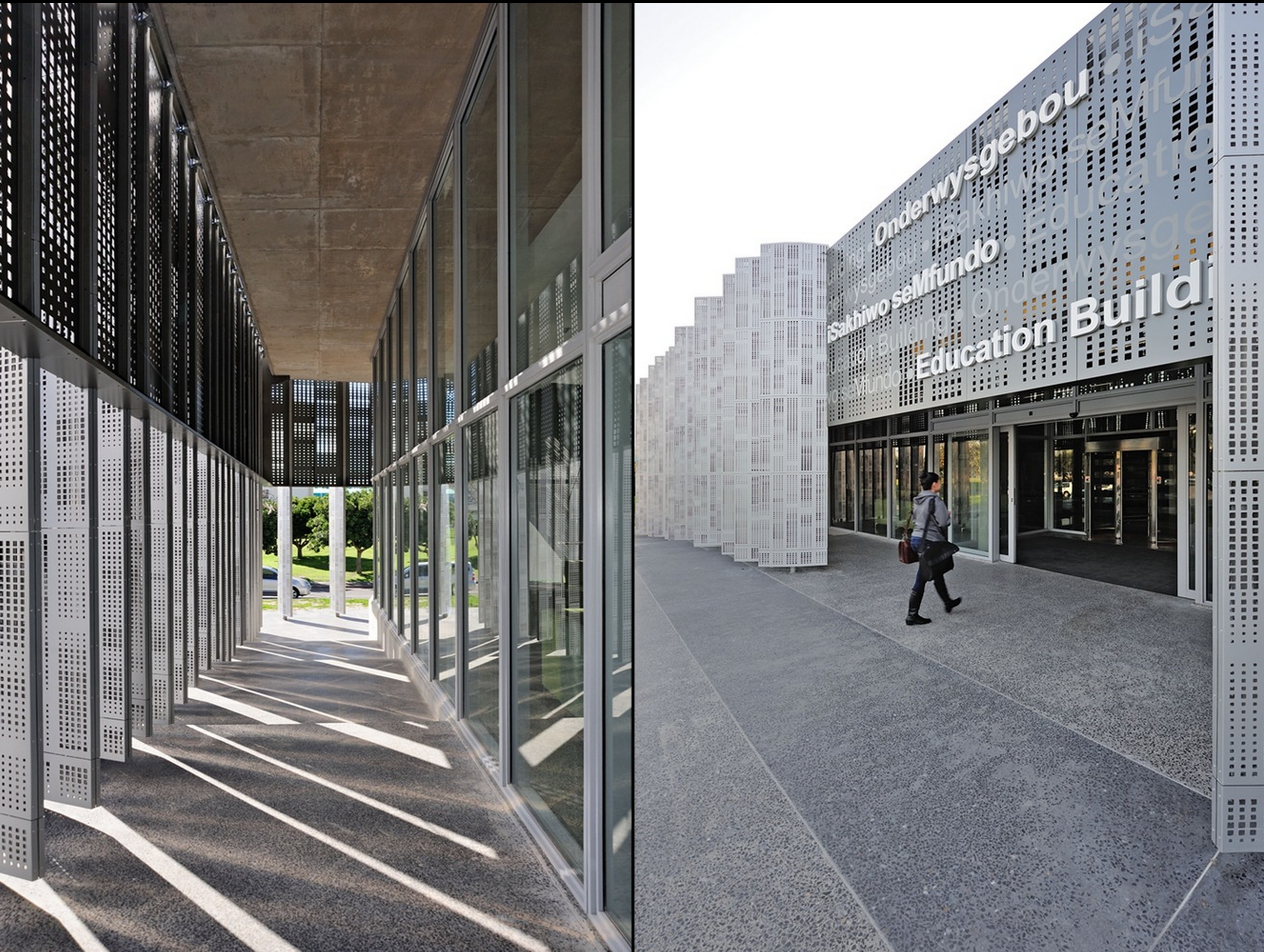
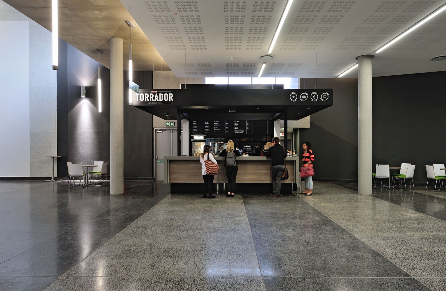
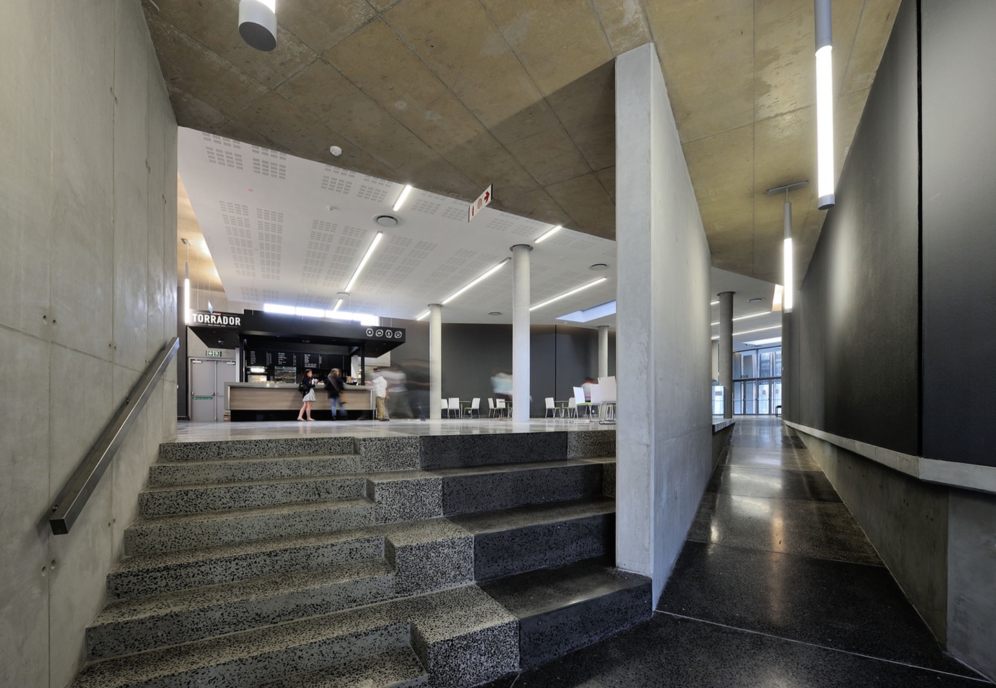
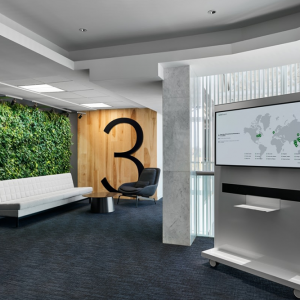
By ‘docking’ into the Teaching Hub, with auditoriums straddling the axis, the opportunity arose to create a new iconic entrance. This also reinforced the axis, linking the Student Union to the Teaching Hub, bringing it indoors, transforming the row of trees into columns. Scale & Massing were important urban design considerations. A low profile was maintained, so to not block a visual connection to the Teaching Hub building behind it. Even so, ± 4,5m internal ceiling heights were maintained appropriately-scaled to internal public space.

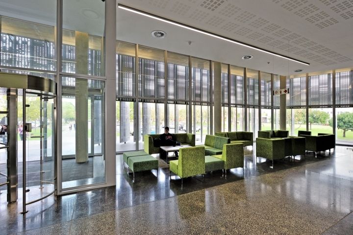
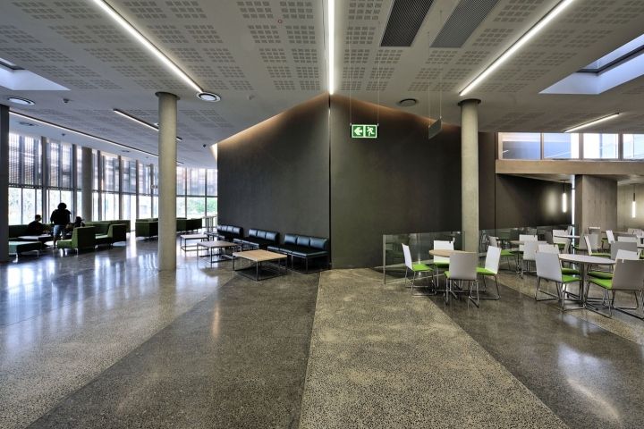
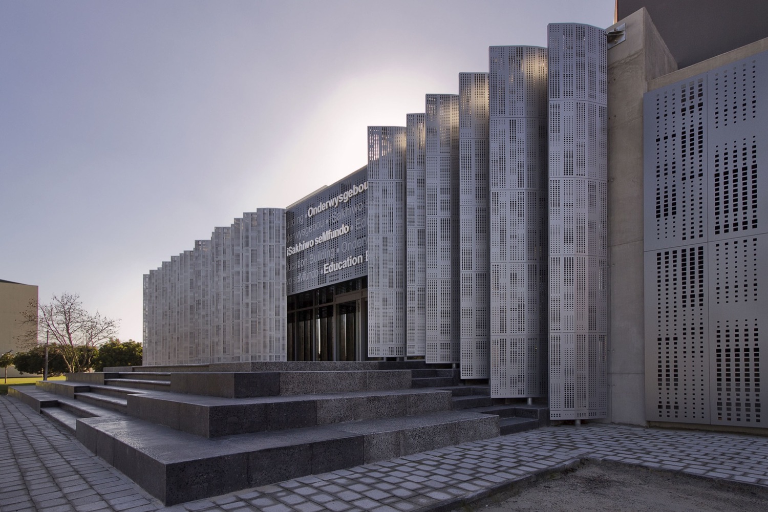
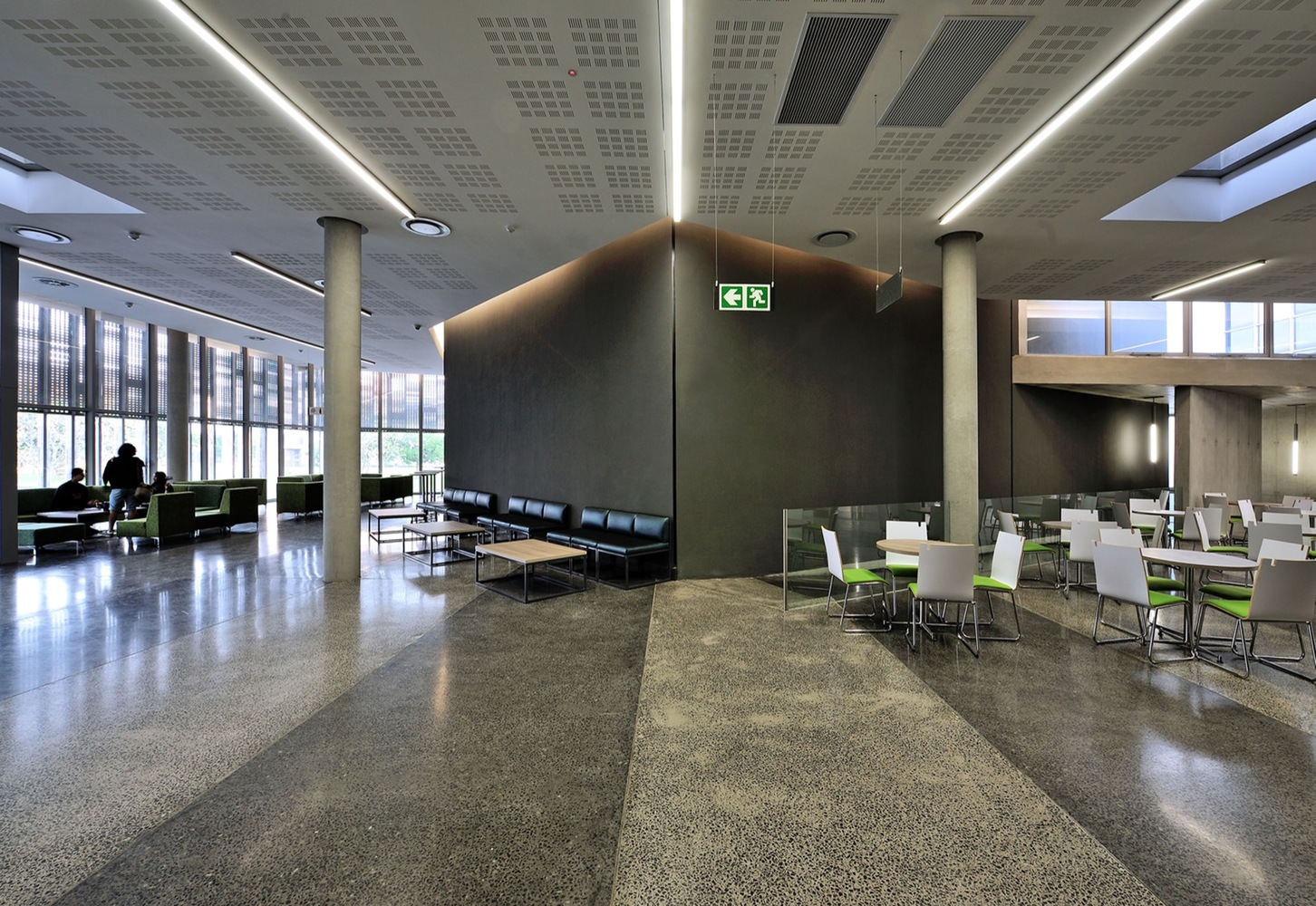
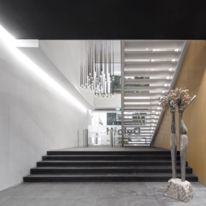
The Tygerberg campus lacked a focal outdoor space, as in UCT’s Jameson steps. These new entrance steps were thus designed to establish symbolic interface. The platforms out of which steps were carved, also serve as seats, while also having planters for trees. The low profile also gave the building good human scale. Straddling the 2 auditoriums over an axis,created the opportunity for a looser composition of solids. These were fronted by a biomorphic break out area, its asymmetry held together by the axis cutting through it.

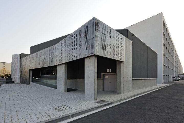
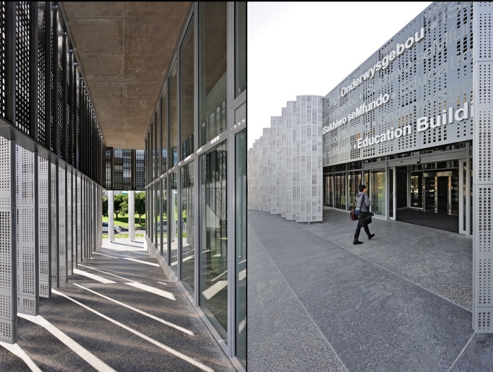
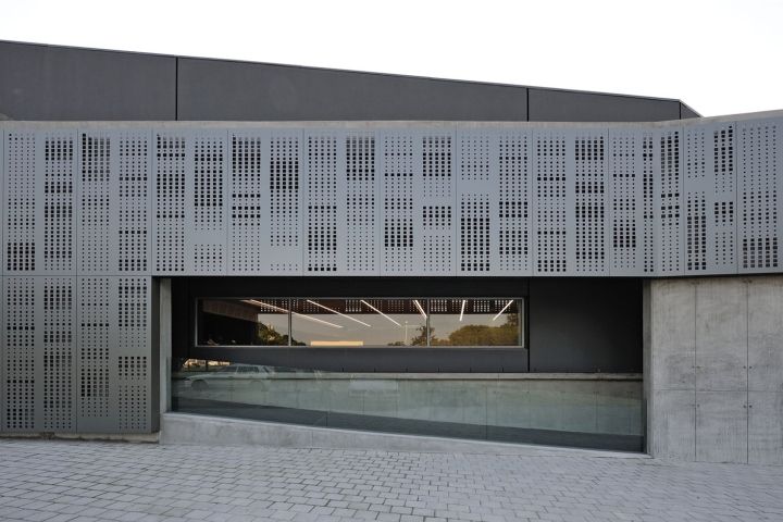
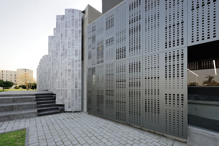
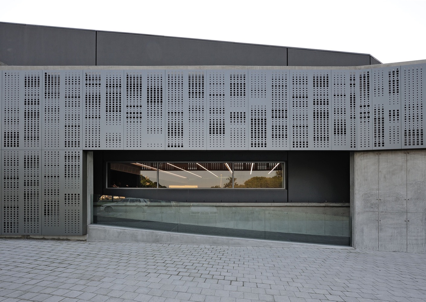
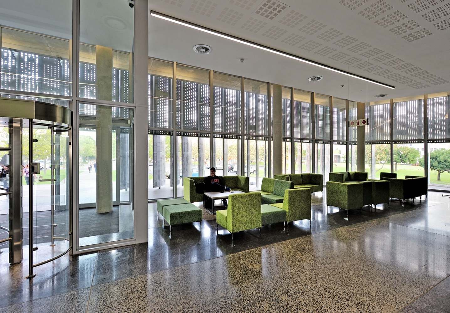
The West-facing, glazed ‘fish bowl’, break-out area presented its own difficulties, which in turn, triggered design solutions. Firstly was the need for precise sun control measures. Secondly the quest to also capture good outward views to the campus gardens. A layer of vertical sun control fins was thus added to the West elevation, manufactured from Hulabond sandwich panels, perforated with stylized DNA patterns. The patterns & signage were designed in collaboration with renowned graphic designer, Robin Lancaster.

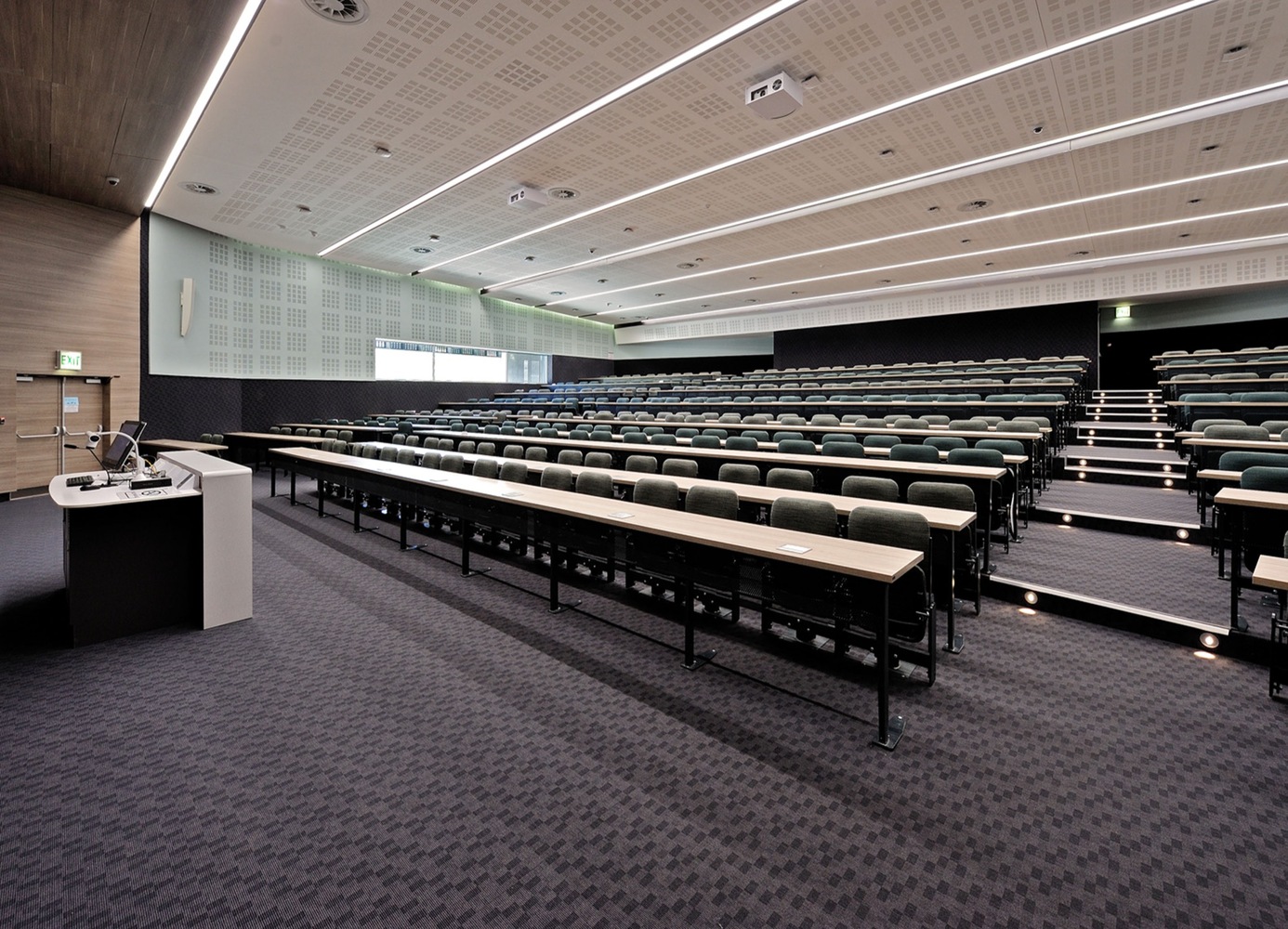
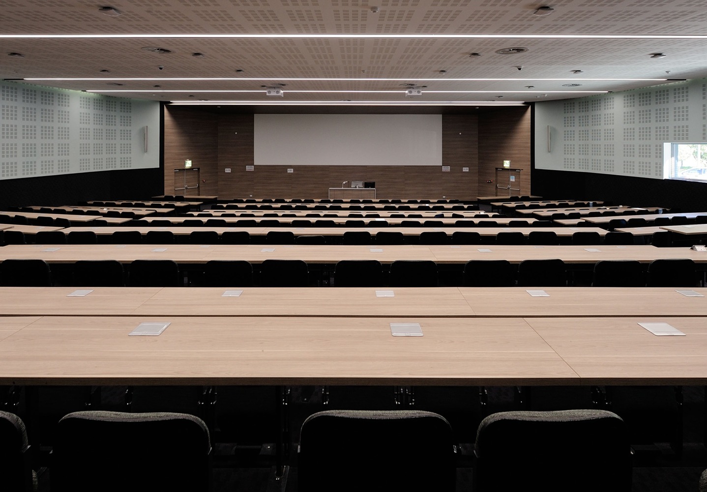
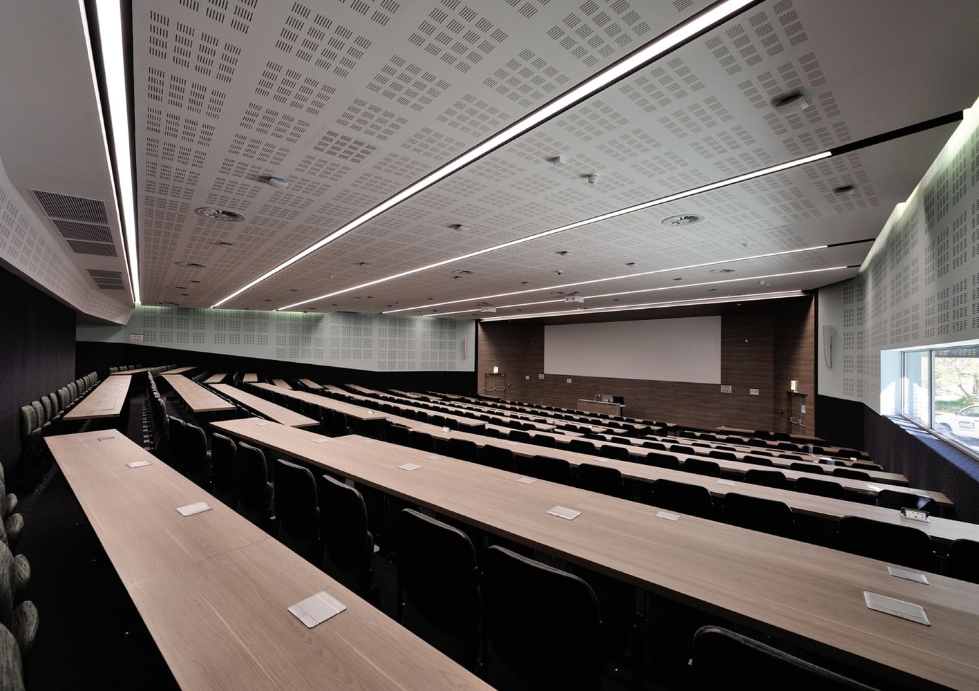
Considerable effort went into auditorium design – size, shape, raking, seating, finishes, lighting & services. The faceted plan was found to be efficient for sight-lines, acoustics & distance from lecturer, while strict lines of geometry where imposed on services, for visual order. A complex arrangement of communication, climate control, power, lighting, audio visual, acoustic & fire detection services were incorporated. The consultant team was managed by a high level of coordination, to achieve functionally efficient, visually uncluttered interiors.

The most significant material used in the project is that of the Hulabond aluminum screens. Part of the client’s vision was to have break-way spaces from the main auditorium that would have a visual connection with the campus surroundings. Due to the orientation of the new building with relation to the old, a clear, unshaded Western façade was not possible. In response to this climatic barrier, the architects decided to introduce vertical sunscreens that were pivoted in such a way that the sun would be blocked out, and the view only partially obscured.

Using aluminum made sense for various reasons. The product is light weight which made the manufacturing of these large fins easy. Being in a coastal area the corrosive properties and durability of the material is also advantages. From an aesthetic point of view, aluminum has a clean and contemporary appearance and could be punctured with a DNA pattern to let in additional filtered light.
Design: MLB Architects
Photography: Wieland Gleich


http://www.archdaily.com/802690/stellenbosch-university-faculty-of-medicine-mlb-architects
