
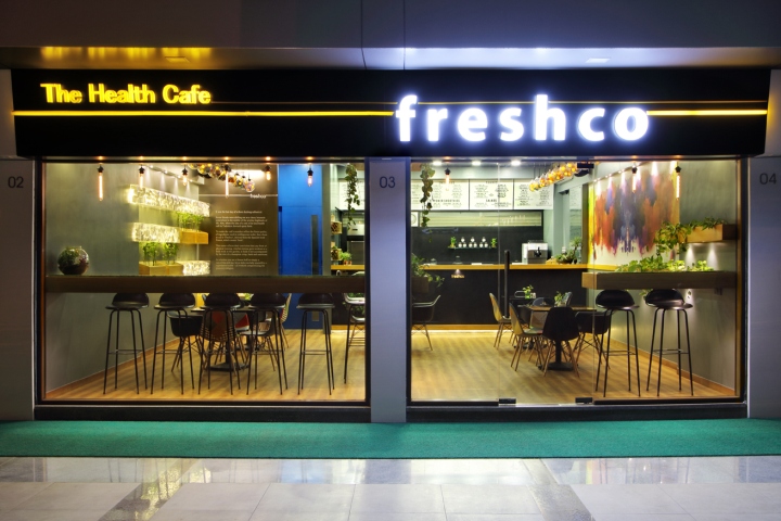
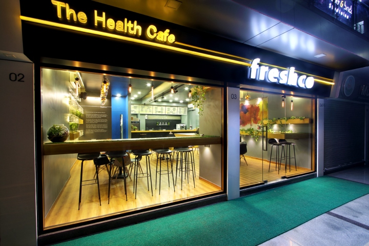
Freshco, The Health cafe by The Crossboundaries, Vadodara – India
posted by retail design blog on 2017-01-12
Vadodara
Add to collection

The idea of opening a theme cafe was initially thought when 7 friends went on a trip to Mount Abu. A lot of brain storming occurred but then we left it and enjoyed sipping our drinks. After 6 months of coming back from Abu the idea again lingered around some of the friends head. Myself being an architect agreed upon making a unique design with one of its kind cafe in the city. But, still the question remained what shall make it different from rest of the cafe? Now-a-days, youth is becoming health conscious. People think twice before eating junk food. Natural juice has started getting more importance than soft drinks and carbonated. Re-thinking on those lines we came up with an Idea of Health cafe. Vadodara’s first health based cafe for the health conscious generation of today. People prefer sipping Healthy shots of ginger then excessive vodka shots now a days. To give justice to the concept I developed certain principles to be used in the design. Considering healthy and fresh products of the case a lot of green plants in the interiors were installed.
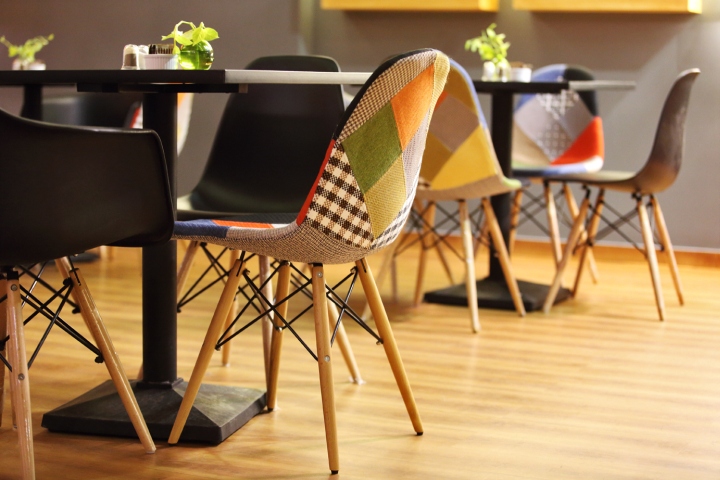
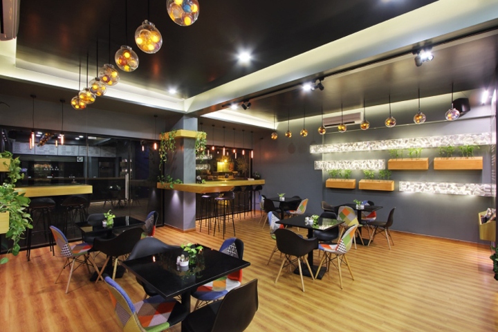
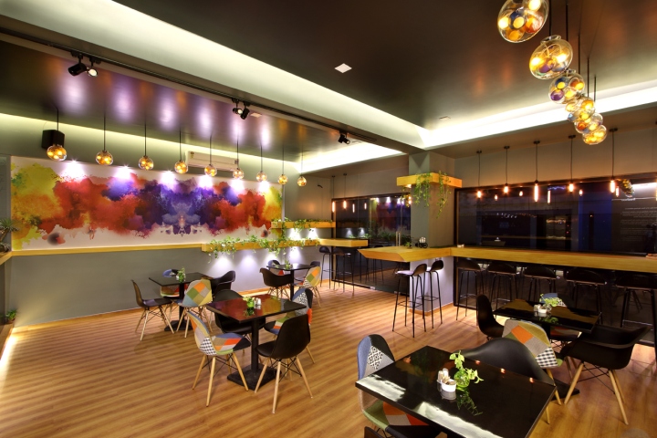
Keeping in mind the small space of 780 sq.ft, some ideas were brain stormed for the placement of kitchen and area distribution of the space. The basic Layout of the café allows proper circulation for customers as well as the owners and staff for regular loading and unloading of goods. 5 small black glossy top tables were placed in the cafe with a combination of Black and colored fabric chairs arranged in a way to neutralize the colors. Well balanced selection of chairs were important so that the table and chairs does not become too dominant part of design. (The chairs were designer chairs by great Architect Ray Eames and hence called the Eames chair). The 13 foot long cantilever table forming an extended cantilever L-Shape with a chamfered edge consists of green artificial grass cut-out in it. With its lime wood finish and button lights at the bottom it adds to the concept of linearity and minimalist design of the cafe. The table has a green feature on it which adds to the green ambience of the cafe. Sitting on the high telescopic legged customized black stool plays a totally different role.
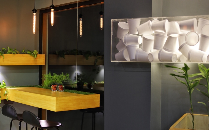
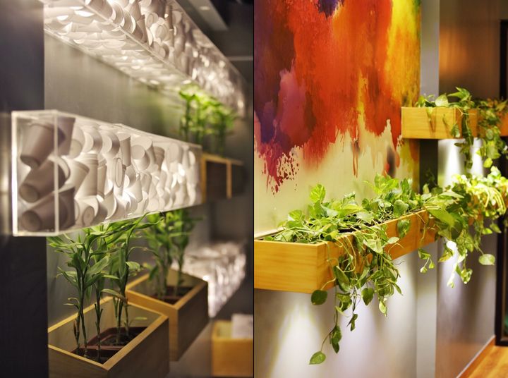
It’s specifically designed for solo customers who drop in for a glass of Protein shake or a juice after heavy workout in Gym or a long run. It’s a pleasure viewing outside the fully glazed glass sipping your healthy drink or having your dish of salad. Similarly on the right side of the entry is yet another 5′ long cantilever table with the same feature of green cutoff on the table. The table is suspended with a invisible thin thread to attain the concept of floating. The Variation in the sizes and shapes of 10 hanging incandescent light bulb plays important role in the design, acting as a welcoming feature from outside as well as a well balanced design feature from inside producing just ambient light for the interiors of the cafe. The elongated boxes on the right store the green natural planters/ creepers trays to add on to the green feature of the cafe.The boxes are designed in a way to hold customized planter trays in it and button lights fixed at the bottom of the box gives ambient light to the grey walls. The customized trays have been designed in a way that it can be lifted up easily when required and hence the planter’s maintenance does not become and issue.
The multiple play of level of the box adds on to the aura of the cafe. The creepers hanging from above acts like a welcoming element and adds to the beauty of green. The right wall is a play of vibrant splash of colors which is one of the most prominent feature of the cafe. The Idea of this wall was derived when I was having a conversation with one of my friend sipping apple juice and the other having orange juice which actually splashed upon my shirt when a young boy zoomed upon his bike losing control and rushed towards us. The mixture of Apple and Orange juice certainty dint look so appealing but when the idea of colors of Grape, Apple, Orange, Tomato, Blue-berry, Watermelon splashed on a white canvas was thought it surely rang the bell and hence I started visualizing it. The wall being a vertical element it was not so simple because the liquid dripped down once splashed over it the Splash wall started looking more like a drip wall. Trying out the idea myself, with professional painters, with fineartist and infact also with the clients throughing color filled ballons over the wall it did not work out.
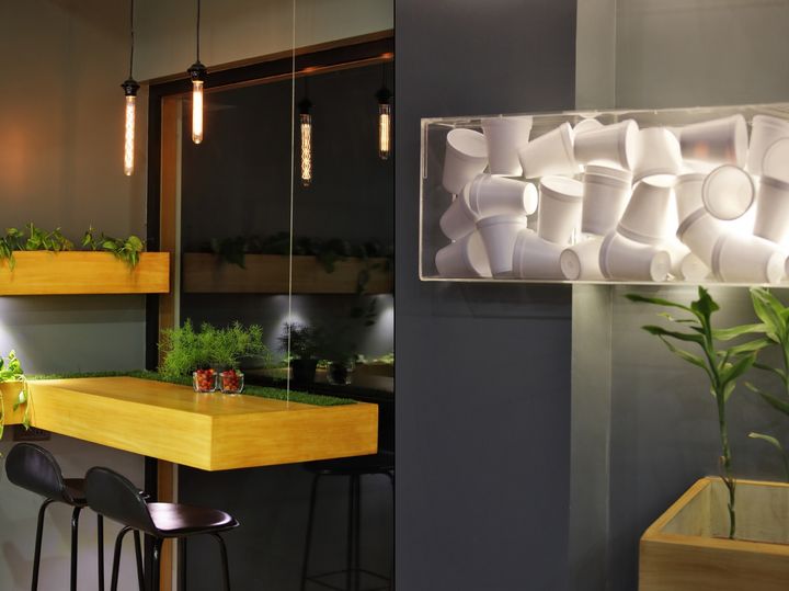
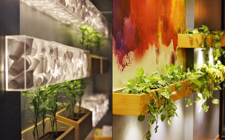
As we say failure is required to get something better i started trying the splash play on a digital media and finally achieved something which all of us agreed upon.Hence, we digitally printed it on a customized wallpaper The wall indeed looks fresh and vibrant now. On the Left side of the wall is the play of Transparent Acrylic boxes which accommodate thermocol glasses. And provision of green planter trays. This wall was kept blank till the end of the Interiors since it was designed as a vertical green wall but facing the problem of budget we had to restrict our design skills. Many ideas started rolling up my mind but nothing unique yet popped out in our head when at one point of time I decided to make the utilization in a way that it does not obstruct the space. Hence, the transparent horizontal acrylic boxes were installed on the wall. The transparent boxes were filled with a very low budget thermocol glasses which was an idea inspired while sipping midnight cutting-chai at station with a friend in those white glasses.

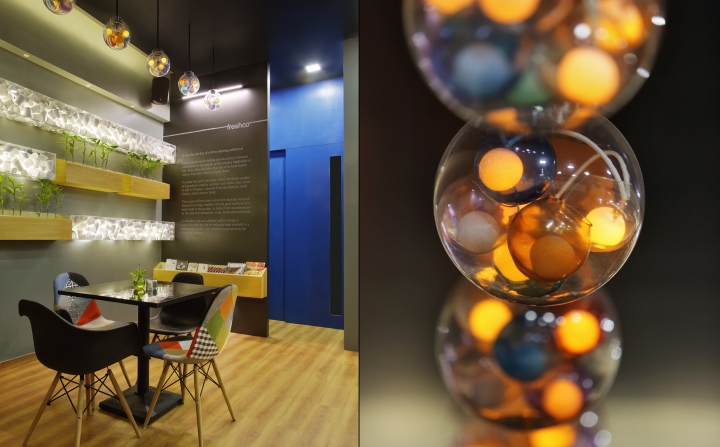
The white thermocol glasses with led lit from behind creates a play of light which allows the light to penetrate and pass through the voids between the glasses. This low cost wall became one of the most attractive feature of the cafe.The wall hung boxes contains the green planter boxes which gets a indirect glow of light because the the transparent boxes. The dark Grey wall in continuation of the acrylic thermocol glass wall is basically a wall where we have tried to note the story line of the inception of Freshco. A short description of freshco has been written with white fonts. A Horizontal pocket is kept to keep numerous books or planters for the customers. The service counter is intentionally made jet black with a crisp tiny button light en-lighting ” Freshco” which is in the lime wood finish laser cut letters. The pocket on the left consists of green planters popping out with a well lit lights. The simple black counter adds to the beauty of cafe and not adding any complex designs makes it look decent and elegant. The Wash basin area is a blue box.The idea of such a vibrant color appeared to refresh the person going for a hand-wash before or after his meal.
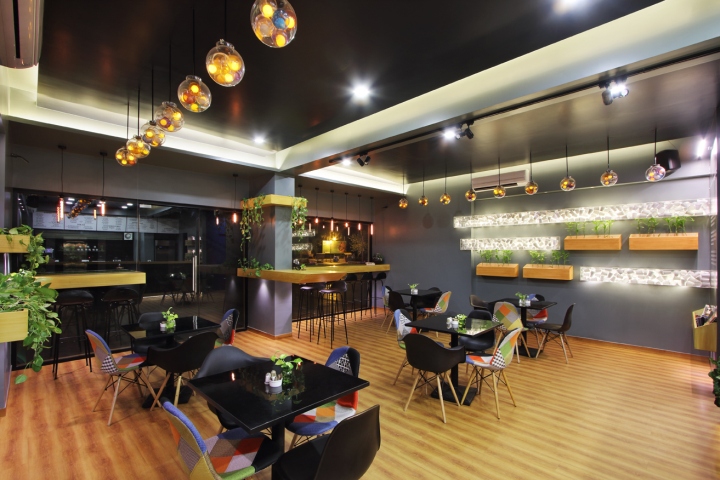
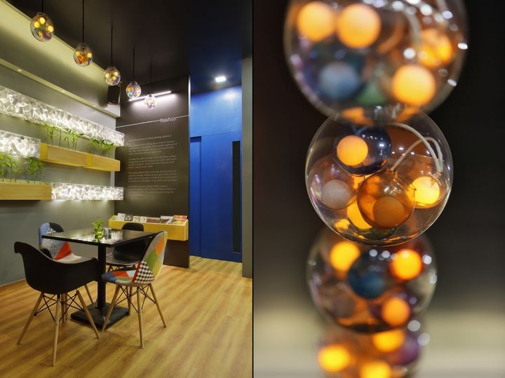
Standing in front of the mirror gives u an impression of standing in a blue box . The small space emotionally changes the perspective and mind set of a person and makes him feel fresh already standing in front of the mirror. One of the most dear and important feature of the cafe are the 18 hanging lights ( 9 on right and 9 on left) This is one of the most important design element by us. It was not long enough when roaming around all the shops in the city and the neighborhood cities to find out the right lights that fit our budget. It was unfortunate that most of the pendent lights we selected were crossing clients budget immensely. Finally it was time when I figured out a fishbowl at a friends place. People had already made terrariums using such fishbowls. But never before had someone used it for customized lights. There again i started playing with a fishbowl, Bringing one large one with 6 small bowls in side. Yes I loved the Transparency effect but a little pinch of colors was must to add to the splash. So, we picked up the stained glass paints and applied it on random small glass bowls. Inside the small glass bowls we placed a pingpong ball by penetrating a bullet LED.
This was the most prominent feature of the light. A layered customized pendent light was ready. A large fish bowl with spherical base containing 6 small bowls of which 3 colored and 3 transparent contained with white pingpong ball of which 3 lit with led. It was actually an achievement and we never thought a rs 500/- product can beat a rs 12000/- This proves that a design does not need to be expensive it needs to be thoughtful. The Transparence effect of those lights made it merge so well with the ambience that I am sure none of the other lights with solid surface colors would make it look so beautiful. Next question was how to hang those pendent lights. We prepared the neck of the spherical fish bowl with 4 holes on each side. Considering safety of the customers a proper fabricated stand was installed above the false ceiling with 9 rods hanging below holding the 9 bowls. It worked perfectly and since its inception many light shop owners have come gazed and yet thinking how is it possible:) In addition to all the elements the dark ceiling, indirect lighting and grey walls perfectly reflects the fresh atmosphere inside the café along with pinch of greens.
Design: The Crossboundaries
Photography: Tejas Shah


Add to collection