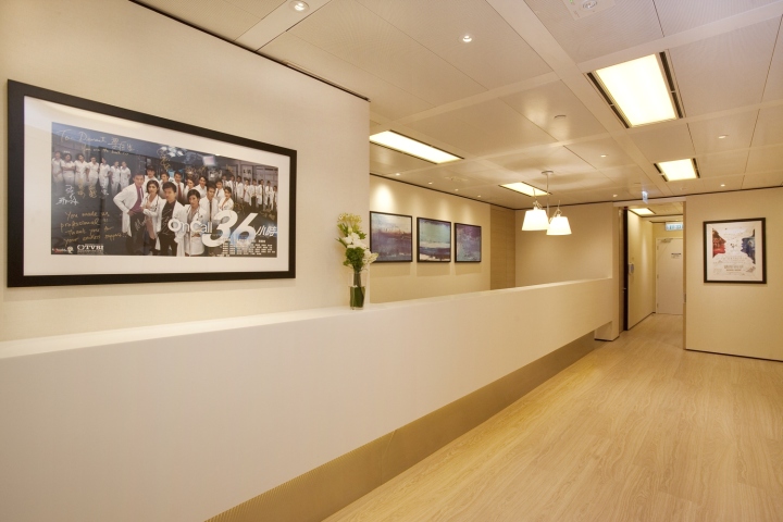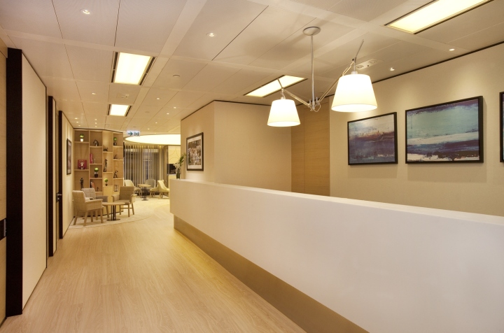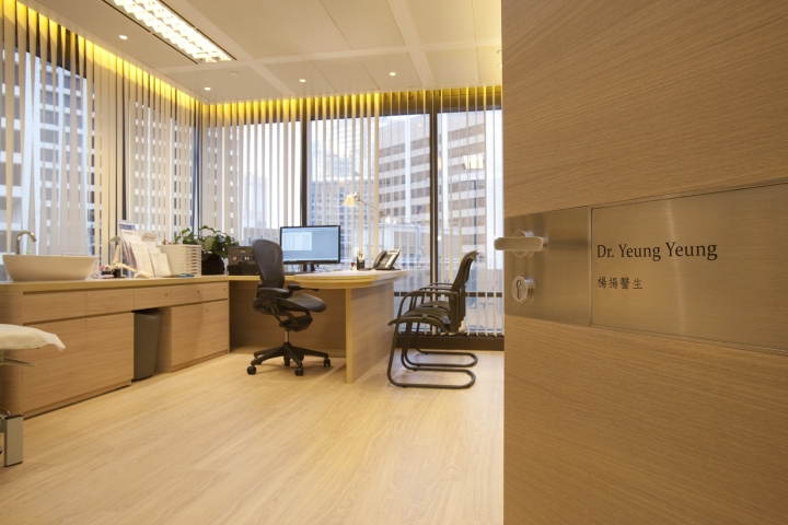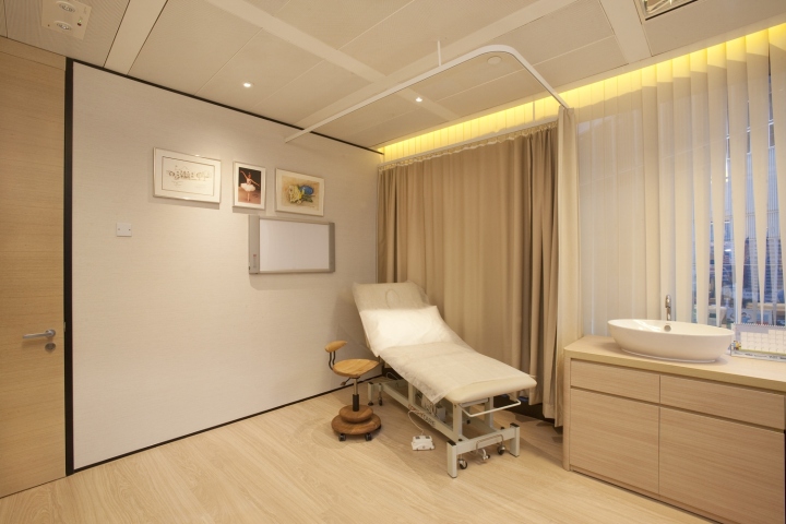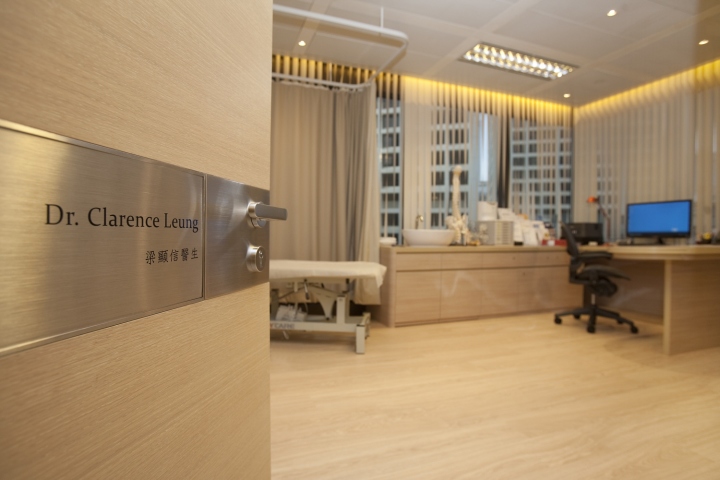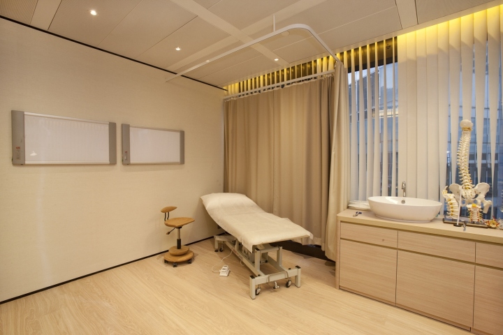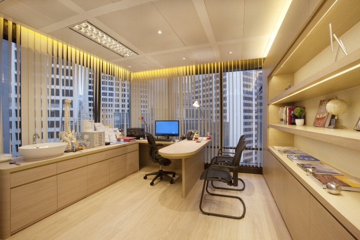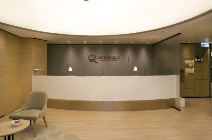
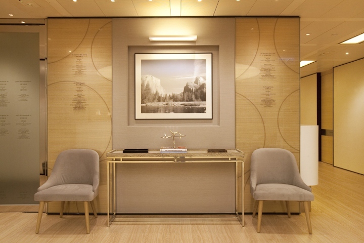

The pressures of modern living—such as long working hours, lack of exercise, and electronic device addiction—have led to the prevalence of musculoskeletal pain among urban dwellers. Located in Central, the Q9 Orthopaedic & Spine Centre aims not only to help clients identify the root cause of their physical discomfort, but also provide a comfortable environment for patients to relax. As such, in coming up with the design vision, Clifton Leung Design Workshop broke free from the traditional and generic clinic design, which gives off a cold and impersonal atmosphere. Instead, the design focused on creating a warm and homely ambience, with patients viewed as family.

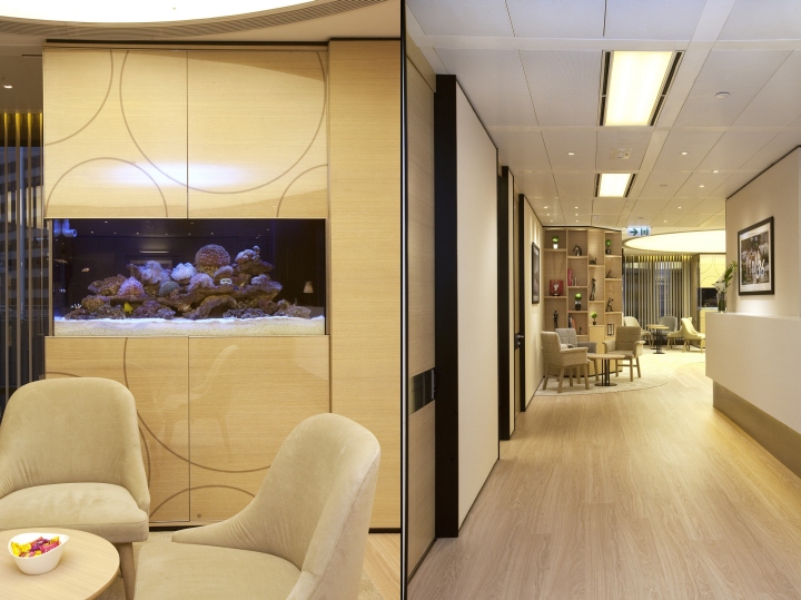
Foreign studies have pointed out that greenery can create a joyful mood; as such natural wood materials are found throughout the clinic. This is complemented with warm and soft lighting, which creates a stylish, elegant and homely atmosphere. While making patients feel at home is of paramount importance, the design also takes into consideration the practical and professional needs of a clinic. As such, a lot of details are incorporated in the design, including the arrangement of seats and décor pieces. Instead of having a plain and conventional white design often associated with medical institutions, the doctors working at the new clinic requested for a chic and homely design.

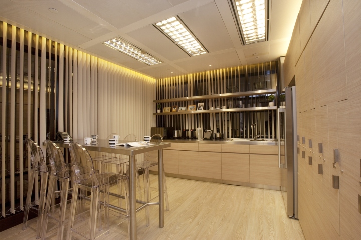
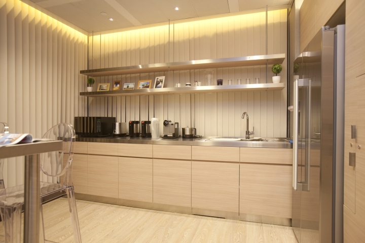
According to experts, what patients suffering from pain need most is a tranquil and cosy environment so that they can relax physically and mentally. Apart from the patients, the design also takes into consideration the needs of the healthcare practitioners, as they are another group of main users of the space. According to the clients, doctors and nurses require individual working spaces that cater to their personality and needs, as well as rest areas to recharge. As such, the design team opted for a clean and minimalist style, which can be used to create a sleek yet relaxing space.

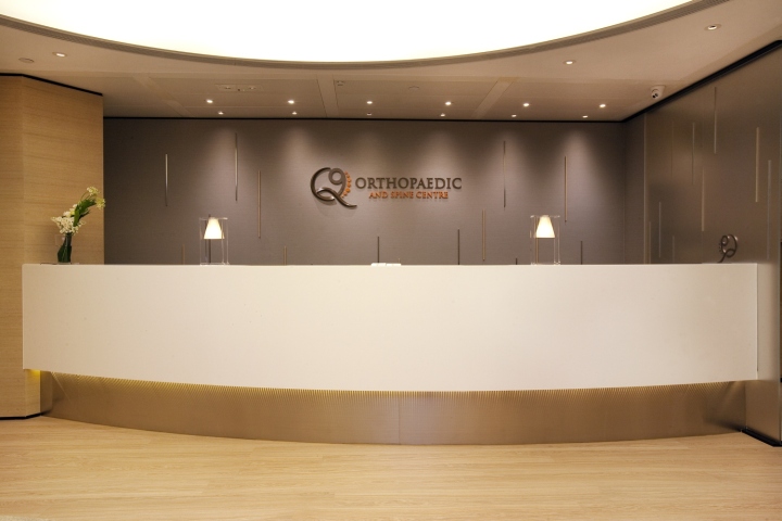
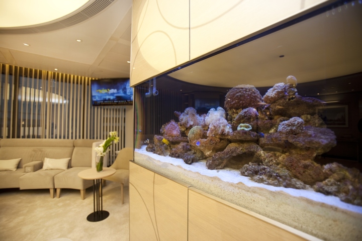
With the physicians very much concerned about the patients’ feelings, they wanted a design that makes patients feel cared for and releases tensions commonly associated with clinical visits from the moment they step into the clinic. As such, it was a challenge for the design team to brainstorm for ideas that are different from typical clinic designs, including a breakthrough in the design of the clinic’s logo, an elegant reception, and an aquarium, which is not commonly found in clinics. Although the design team has worked on designs for hospitals, the requirements of designs are different.

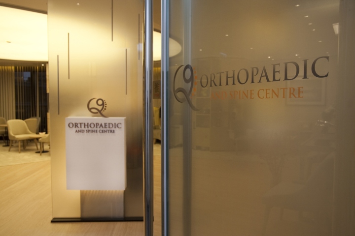
While an open design is favoured for clinic designs, the building’s floor-to-ceiling windows allowed too much sunlight to enter, instead creating a too brightly lit environment. As such, curtains have to be installed to enhance the degree of privacy. The patients’ practical needs also need to be taken into consideration, so it was challenging for the design team, who are not medically trained, to come up with a cohesive and functional layout for patients to get from place to place, such as from the consultation room to the X-ray room, efficiently and comfortably. To give the clinic a homely ambience, the design team put a frosted glass screen at the entrance, which also increases the degree of privacy.

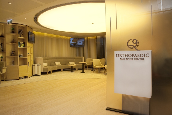
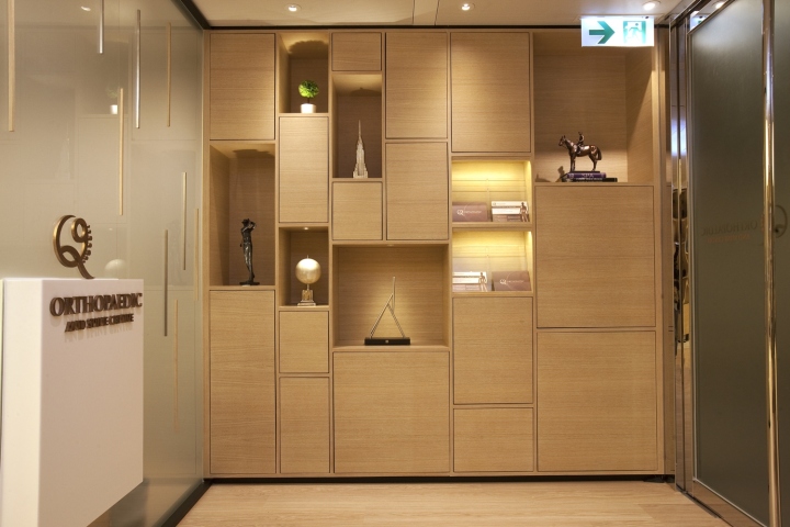
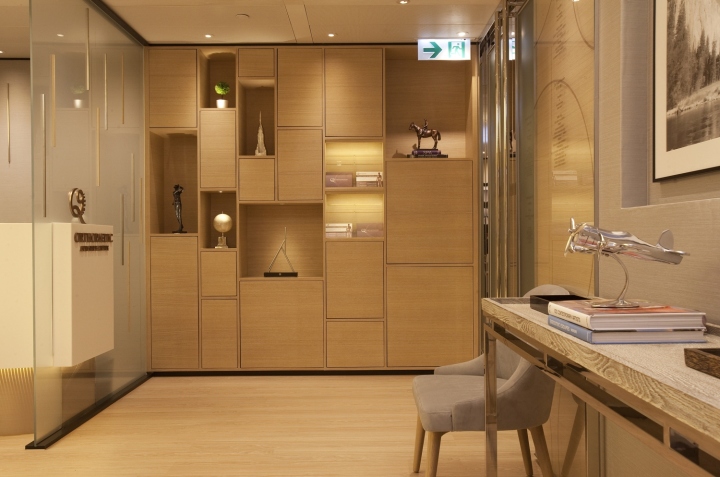
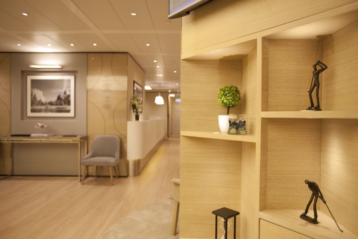
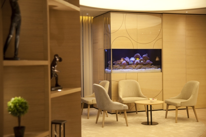
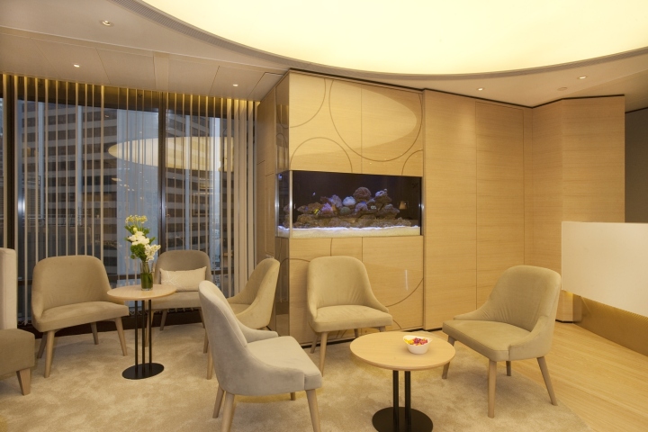
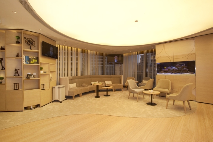
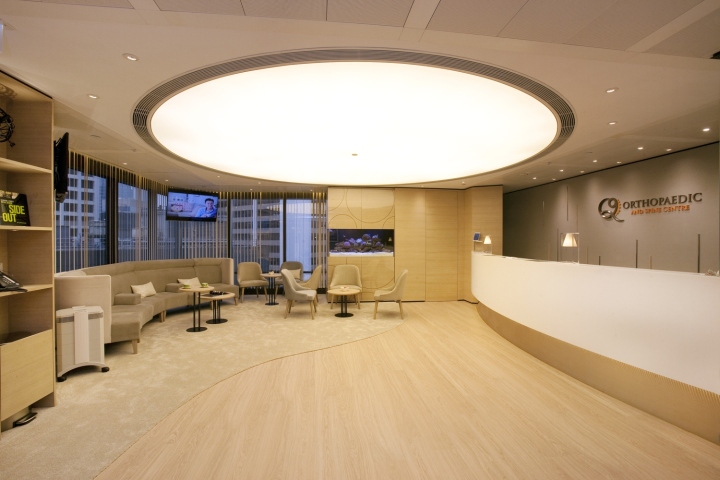
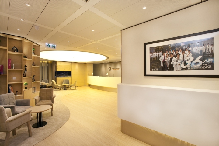
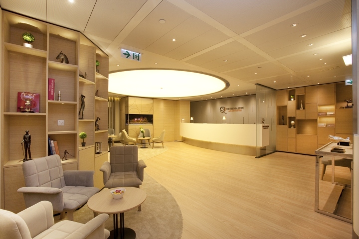
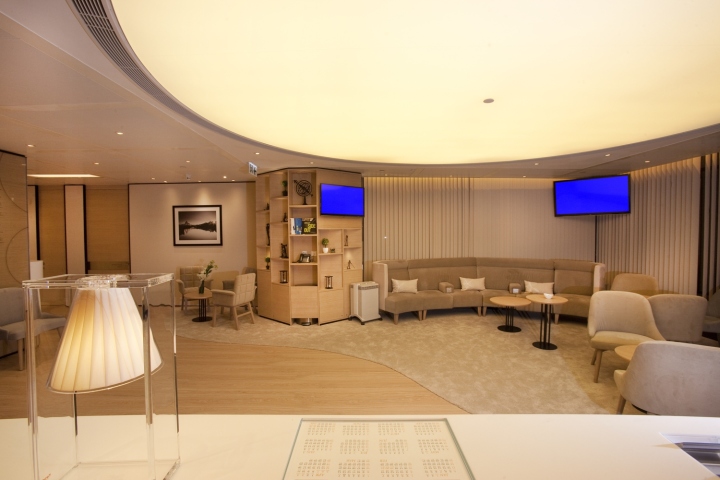
The waiting room has an open design, with a big round ceiling lamp illuminating the space and an arc-shaped carpet. The minimalist design places the focus on the patients. The carpet is complemented by many sets of streamlined chairs. These tailor-made chairs are ergonomic and cater to visitors of different body shapes and sizes. To match the clean lines of the geometrical cabinets, the design team and clients added sports-inspired sculptures, such as those showcasing golf and discus, to the space as well as tropical fishes, giving the clinic a dynamic and lively atmosphere.

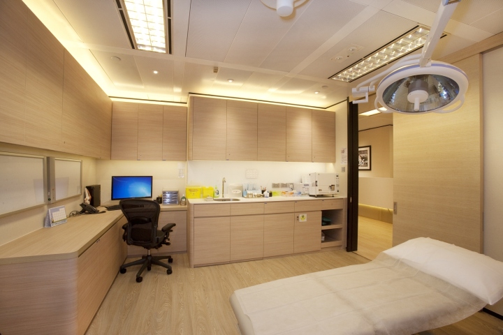
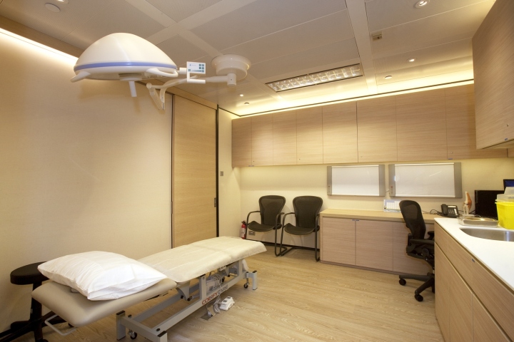
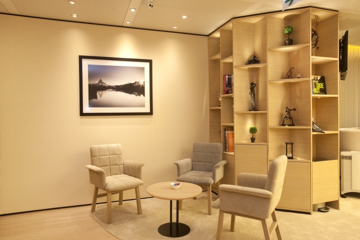
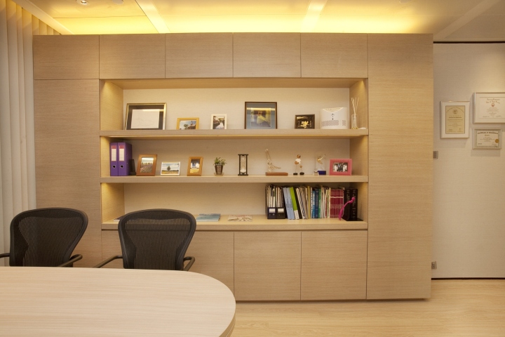
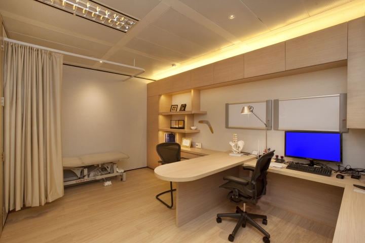
When a patient moves from the treatment room to the X-ray room, he or she might feel lonely and uneasy, so the design team filled every corner of the space with light brown wood and soft warm light tones, which allow patients to get a sense of serenity. The décor of the clinic’s four consultation rooms are a continuation of the colour scheme and style of public areas of the clinic. The only difference is that the consultation rooms have various custom-made cabinets that showcase the doctors’ favourite memorabilia, such as art works, plants, photographs and books.

These dispays allow patients to get a taste of their doctors’ character, making the patients feel more at ease during the consultation process. In summary, while the clinic is the workplace of doctors, the welfare of other healthcare practitioners and patients are equally important. As such, their needs are taken into consideration in the design. This is achieved through the clear demarcation of the centre’s different spaces, such as those for treatment, storage, and resting. The most eye-catching part of the centre is the homely and café-like waiting area. Another innovative feature is the canopy-like LED lights.

The light emitted is similar to that of natural light, giving vitality to the space. Practicality and creating an uplifting atmosphere are the key elements of this project’s design. The former caters to the function of the clinic, as a medical facility, while the later caters to the emotional and psychological function of a clinic, which is often overlooked in designs of medical institutions. Through the careful choice of materials, thoughtfully designed lighting and meticulous planning of the layout and the arrangement of furniture and décor, a clinic can be comfortable, warm, and uplifting, and the connection between the staff and patients can be increased.
Design: Clifton Leung Design Workshop
Photography: Shia Sai Pui
