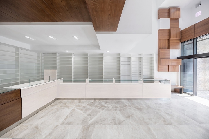

The client is an old pharmacists who live in pirouzi district one of low-level one in Tehran. The old pharmacy has established in the year 1332 (63 years ago – 1953). Due to the placement of pharmacies in the municipality and widening the intersection, a neighboring property assign to the client to construct a new pharmacy. The purpose of the client was full transition to the new location and correction of shortage of old pharmacy. Within area limitation of new property than the old pharmacy was the most important challenge in meeting the needs of the client.
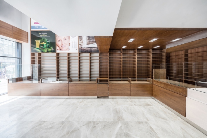
The required levels in pharmacy 1332 were taken and the medicine cabinet in new pharmacy and consequent layout of the shelves were designed to provide the space which is needed. The interior space were divided into two distinct, the wooden part assign to sales of cosmetics and the white part assign to medicine. To achieve the client’s requirements, providing visibility and limitation of construction in each levels due to maximum construction of 60% of area the, a void was designed to providing visual communication between different parts of Pharmacy.
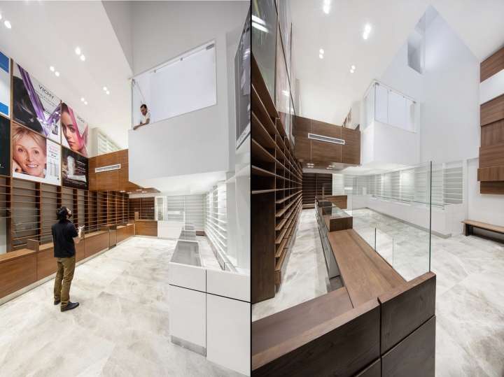
The void and arrangement of spaces at the ground floor were combined in such a way that the two cosmetics and medicine parts were emphasized. Two separate section dealing with different materials, one white and the other wood surfaces which is combined with whole volumes and integrated with space. The gap between these two parts to form a glowing crack in the ceiling of the ground floor, first floor walls and eventually extends to the façade of the project.
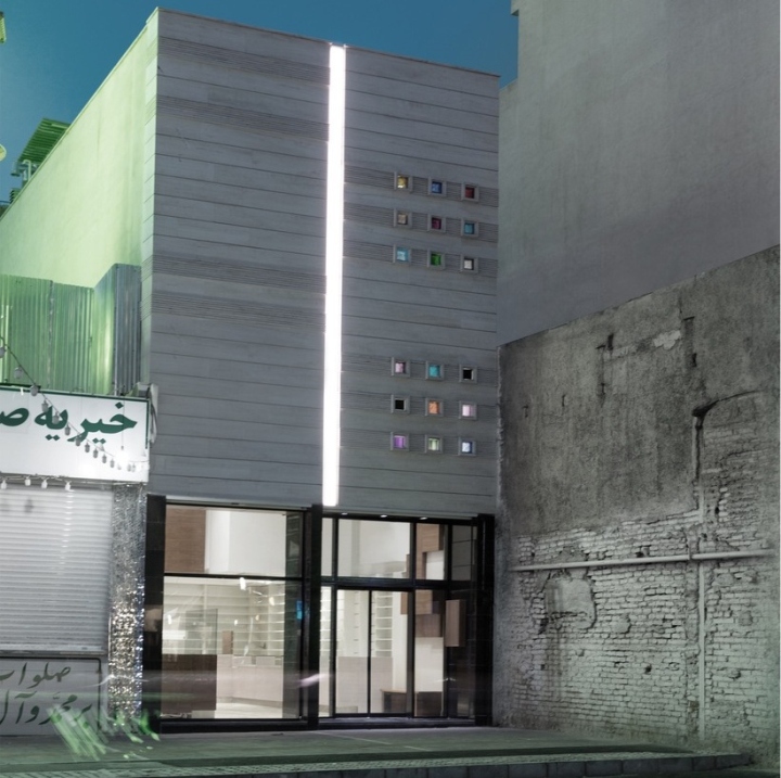
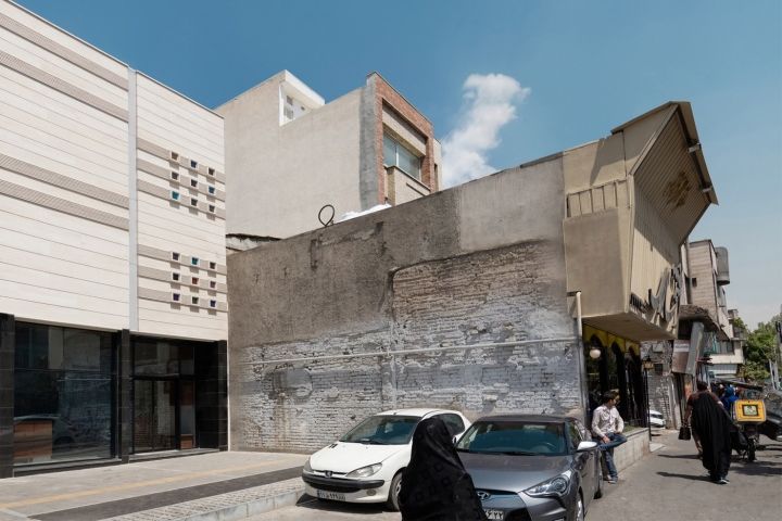
1. The simple and silent architecture in the bustling traffic intersections.
2. Transparency in connection with pedestrian level.
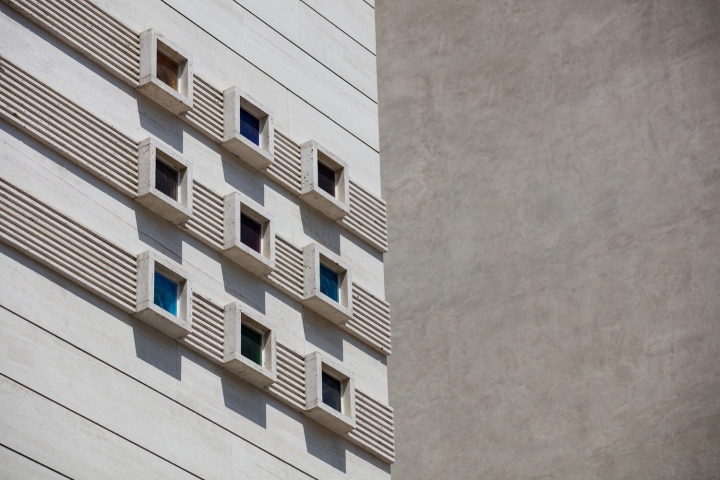
3. The rigid shell posing as a hidden shell of the interior.
4. Establishing the variety of different heights and scales to make diversity. In result of this diversity space were contrary to the customer’s aspect of space.
5. To regard municipality’s role vertical opening and voids design which create a different atmosphere.
6. Making view of different parts to the main ground level.
7. Establishing the distinction in various cosmetic drugs and materials using in-game volume.
8. The general move along the interior (light gap between the two main sections) in the exterior of project.
Design and photography: Led Architects

http://www.archdaily.com/803391/navid-pharmacy-led-architects


Add to collection
