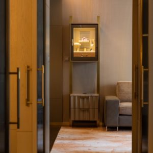
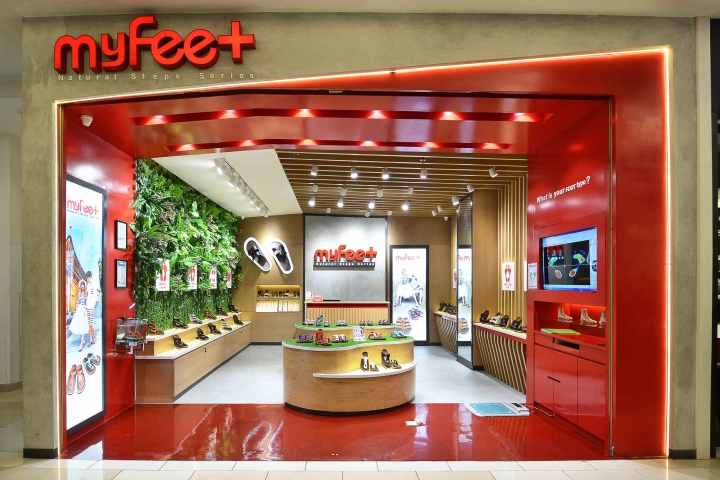

MY FEET comes with the idea to provide recover natural foot and develop their products to fulfill the changing needs of society in terms of foot care. This store starts in Hong Kong but now comes world wide by having store in many countries in Asia. Based on the vision, we made the store design environment more like natural and comfortable to reflect My Feet itself.
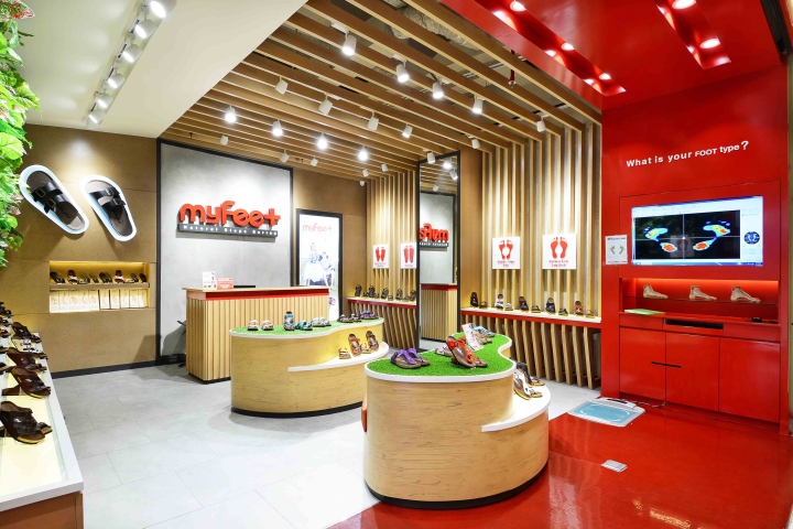
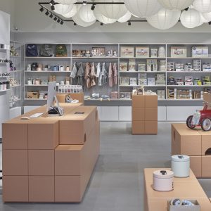
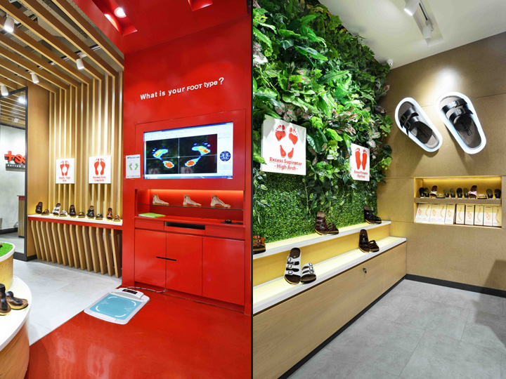
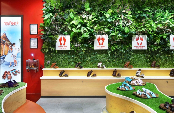
We aimed to emphasize its existence by sandwiching the space between the ceiling and the floor with woods and some space with artificial plant, because it was surrounded in passages and there were few wall rack to put the products display. Red colour in the design concept was chosen to represent more about the company.
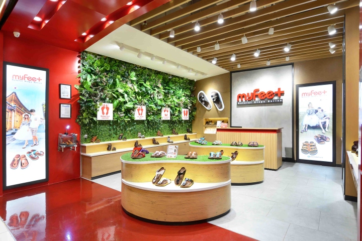
In addition, we aimed to emphasize a wood ornament as the icon of this store by giving an indirect lighting and red colour in the design concept to the pillar as comparison with the textures of woods. On the other hand the red colour was chosen to represent more about the company and put more lighting to make the store more interactive.
Designed by Metaphor Interior
Photography by Adeline Krisanti


Add to collection
