![](https://retaildesignblog.net/wp-content/uploads/2012/12/Spazio-La-Stampa-exhibition-MARKTHING-Turin-300x300.jpg)
![](https://retaildesignblog.net/wp-content/uploads/2017/03/Cafe-Penny-Lane-branding-by-YNL-Design.jpg)
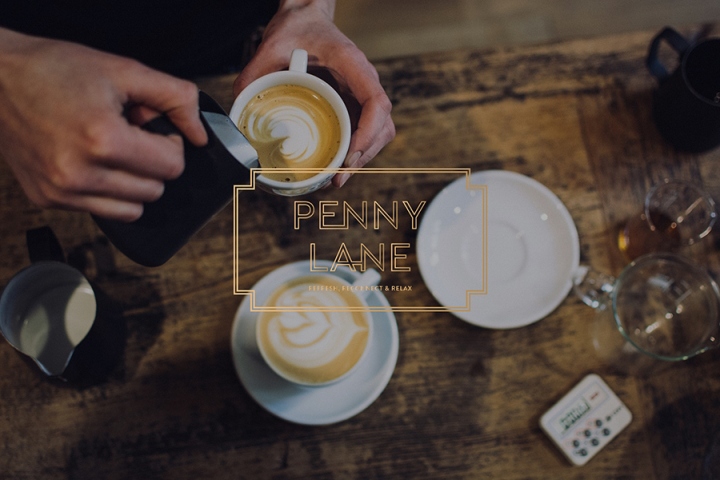
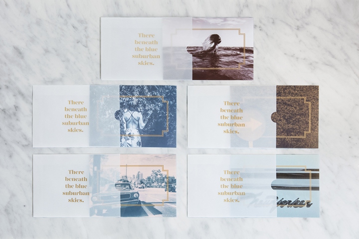
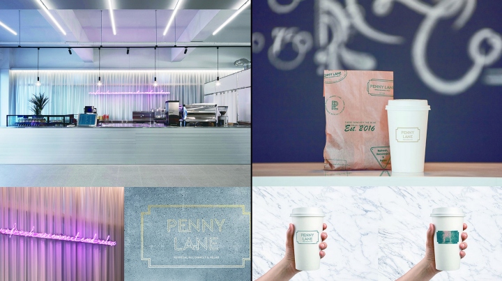
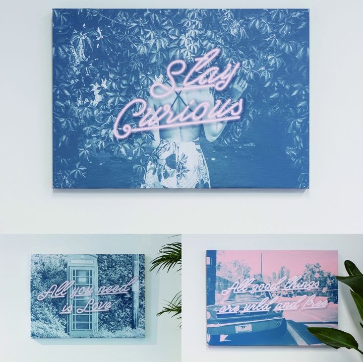
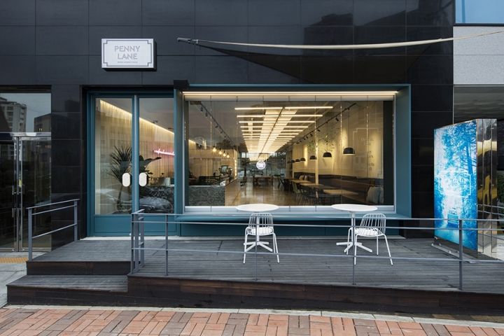
Branding & graphic design studio YNL DESIGN worked with cafe Penny Lane to develop a new brand identity for its cafe chain – which included logo, print, packaging, signage, post cards, signboards, stamp design, leaflet, and artworks. Located in Gwanggyo, Korea, Penny Lane is a cafe where brunch and roasted coffee can be enjoyed together.
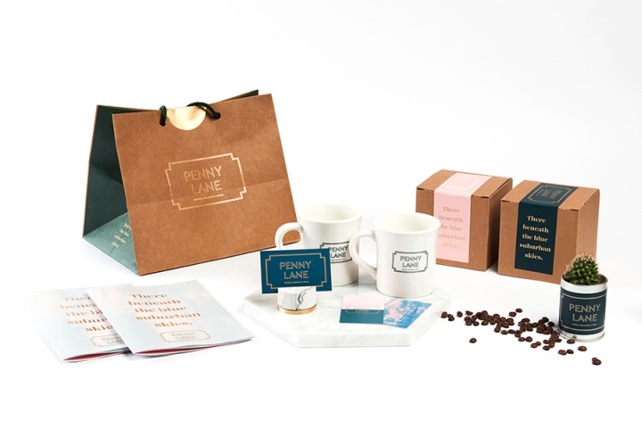
The main color is natural deep green and pale pink color and has created a subtle depth and sophisticated atmosphere. The slogan “Refresh, Reconnect & Relax” captures the branding direction of comfort, freshness that Penny Lane pursues.
Design: YNL Design
![](https://retaildesignblog.net/wp-content/uploads/2017/03/Cafe-Penny-Lane-branding-by-YNL-Design01.jpg)
![](https://retaildesignblog.net/wp-content/uploads/2017/03/Cafe-Penny-Lane-branding-by-YNL-Design02.jpg)
![](https://retaildesignblog.net/wp-content/uploads/2017/03/Cafe-Penny-Lane-branding-by-YNL-Design04.jpg)
![](https://retaildesignblog.net/wp-content/uploads/2017/03/Cafe-Penny-Lane-branding-by-YNL-Design05.jpg)
![](https://retaildesignblog.net/wp-content/uploads/2017/03/Cafe-Penny-Lane-branding-by-YNL-Design06.jpg)
![](https://retaildesignblog.net/wp-content/uploads/2017/03/Cafe-Penny-Lane-branding-by-YNL-Design07.jpg)
![](https://retaildesignblog.net/wp-content/uploads/2017/03/Cafe-Penny-Lane-branding-by-YNL-Design08.jpg)
![](https://retaildesignblog.net/wp-content/uploads/2017/03/Cafe-Penny-Lane-branding-by-YNL-Design09.jpg)
Add to collection