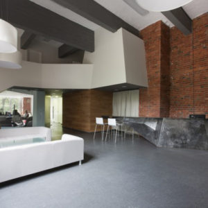

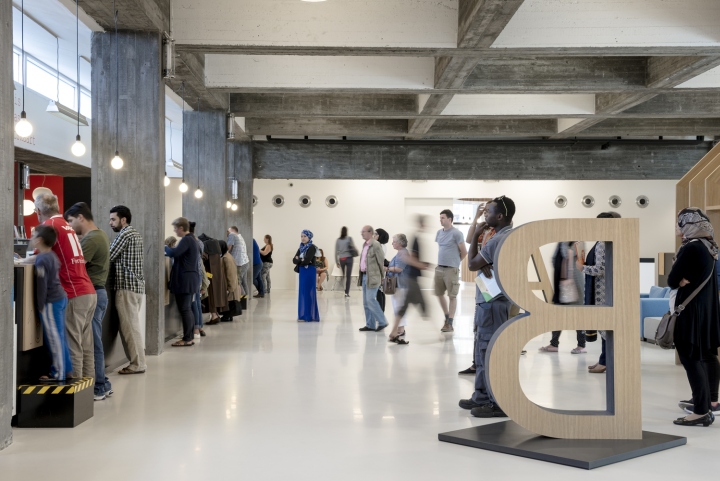
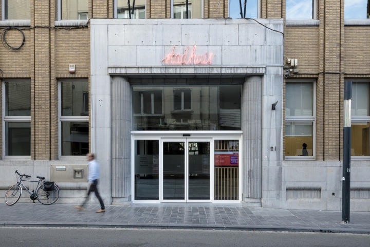
For the extension of the historic town hall, the neighbouring bank building was bought and renovated. The town hall fulfils an important urban function as it demonstrates its public character with its large open hall and central location within the city centre. Accessible from three sides, the town hall with its central public square acts as a passage within the urban life of Kortrijk.
Throughout the years the many requirements of the city services have changed. At the request of the municipality the current division and use of space will be adapted into a more efficient way of working. As architects our task was to create a “front desk” at the entrance of the Leiestraat with some minor adjustments in the public square.
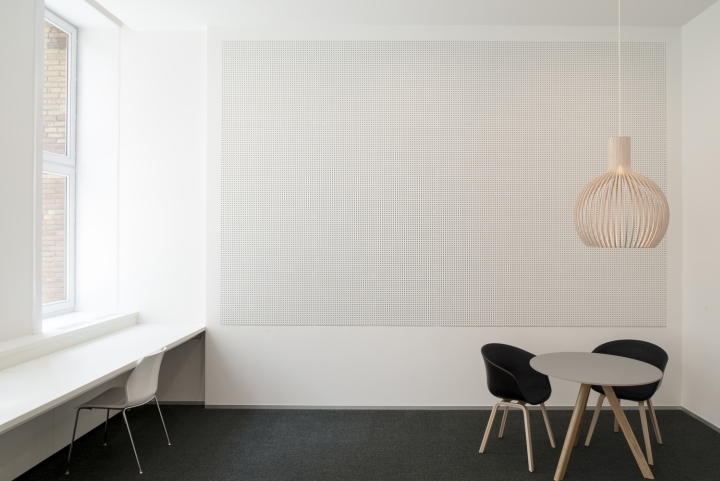
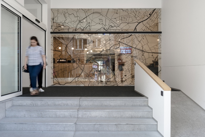
This includes removing the fast service desk, improving accessibility, introducing child-friendly waiting areas and optimizing counters. We tackled a variety of rooms with a limited budget. The entrance to the Leiestraat is expanded and the height difference is bridged by providing a ramp and an integrated wheelchair lift. Now the town hall is truly accessible to everyone.
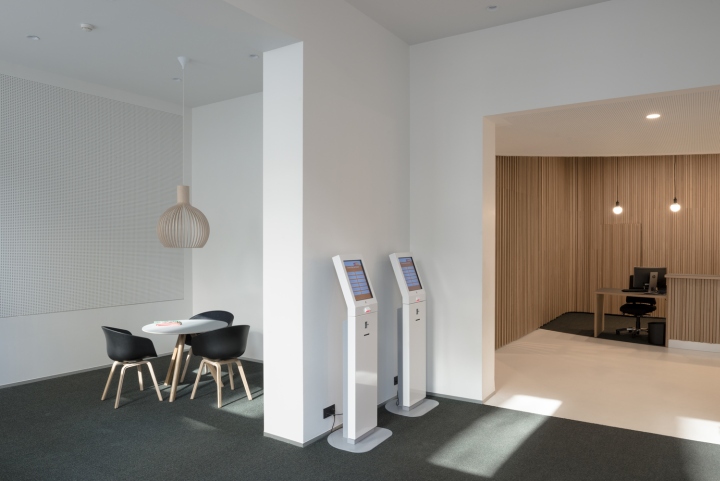
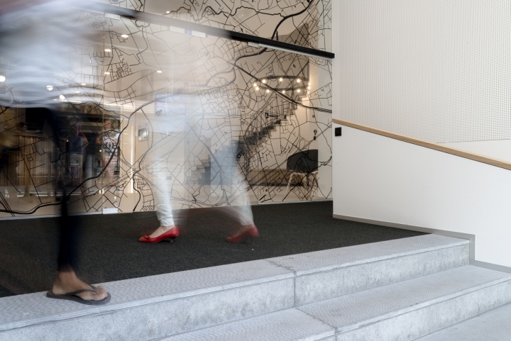
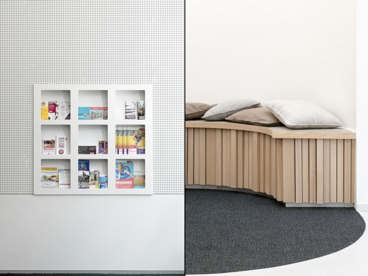
From the public road, access is clearly indicated thanks to the fresh new look of the on-glass printed citymap of Kortrijk. Intuitively, people are led to the left where the information point is located. Space is provided for a brochure holder and a ticket distributor as digital services. One can make a reservation on the spot or make a withdrawal and so forth.
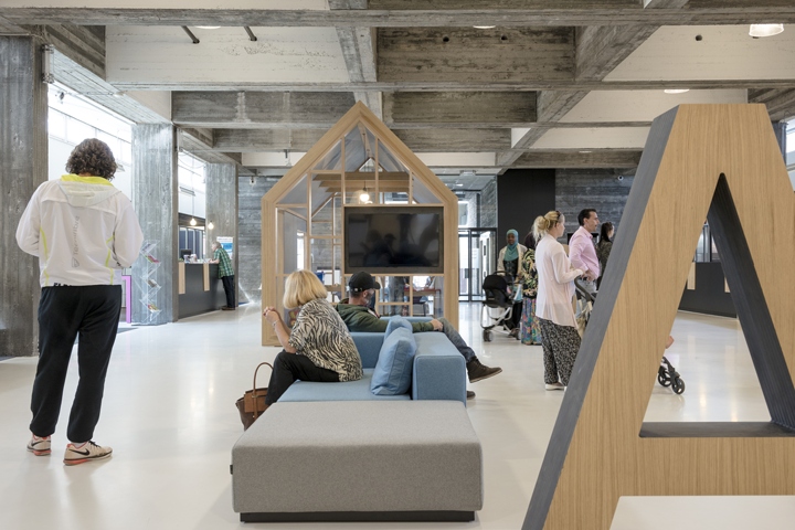
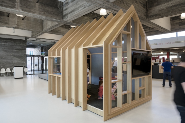
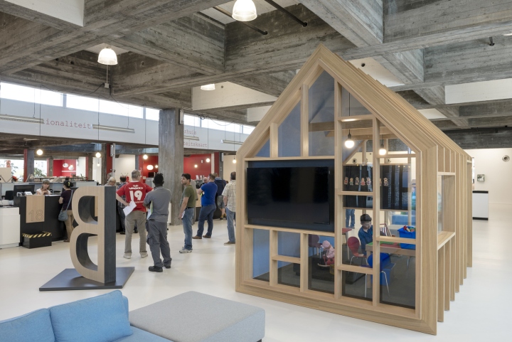
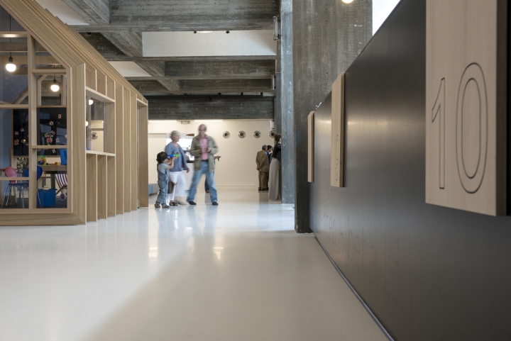
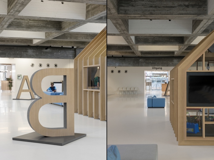
In the centre of the public square a wooden playhouse was created as waiting area for toddlers. The house is designed in a way the interaction between the parents at the counter and the children playing is ensured. All spatial interventions are accomplished according to a same design logic, retaining the original qualities of the existing spaces.
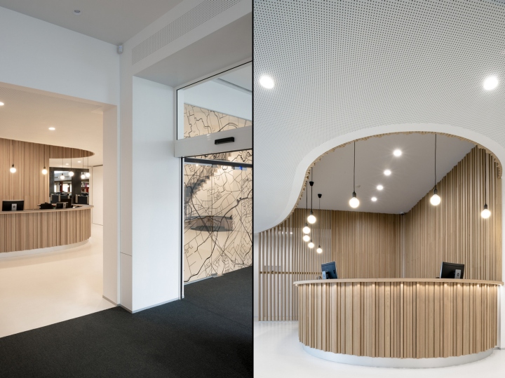
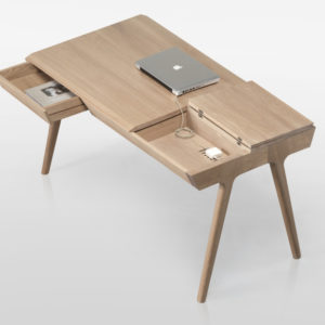
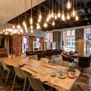
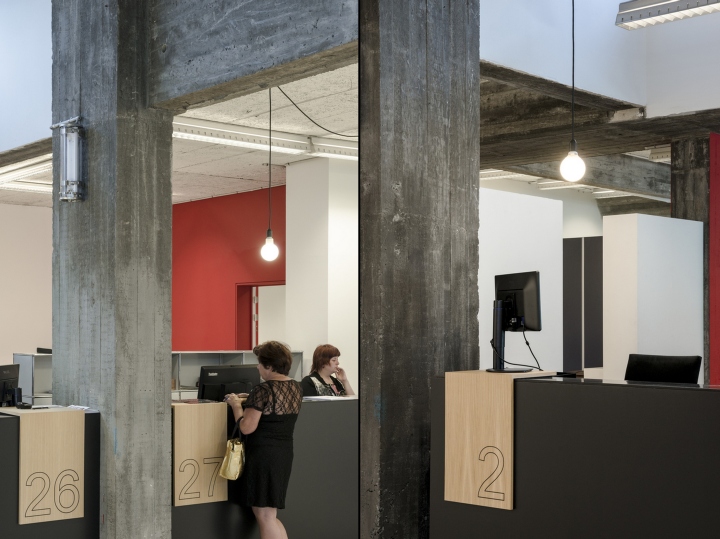
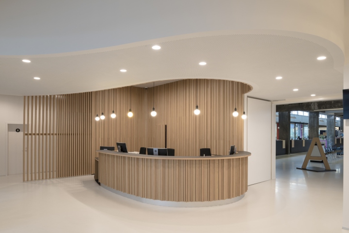
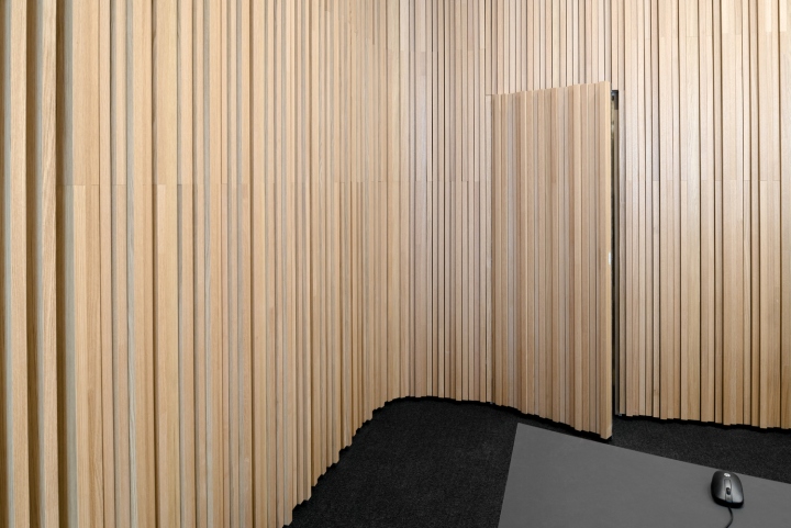
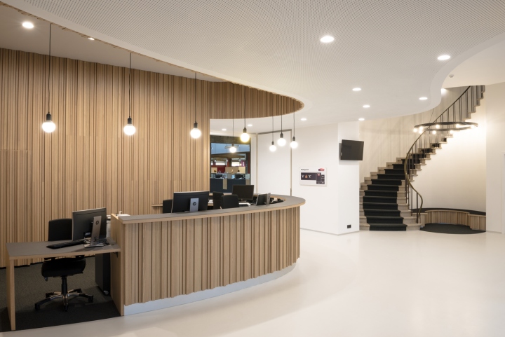
The new design is highlighted in the use of materials. Materialization in wood, solid gray carpet and perforated plasterboard panels guarantee a warm effect and acoustic comfort of the different spaces. The expressive wooden desk takes care of the dynamic circulation in the room and contributes to an intimate working environment.
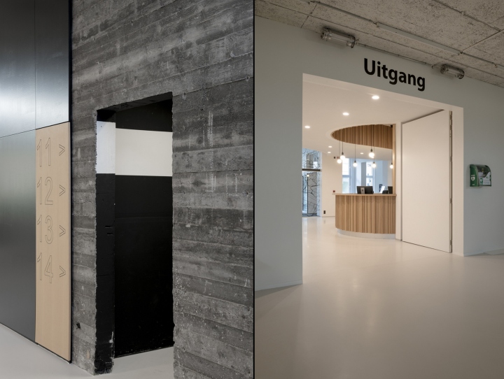
Thanks to a clear spatial articulation, reflected to the ceiling, a fluent passage is assured from the information point to the counter to the public square. The customer services feel warm and welcome thanks to the quality appearance of the wood, which is also reflected in a pleasant working environment.
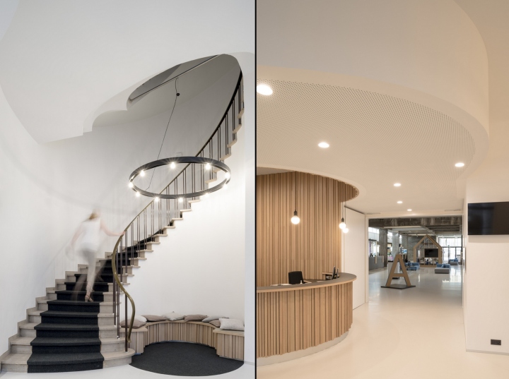
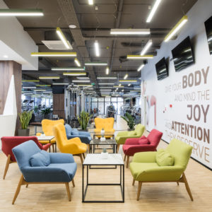
The transition from the “front desk” to the public square is softened by a continuation of the used materials. Also the numbers of the counters and the playhouse is fabricated in wood. A distinctive choice of furniture contributes to a homely atmosphere and perfectly absorbs the noisy peak moments.
Design: Cnockaert Architecture
Photography: Dieter Van Caneghem

http://www.archdaily.com/796547/new-city-hall-cnockaert-architecture


Add to collection
