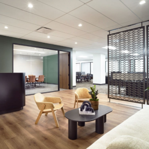
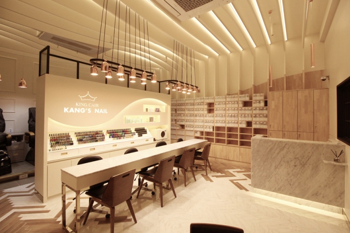

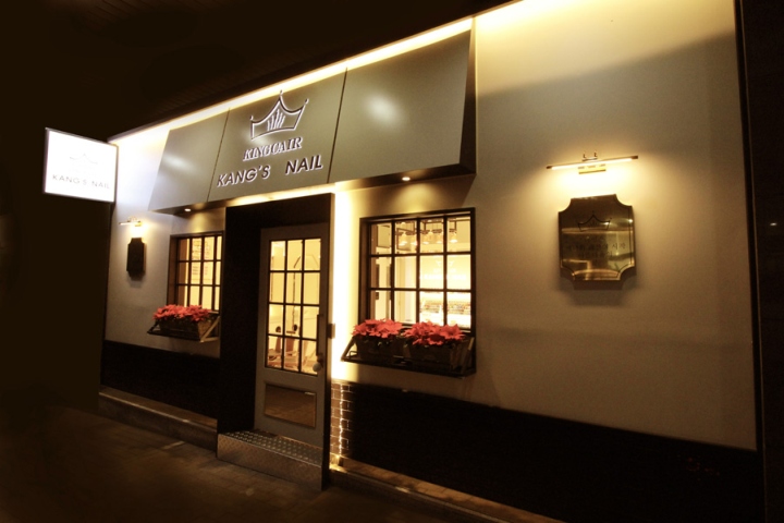
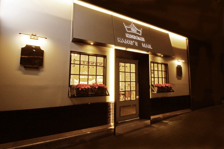
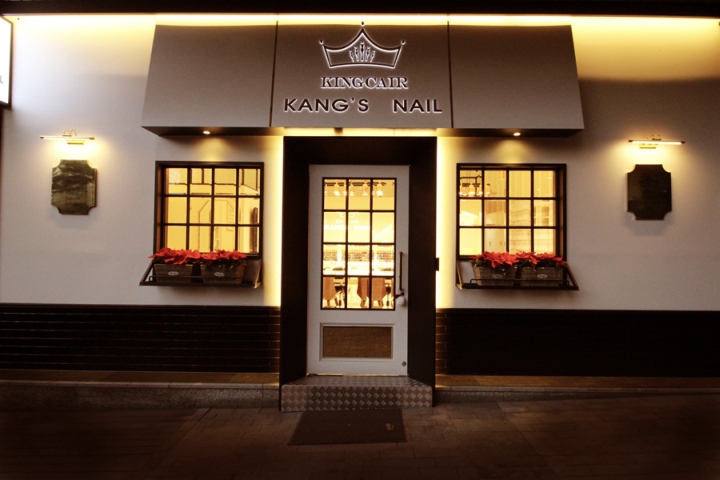
The key point of the design of KING CAIR shop was started with overturning the concept of existing nail road shops. As compared to most road shops installing full glass on their exterior wall in order to show inside of shops, KING CAIR chose to be “hidden”. Such “hiding” was the designer’s trick to reveal the interior with glamorous and high-rise ceiling to customers. European house porch was the motif for the front door so that customers can feel comfortable as if they walk into their neighbor and enjoy exotic mood at the same time.
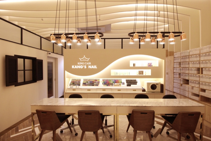
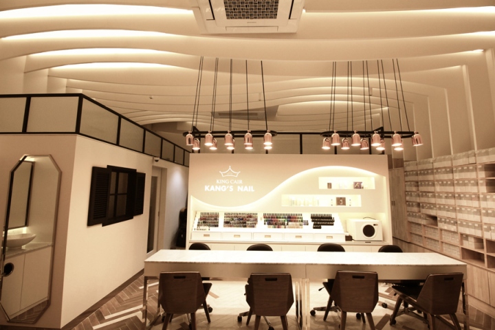
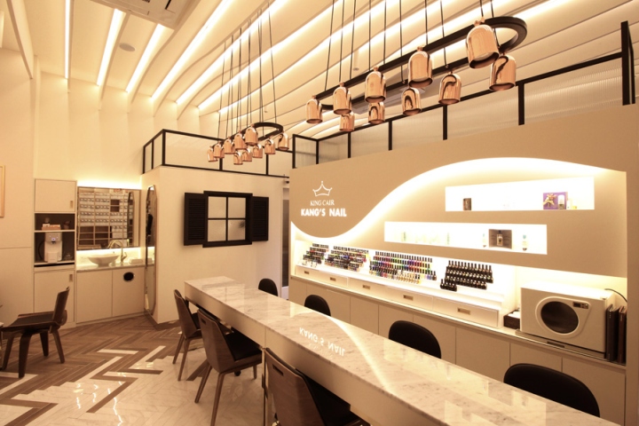
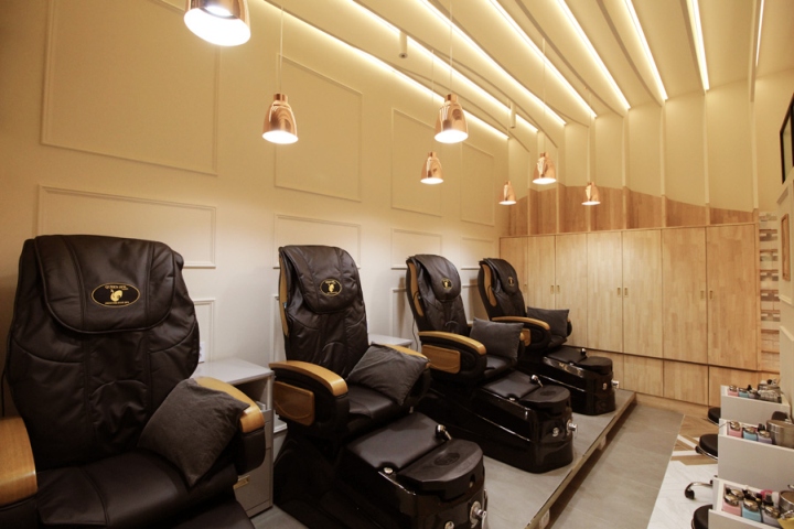
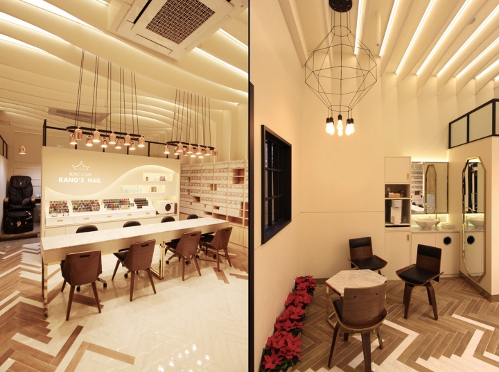
Wave patterns flow with vitality on the simple and boring ceiling. The wave patterns run all the way down to personal lockers on the side wall which represent cleanliness and sanitation of the shop and concern for customers. The walls are designed by using some sort of partitions and don’t reach the ceiling to emphasize the high ceiling and to complement the small area. The floor, walls and ceiling all together seek for an organic unity and also a diversity not to look fixed or monotonous.
Design: Ssomoo Design
Photography: Dongjun Goo / Ssomoo Design


Add to collection
