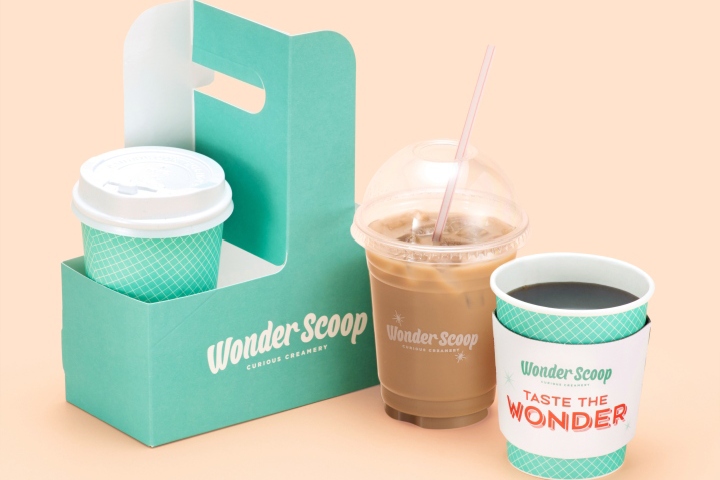

Wonder Scoop is a new ice cream brand launched in collaboration between Shinsegae Food and the Brand Strategy Team of Emart. In line with the brand name “Wonder Scoop” and its slogan “Taste the Wonder” which evoke curiosity, the brand introduces unique flavors never before tasted with designs that enhance the surprise and excitement of exploring these new savory flavors.
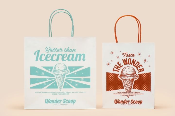
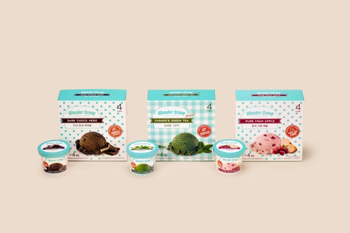
Inspired by American ice cream parlors of the 1960s, the design focuses on recreating retro vintage aesthetics to arouse nostalgic emotions of excitement, desire, and yearning for ice cream from our childhood. The logo is skillfully crafted in retro script and paired with other typographic designs such as checkered and dotted patterns to enhance the old-fashioned appearance.
The use of complementary color palette of mint and orange creates youthful enthusiasm and vibrant energy, while the contrast allows the eye to navigate freely around the composition. The colors are also expressive of the sweet taste of ice cream.
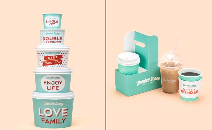
Ice cream cups are overlaid with witty phrases such as “single yet,” “double happiness”, and “diet tomorrow” to distinguish portions and stimulate humor, while shopping bags resemble lightly distressed vintage posters. All elements merged create a strong identity for Wonder Scoop, one that is nostalgic in a delightful vibe.
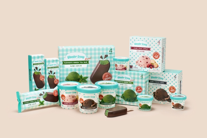
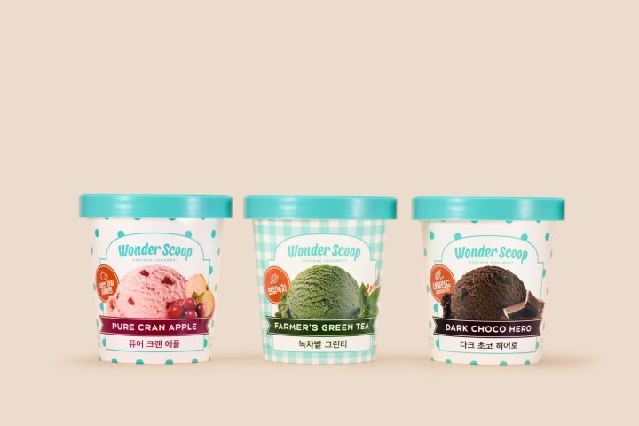
Packaging design for consumer-packaged goods continue the use of mint and orange and maintain the retro-theme through checkered and dotted patterns. As for packaged cups, an image of freshly scooped ice cream with raw ingredients enhance each flavor look both luscious and mouthwatering. The savory sweetness of ice cream and the crackling crispiness of the chocolate-cover are translated on the packaging of the ice cream bars.
Design: Emart
Photography: Jung Hoon Han


Add to collection


