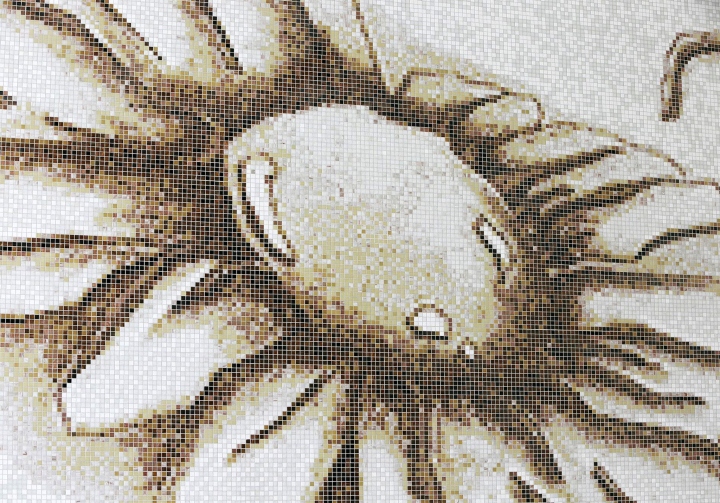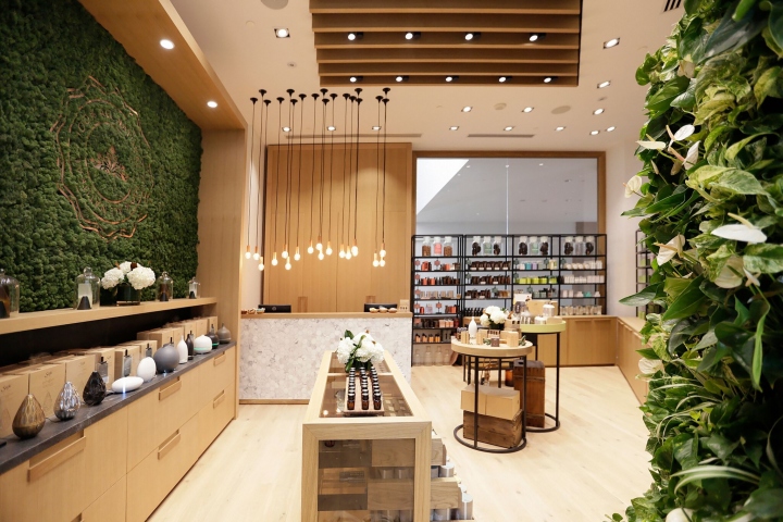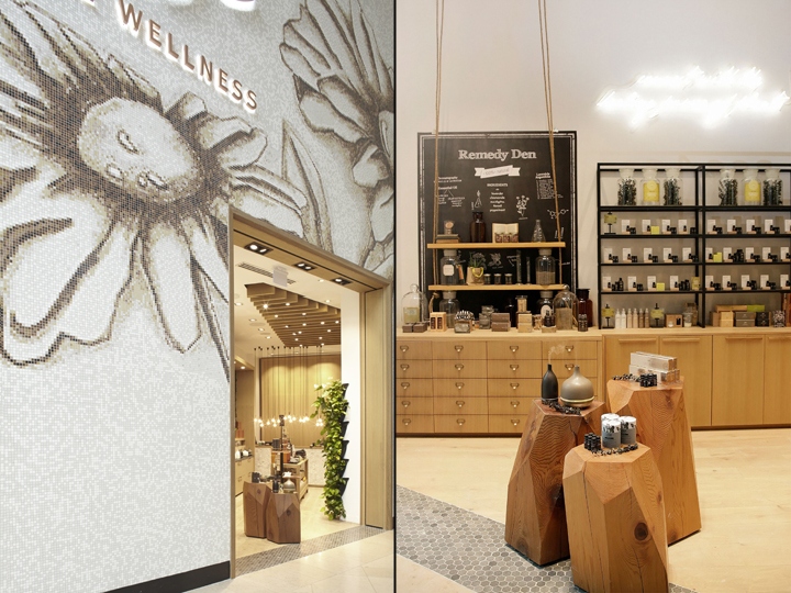


The Sherway Gardens retail store is 618 square feet and triangular shape. It holds a line of 100% natural aromatherapy body and bath products. The idea was to create a store that was captivating, comfortable, and impactful. With a small footprint and a large storefront, the transition from exterior to interior was inevitably dramatic and each stage of the customer experience was important. A custom Bisazza glass mosaic was commissioned to clad the over 30 foot high storefront.

Lavender and chamomile used in the aromatherapy products were the inspiration for the imagery hand drawn by the designers. As part of the experience, the botanicals can be seen from a far distance away and as customers walk closer the image begins to blur and becomes an unexpected pixelated graphic of coloured glass tile. The sepia tone colour palette of the mosaic compliments the oak millwork, bronze glass, and copper highlights within the interior.

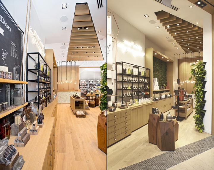
A living plant wall at the entry, a signature installation for the client, brings an element of freshness to the shopping experience and reiterates the retailers dedication to the natural world of plants. Vertical wood planks used as a ceiling treatment accentuate the unique shape of the retail space while adding depth to the high ceiling.
Key design features include the neon art installation, positioned to draw the eye in from the oversized botanical toward the entry and is a juxtaposition of modern and old world apothecary.

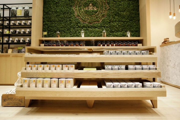
The Little Gem display logs at the storefront entry showcase feature products. These tables are made by a furniture designer in Vancouver who salvages the cedar from the wood chipper and gives this wood a new life. To maximize space a shoppable fixture was designed for the centre of the store which served as the interactive essential oil blend bar while the transparent top and open front draws enable merchandise to be out of the way, yet visible and accessible to customers.

Storage was an asset in the tiny space so tall millwork closets were designed as a backdrop for the marble mosaic cash desk and warm LED copper pendant lights creating a luxurious purchasing experience for the customer. Though the shape and proportions of the space did prove to be a challenge there is not one piece of this pie that was left unconsidered or undesigned leading to a very cohesive and comfortable space.
Design: Jennifer Dunn Design
Photography: Saje Natural Wellness & J.Christopher Lawson Photography Inc
