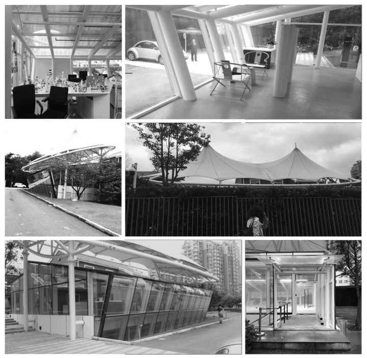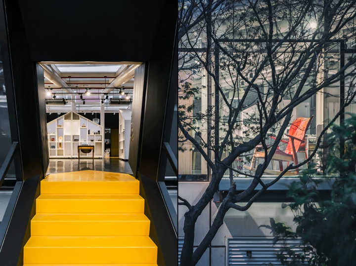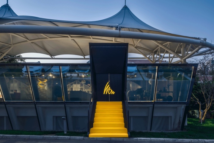

Owner of the famous architectural design company, UDG, invited us to rebuild a gym into a WoW lab. WoW is a household E-commerce brand, and this laboratory is WoW’s offline experience center. Why an architect with hundreds of architect employees wants to find an atypical architect to design his carefully cultivated cross-border brand? According to director Bo, Yu Ting and Wutopia Lab’s pursuit of publicity and life feature is what the lifestyle brand-WoW Lab needs. The gym’s current situation is a glass box. Transparent glass creates an open illusion, but is actually a cell which we want to break. We see WoW Lab as a complex system that grows, it needs to break through its own boundaries.

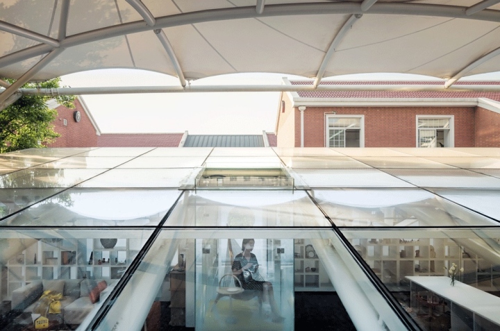
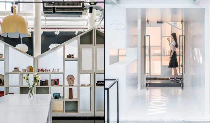
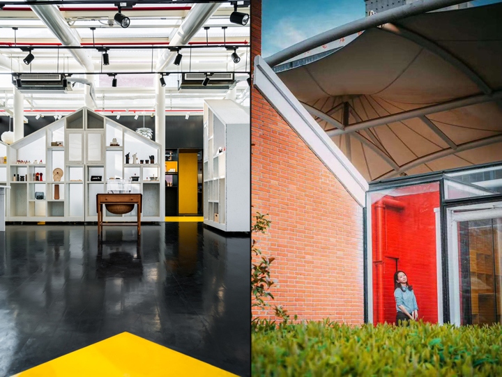
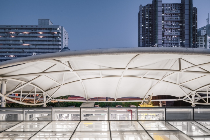
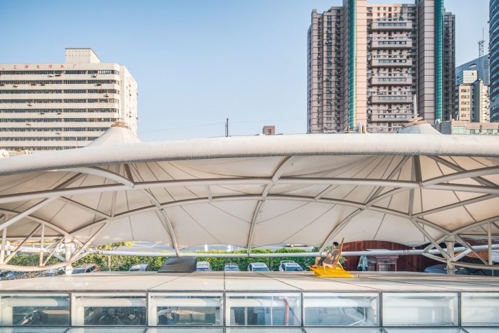
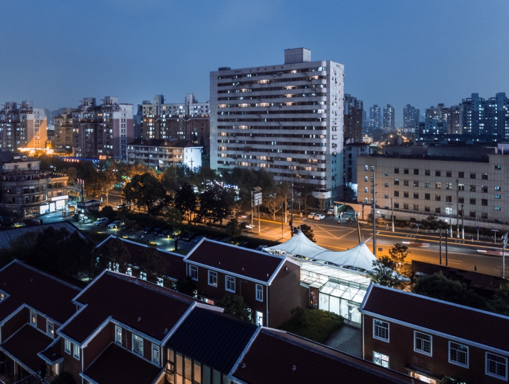
We first set up a distinct entrance on the south side, directly lead the south main road traffic into the laboratory, followed by retaining the north side entrance, once again used fixed furniture to separate the exhibition hall and the office area to keep the aisle in between. On the east side we used a cantilevered transparent glass space to break the building interface to reach the east side woods. Finally, we studied the roof of the building, decided to design a miniature atrium with a lift inside. People could break through the ceiling to occupy the roof and overlook KongJiang road.

According to YU Ting, ‘In my painting study, the Chinese Yuan Dynasty landscape ink and German expressionist emotional color is two important models. During the long-term modernist architecture education, I slowly isolated colors outside the architectural design. Starting with the Instant Red, I re-tried to use highly saturated colors onto buildings, thus brought the expression of German expressionism back into my heart. In Ergeng Headquarter in SH, I tried to paint all sides of the building into black, embellishing with a blue of high saturation to let the building has a temperance sexy.

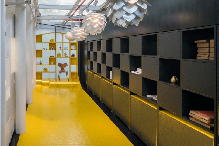
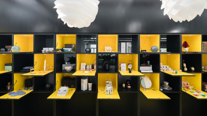
So in the following One person’s Gallery and the Underground Forest in Onepark Gubei, I used black in a large scale. White can reflect all the bad things and create a kind of purity, black, on the other hand is to absorb all the bad things and create a temptation, this is fascinating. WoW Lab LOGO’s base color is black and bright yellow, so I used these two colors to shape the basic background of the interior. In the back of the house there is a redundant small corner, echoing the bright green outside, I decided to use its contrast color red.” WoW Lab’s essence is firstly a furniture exhibition hall, the architect decided to use furniture to create a miniature city.

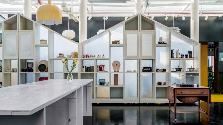
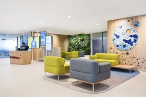
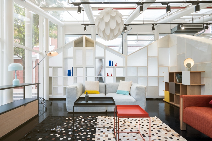
The city should consist squares, commercial streets, terraces, elevators, large steps, street facades, skyline and some edge spaces. The architect tried to experiment some conclusions of the book “A Pattern Language ” with the design and combination of furniture. The architect designed three sets of fixed furniture, the first set is the cabinets which used translucent acrylic backboards to express the street continuous facade and urban skyline. In recent series of works, the architect continued to test translucent on the interface. He noticed that the interface could be closed by luminous beams, or it can be semi-open due to the dissolve of shadow.

This kind of interface possesses multiple meanings. The architect wants the city interface to be so. We designed the acrylic cabinet as a unit with a triangular top. These units can be separated into different areas by needs. As the traditional Chinese screens, this is which furniture redefines spaces. The second set of fixed furniture is partition the of exhibition hall and office area. When the furniture’s leafs and concealed cabinets are closed, it is a common wall closet used as partition. When the concealed cabinets and the leafs are open, this is a display area. The third set and the first and second sets of furniture defined the so-called terminal of the commercial street, it is not only a display but also a seat and a facade.

But that is still not enough. Bo Xi put a prototyped chair which Alva Alto gave the carpenter on top of the transparent glass house. The chair – which was brushed into red by the carpenter’s own idea – redefined the glass house into a space for people to daze and think next to the outdoor branches. So that this space can be separated from the main space and exist independently. A chair and a coffee table are placed on the lift, thus the traffic space can be defined as a movable rest space. When the platform slowly gets out of the roof, glass ceilings reflect the person’s own body as the lake surface, this is a moment of absence.

I think, if this could be just one person’s afternoon tea, then how lonely it is. UDV LianChuang Shanghai Design Valley is converted from the former new Fengcheng Hotel. And its location Fengcheng new village was a famous workers new village which derived from Shanghai municipal government’s “twenty thousand” plan to solve the problem of workers ‘s dwelling problems after liberation. In the past 20 years, Fengcheng new village does not seem to catch up with the pace of Shanghai. Streets in Yangpu distinct are mostly named after the Northeast cities. And the result of Yangpu seems to become the northeast of Shanghai – which had a very brilliant history but lags behind nowadays.

Commercial centers and high-rise residential buildings can not cover the decline of Yangpu, but act as a blindfold to conceal the glory of Yangpu’s worthy preservation industrial context. WoW Lab’s city meaning is that design, as an industrial weapon, can borrow architectural and spatial transformation to redefine the workers’ new village and the industrial heritage. The lonely afternoon tea is not the so-called romanticism, but a possibility of acupuncture, to create a proud hope in places which people are accustomed to.
Design: Wutopia Lab
Photography: CreatAR Images & Momo Chen


http://www.archdaily.com/870967/wow-lab-wutopia-lab?ad_medium=widget&ad_name=navigation-prev
