Add to collection
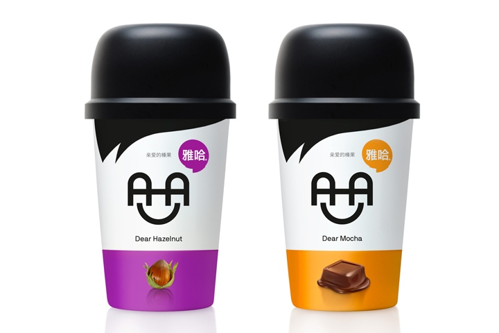

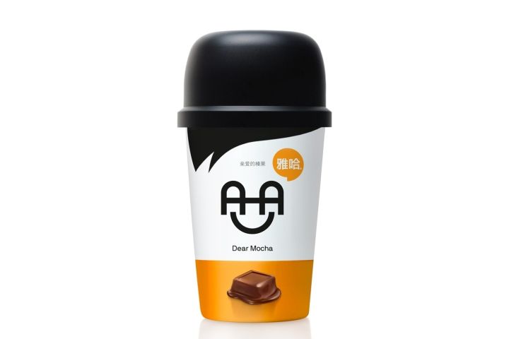
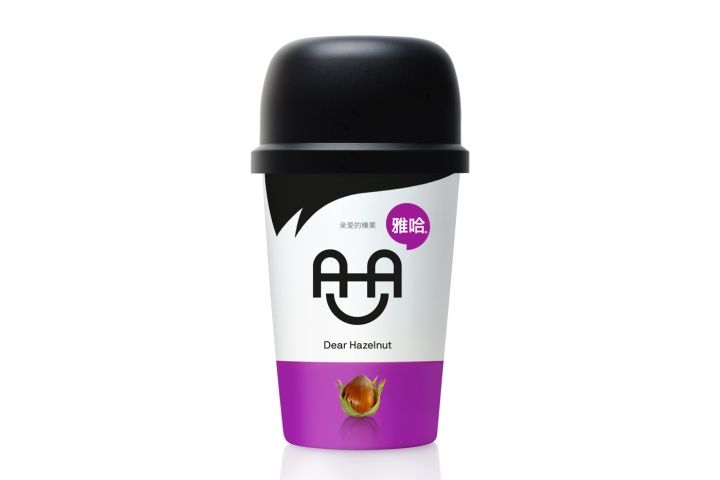
The briefing: “We need a logo and packaging for our cold coffee drink” The target consumer: Consumers of working routines and busy schedules The design: The chinese name of the product translates phonetically as ‘AHA’. We decided to turn this fact into an aesthetic argument and used it to create a logo with anthropomorphic references.

The specific coffee containers are defined by the use of this logo and, in the case where mousegraphics also designed a cup-like container, the logo became a decisive structural element. In this way the product logo animates the packaging with a friendly, memorable face.
Design: mousegraphics
http://www.packagingoftheworld.com/2017/05/aha-dear-series.html


Add to collection