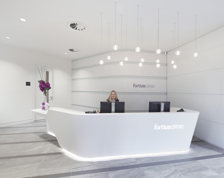
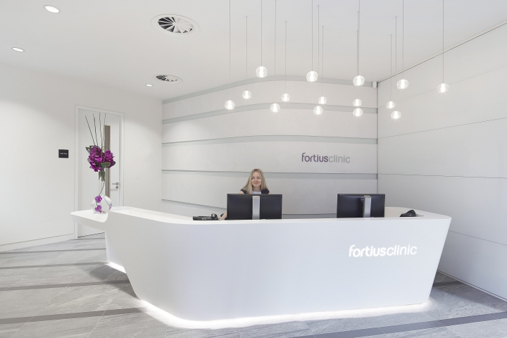

Fortius Clinic is a leading worldwide orthopaedic and sports injury clinic. The new 12,000 sq ft state-of-the-art consultation and diagnostics clinic is located in the heart of the City. The lighting team from Hoare Lea worked closely with tp bennett to design a light, spacious environment that would create an impression of solidity and wellness for patients and visitors.

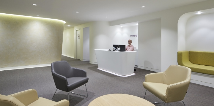
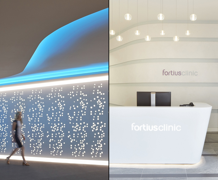
With the clinic located on the lower-ground floor, the design seeks to use the minimal daylight available, with bright open spaces, ambient lighting, reflective surfaces and clean lines. Patients enter through a prominent entrance and attractive period façade. Within the main reception, decorative pendants and concealed lighting details to the desk create a welcoming environment, while a cove detail at high level draws people downstairs to the lower-ground floor space.

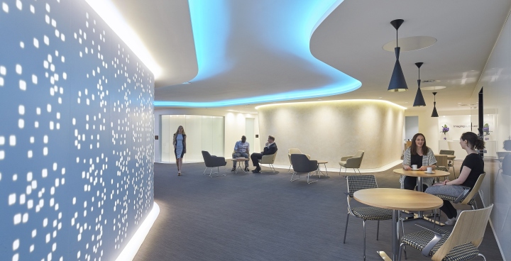
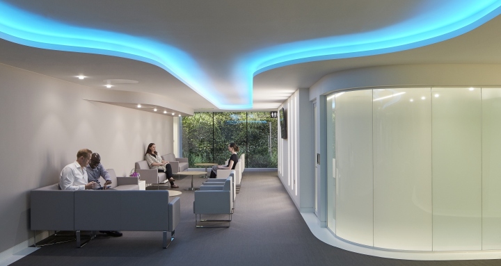
Generous circulation and waiting areas are in the centre of the accommodation on the lower-ground floor, with a central pod adding geometry and helping to orientate the patient. A contemporary feel helps to create a relaxing experience and spaces are curved and organic, thereby eliminating the constricted feelings associated with narrow corridors. The lighting follows the curved lines and is integrated into walls and ceilings. LED units are incorporated within a large ceiling coffer detail which flows throughout, lifting and unifying the space. Colour is also used within the coffer, adding interest and preventing the areas from becoming overly clinical.

To convey a sense of light was a key challenge and the lack of daylight has been met with the creation of a bright environment, in which vertical illuminance ensures the space feels inviting. This has been achieved in a number of ways to provide visual interest. For example, LED units, mounted behind perforated panelling, create a striking, 8m long, feature wall; lines of light and cove details provide further vertical lighting elements, adding depth; and pendant lights over tables enhance the relationship between the lighting and interiors pallet.

Consulting, treatment, imaging and procedure rooms are located around the perimeter to optimise the use of space and simplify patient flows. Here recessed lines of light and downlights provide good levels of clean, functional lighting, creating a calm environment. ‘The majority of the Clinic sits at lower-ground floor level, with very limited daylight – the lighting design therefore had to work extra hard to enhance the space. It was essential that the lighting captured the ‘moody’ ambience we wanted to create and provide a welcome relaxing retreat from the noisy and hard urban environment above.

‘The lighting effect is stylish and reassuring, and the resulting space has a sense of gravitas and efficiency. The lighting to the green wall adds depth and interest, whilst the feature light wall by Isomi is quirky and dramatic. Patients feel at ease and confident in their surroundings, as the subtle hospitality feel within the circulation and waiting areas contrasts effectively with the bright clinical spaces.’
Interior Design: tp bennett
Lighting Design: Hoare Lea Lighting
Feature Wall: Isomi
Photography: Hufton + Crow
