
To Camoe Ice-Cream packaging by DN Group Digital Production
posted by retail design blog on 2017-07-20
Add to collection


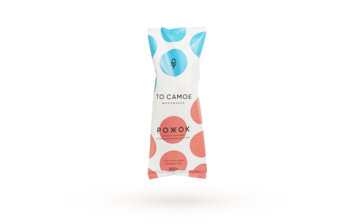
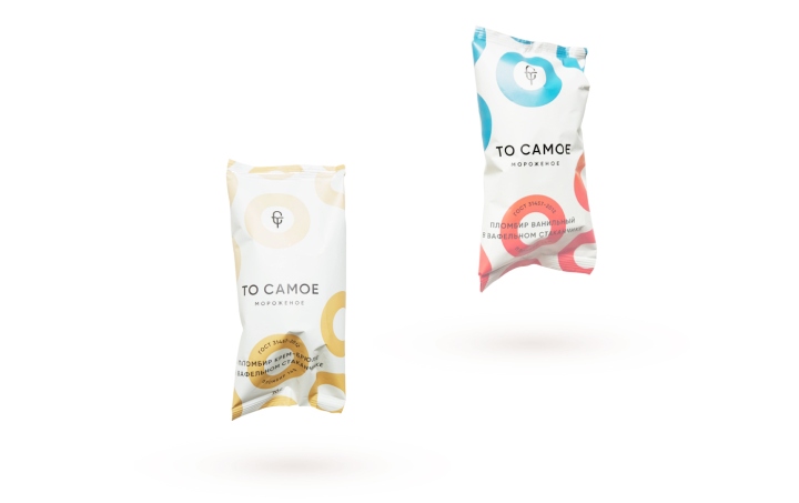
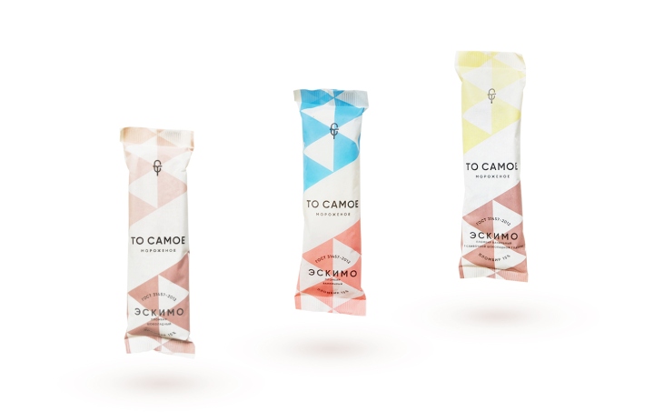
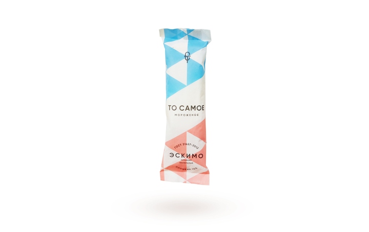
The packaging design has continuity with the style of Soviet advertising posters and classic patterns of the past. Why exactly Soviet classics? Because we wanted to emphasize the naturalness of the product, this ice cream – it’s a classic 15% cream made by Russian state quality standard from natural milk, the same as was thirty years ago.

As soon as we created the design-concept for packaging, we moved on to developing the logotype and made it in a minimalist style using a strict grotesque font.
Design: DN Group Digital Production


http://www.packagingoftheworld.com/2017/07/to-samoe-ice-cream.html


Add to collection