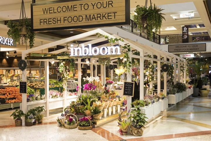

Surrounded by Coles, grocery shops and fresh food suppliers, this kiosk was not only developed to act as a flower shop but also an entry point to this busy shopping centre’s fresh food market area. This area is mostly family orientated and with a high activity, we want to draw attention when people pass by from the crowd. The open layout design also creates an intensive connection between the florist and the neighbouring shops.

The brief from the shopping centre and the client was to create a unique looking shop to add a dynamic element to this existing busy atmosphere. Dominated at the entrance of the fresh food market, the kiosk should play a role to define the market and the rest of the retail zone in the shopping centre with the display of passion for the flowers. There is also a void above which had to be taken into consideration when the onlookers are looking down from the level above.

Most of the kiosk design in the shopping centre always has a flat look due to the height restriction. With the consideration of leading people from the different shopping zones, the design team was trying to introduce a more 3D architectural image to consolidate its position for drawing attention from the busy environment. To link the products with this idea, a Flower Pavilion became the concept to this space.

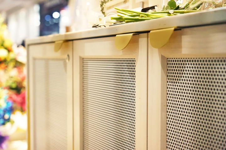
The rows of timber frames are the base of the structure which form a unique pavilion looking design but with a minimum vision blocking from the overall environment. With the integrated white mesh baskets, the structure works both aesthetically and functionally. With materials used like the brass, painted solid timber and concrete tiles, the kiosk displays a contrasting look of luxury and humbleness.
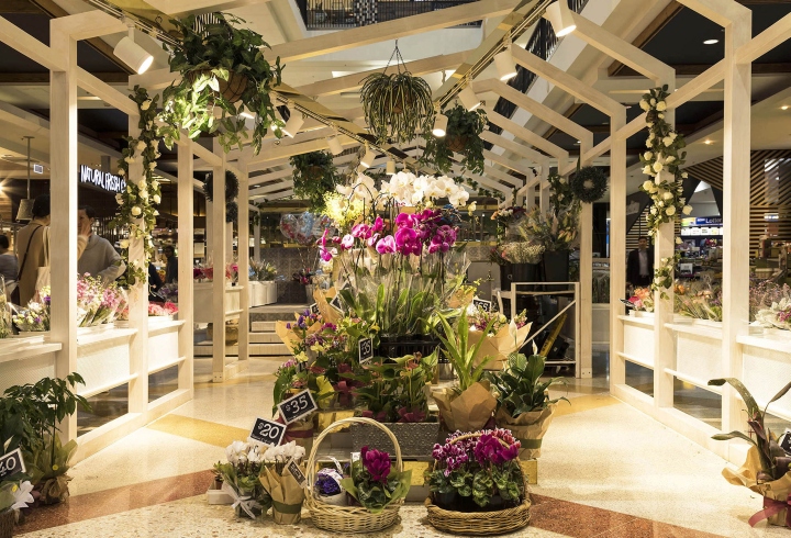
The simple colour scheme also make the flowers themselves be the hero of shop. The brass tracks suspended from the frame act as a feature with the lighting which illuminates the space in a smart way. It also breaks up the look of the symmetrical timber frames and forms a contrast of materials and pattern, especially when you are looking down from the void above.
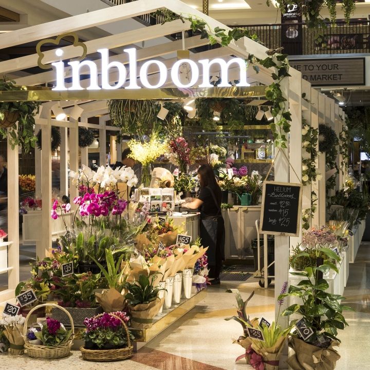
The major design challenge is the height limitation of the kiosk design, which is required by the shopping centre for preventing vision block. The design team has created a unique frame language to balance the look of the shop and the height restriction to reach an acceptance to lessor. Also, for a normal kiosk design, it relies on the mall lighting for illumination which could be quite flat and insufficient for an open display environment.

The combination of the frame and the lighting track provides quite a good solution for this. Local materials such as natural timber, brass, patterned concrete tiles and energy saving LED lights were used throughout the space. Most of the materials are recyclable and biodegradable which makes this kiosk very environmentally friendly.
Design: Span Design
Photography: Andrew Worssam


Add to collection
