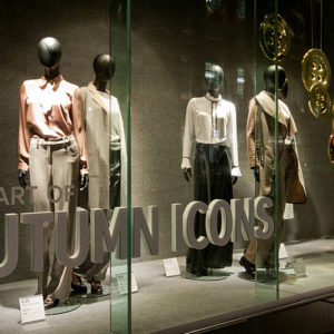

With 2 existing shops in Melbourne and Sydney, Zenith is the exclusive Australian home of the finest collections from the world. Span Design was engaged to create a new shopping environment and branding image due to the expansion of the business range. Situated in the heart of Sydney CBD, this new fashion boutique is to target the young people who have a strong fashion sense and passion for trendy international brands. The customer brief was to create a new shopping atmosphere to integrate different brands and styles of fashion collections with a vibe to suite the urban locality where the shop is situated in.

With the existing 30 square metres, we were required to design a space to accommodate products of more than 15 brands with all sorts of clothing and accessories including bags, shoes and hats. The design needs to represent Zenith as a combination of fashion and modern luxury pieces with the most sought-after looks of the season but still being easy and amiable for young generations to approach. When we were approaching the concept, the first word that popped up into our thoughts was “connection”. During the research of the 15+ brands that Zenith sells, we noticed that they all have their own personalities and characteristics.

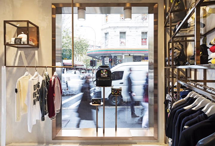
To bring all the elements and styles together, we created a design language based on a cube shape to form the wall display system, counter and floor display unit. The cube unit is not only for linking and integrating the difference within the products under a similar language but also making the shop easier to accommodate products with all kinds of shapes and forms to showcase the carefully curated collections and fashion designer excellence. The walls of the space were treated minimally to work as a backdrop and make the product display stand out more.
The main challenge of this project was to maintain the high volume of products in a small space and still achieve a boutique looking display.

Our solution to this was to use the cube shapes to define and emphasise the boundaries of products to showcase their individuality. This reduces the visual chaos and competition between the products with the overall product presentation flowing into a nice rhythm. The consumer for these brands target mostly the Generation Y and the Millennials. Having to stay in trend and making sure that the materials used, so that it’s not out dated in the future was vital to the design.

Marble and copper are great materials individually, they’re both timeless elements and when combined, it adds luxury whilst maintaining the stylish look that the younger generations will always be drawn to. Long lasting natural materials such as copper tubes and marble floors are used in this shop, which means low maintenance during the daily trading and recycling in the future. Efficient LED lights are used with low energy consumption.
Design: Span Design
Photography: Andrew Worssam


