
If it wasn’t true that real-world shops can fundamentally shape brand perception and establish emotional connections with customers, Apple wouldn’t be building glass boxes all over the world. Yet this fact is too often overlooked in conversation about the challenges faced by bricks-and-mortar retail in the digital age. There’s tension between the imperative to sell a brand’s product and the desire to tell a brand’s story, of course, but if the right balance is achieved, well, that’s the moment a brand can take off. When Endota Spa first engaged Melbourne retail design specialists Studio Ginger, they weren’t thinking about the brand side of that equation so much as the retail side – specifically the in-store sales performance of their range of skincare and cosmetics products.

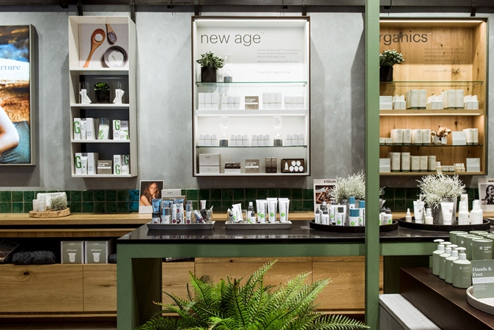
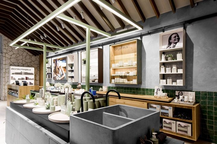
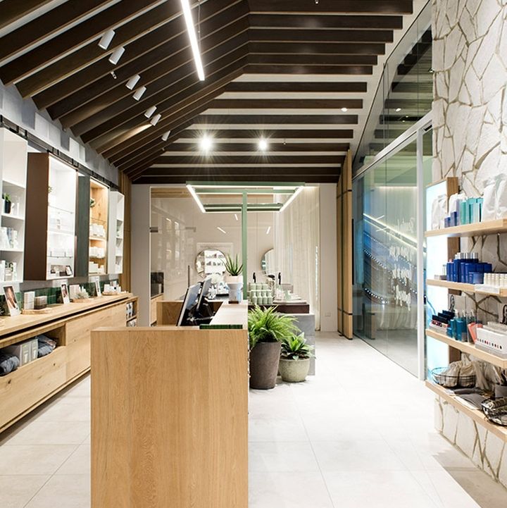
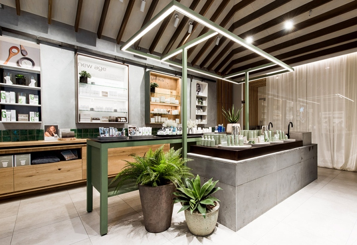
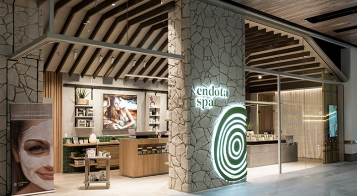
Endota has Australia’s largest network of day spas, but their product offering had been merchandised as a complement to their spa treatments, much like incidental add-ons at a hair salon, rather than being sold in its own right. Studio Ginger’s job was to design a new fit-out that would place product centre stage, attract more foot traffic and increase sales. On a purely retail level, the designers’ response has been transformative. The new stores, five of which have already been rolled out in both strip shop and shopping centre contexts around the country, are designed to draw people in from a distance: apart from a bold entry column, the shop frontage is completely glazed, providing an enticing window to the carefully choreographed retail theatre within; and a faceted ceiling folds down into the rear wall, creating a sense of openness to passers-by.

The most decisive retail move, however, and the one most clearly linked to the original brief, is the relocation of product from walls to floor. Just inside the lease-line, a small display podium provides the first opportunity to browse and explore the product, a tempter to come closer; further in, a dabble bar encourages customers to touch and feel some more. Far from being a service-focused environment that seems open only to spa customers, these new stores feel welcoming and actively encourage casual visitors. Tellingly, in the new stores, the proportion of revenue generated by product sales has grown significantly on the national average.

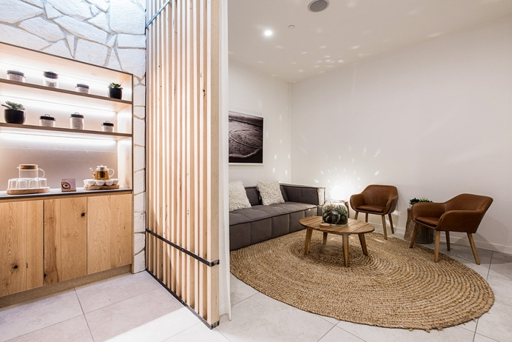
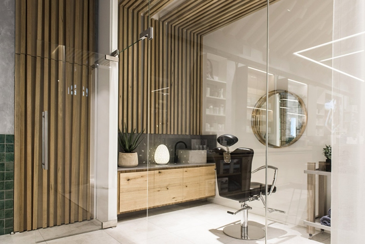
But as Studio Ginger Design Principal Luke Cannon says, “We saw this as an opportunity not only to create a new product-centred retail strategy, but to tap into the brand’s roots on the Mornington Peninsula and bring that emotion to the retail space.” This meant removing the white walls and blonde timbers of the existing stores, which were a clean, modern nod to the clinical aspects of spa treatments but did little to differentiate Endota from their competitors. In their place is a warm, honest materials palette of saw-cut timber, bluestone and a range of finishes in earthy, coastal tones redolent of the brand’s essential bush-meets-ocean identity. Studio Ginger enlisted the help of a food stylist, developing an approach to product display that leverages a selection of their natural ingredients – lemon aspen, lilly pilly and Davidson plum.

And the new fit-out has created a new and more natural experience for spa customers too, of course, no longer transporting them to some imagined Scandinavian therapeutic facility, but to a tangible slice of the Mornington Peninsula. That the new materials are naturally hardwearing and will look great for a very long time comes almost as a bonus, because the impact on customer perception is enormous. By giving physical expression to the essence of the brand, and in time rolling it out across almost 100 individual locations, Endota Spa presents a face to the world that feels truly authentic, and is unique amongst their competitors. Studio Ginger’s new fit-outs achieve a rare balance between retail pragmatism and experiential magic – they work hard for the Endota product range, as was the original brief, but also for the brand.
Design: Studio Ginger
