
The owner of this project is a post 80s from a pharmacy family, as the third generation, he hopes to subvert the traditional image of pharmacy and melt it into the diversified modern environment. Just like MOLECURE is split and reorganized from words “Molecule” and “Cure”, while approaching to the design, we returns to the original purpose of pharmacy- extracting molecule from nature to synthesize healing drugs.
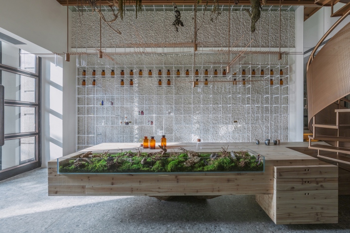
Thus we get the idea of building a space which we named “green in the lab”, combining the seemingly conflicting qualities of “primitive” with “technology”, just like new compounds formed due to molecular bombardment. Ways of molecular aggregation varies from triangular to polygonal, spherical to cones, and the change on its shape due to different ways of aggregation could be amazing. We extracted the two characteristics of molecule – “connectivity” and “aggregation” into our design.
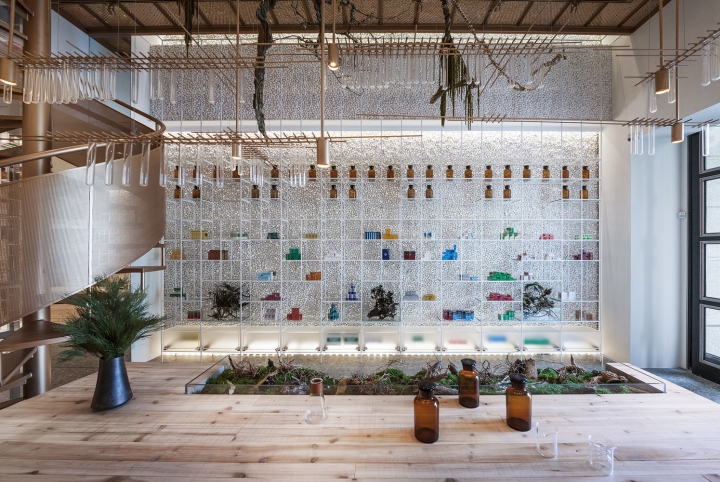
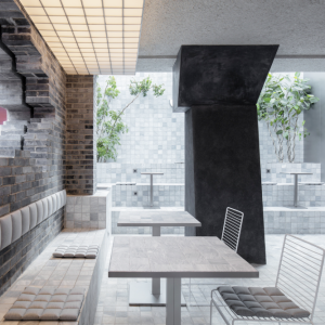
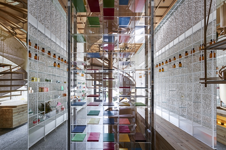
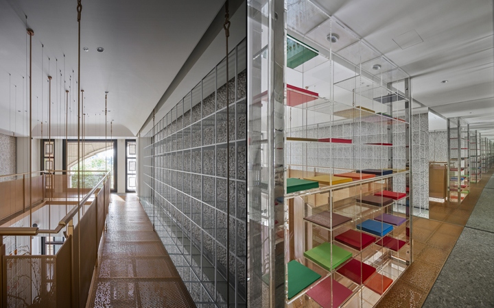
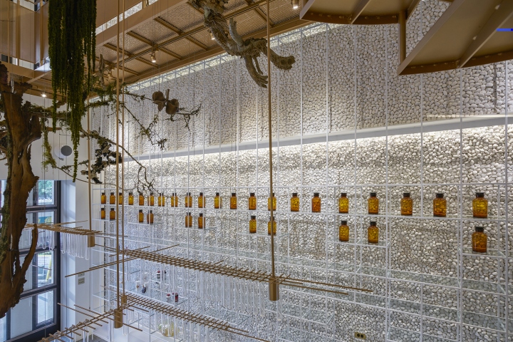
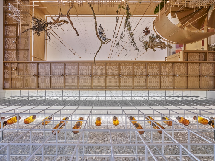
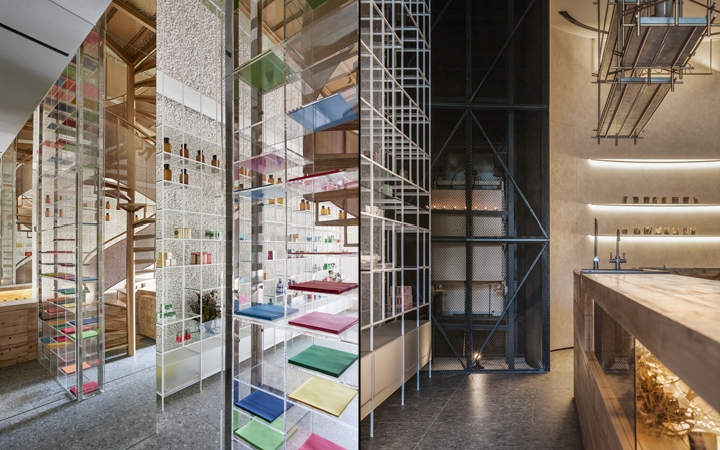
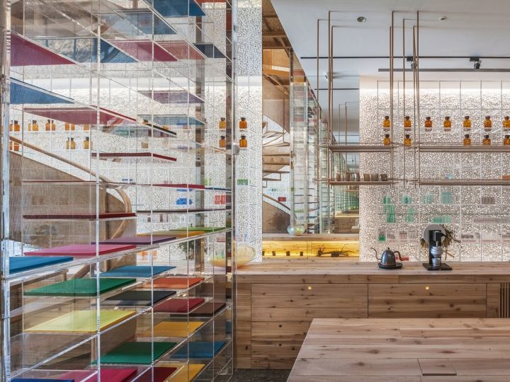
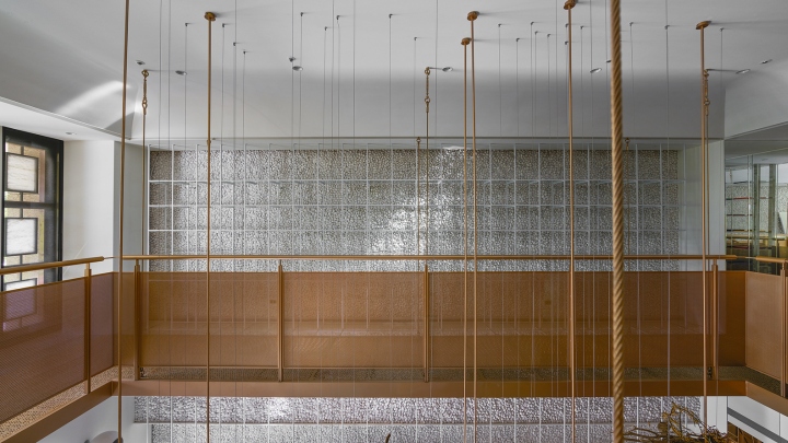
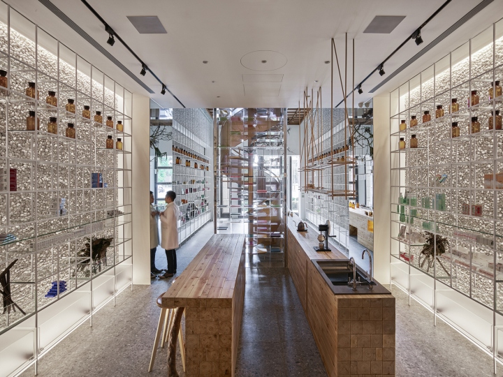
For example, we used cement to stick cobblestones on the two towering walls on the left and right side, whose rough texture gives people a sense of being real. The metal, lightweight glass and transparent acrylics are crisscrossing, and straight lines are adopted to build the display racks which is in longitude-and-latitude shape; just as repeated expanding of the molecule – with drugs put on them, the display racks seem to disappear from the space, while the colorful drugs act as paintings to color the walls.
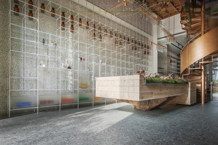
The space is thus floating with breathtaking abstract art atmosphere. One-way mode of traditional pharmacy counter service is avoided here, the core of the space is a laboratory table, where pharmacists interacts with customers. Together with the open dispensing area, and iPad embeddedconsulting service system,interactive information aggregation function and innovative customer experience are created.
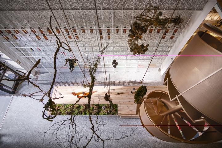
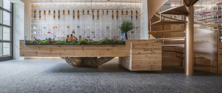
The laboratory table is stackedwith solid wood, original cortex of a trunk over a hundred year is taken as the base of the table, together with the hanging green plants that grow profusely, it looks like an original forest. This subvert the dumb atmosphere of a traditional pharmacy, and also turns medicine and health care into a healthier lifestyle.
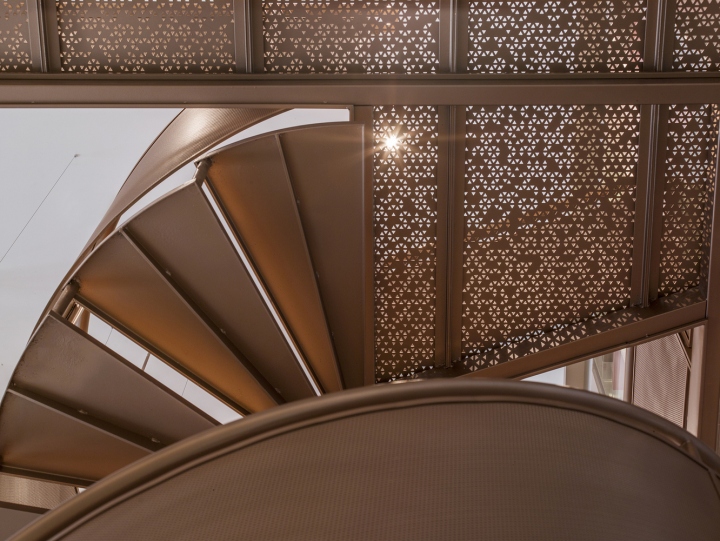
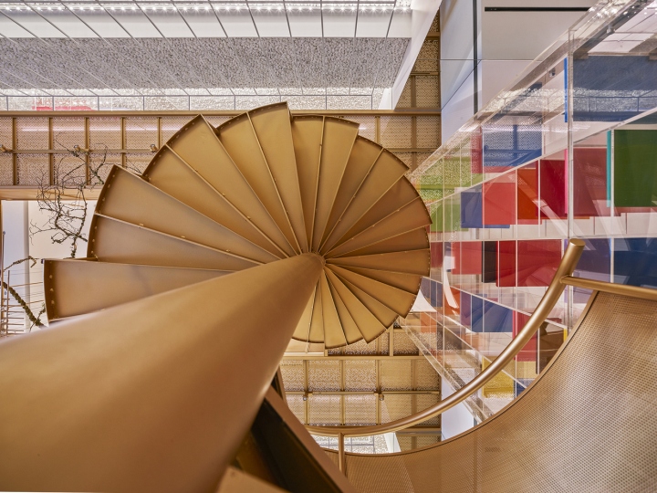
As an unprecedented integration of three business types – drug display, dispensing experiments, and life experience, what connects them is a curvy copper corkscrew staircase, which makes people think of DNA double spiral structure in molecular biology. countless molecule-like triangular holes are cut by laser on the stairs to create shadows which symbols scattered shadow of leaves. This acts as asalute tothe nature.
Just as the owner desired, Molecure Pharmacy not only gets rid of the fixed stereotype of Pharmacies, brings the three-generations traditional pharmacy a totally different look and improves the value of existence of Taiwan’s stagnant pharmacy industry, redefines the value of health from four aspects: drugs, health food, diet and exercise, but also brings people who pay increasing attention to health a new space which integrates function, aesthetics, and experimental spirit.
Design: Waterfrom Design
Photography: Kuomin Lee


http://www.archdaily.com/878583/molecure-pharmacy-waterfrom-design


Add to collection
