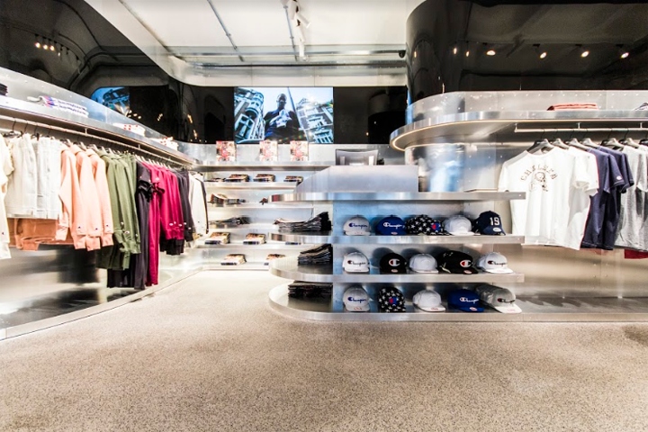

Champion Soho is the first UK flagship store of the brand, which makes its debut in the heart of the shopping center of the city of London. From the desire to place special elements on isles and show product on coves the idea of a dynamic and sinuous line is born, running on the perimeter of the store and creating a hand-like shape that recalls both the hand of the builder and the hand that grabs the product.

To properly follow with materials the dynamic soul of the store, the riveted aluminium used for old planes came naturally: it perfectly follows the sinuosity of the store and helps to give the dynamic effect through its reflections and brightness.

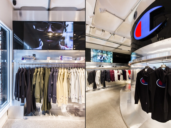
Just like the windows on the planes, a black reflecting banner is inserted in the aluminium to allow to focus on special products through hidden displays. When turned off the TVs disappear, when on they can show product specs, marketing campaigns and product focus.
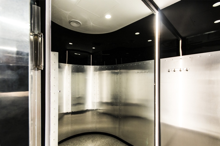
Shelves, tables and windows are highlighted by led stripes that help to define and enhance the lines running all around the store and to keep the products always as the protagonist.

Custom lights come down from the ceiling taking the shape of it to help to focus on the two tables for product display at the center of the store. In a white, black and gray surrounding the red and blue colors of the Champion logo really stand out on the tables and on the “C” sign.
Design: Anna Faccioli & arch. Tommaso Zanini / d+d group
Photography: d+d group




Add to collection
