

Linda Farrow’s Paris store by Sheridan&Co, Paris – France
posted by retail design blog on 2017-09-14
Paris
Add to collection


Global retail design agency Sheridan&Co reveals its latest work in the developing the retail strategy and design for luxury sunglasses brand Linda Farrow’s Paris store, which opened this month. The agency was tasked with supporting the development of a strategic international rollout of the brand’s stores and retail presence – a move that will see between 50 to one 100 stores open globally within the next few years. Blending opulence with innovation, Linda Farrow’s eyewear is unique and distinguished; elegant, understated hues, polished detailing and experimental shapes and structures nod to a timeless 70s vintage aesthetic rejuvenated by edgy modern finishes.

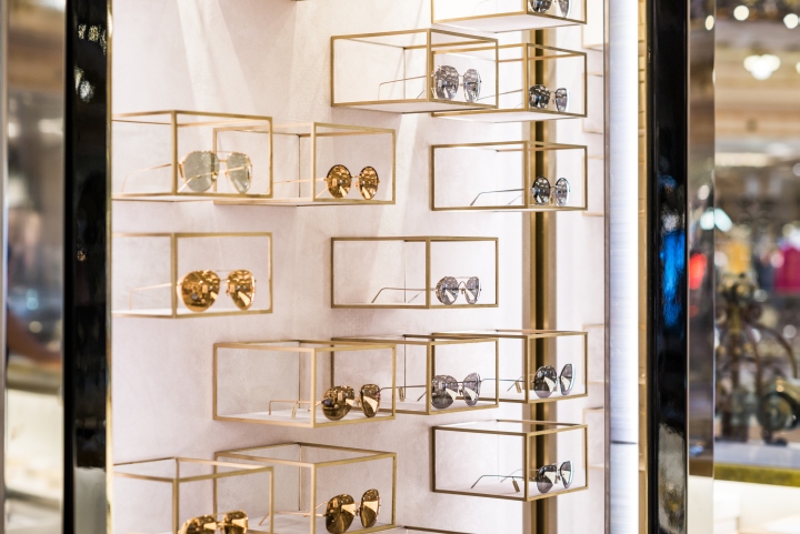
The British brand, which many argue was the first to position sunglasses as a fashion item, wanted to redress the way in which its merchandise was presented, seeking fresh and innovative concepts that displayed the wares in a clean and uncluttered manner, as well as fine tune the in-store treatment of colours, materials and finishes in order to create consistency and uniformity across all future builds. “The design solution needed to exude luxury but in an elegant and modern way. It had to, in many senses, echo and extend the aesthetics of Linda Farrow’s eyewear to create an immersive brand experience,” said Michael Sheridan, CEO and founder of Sheridan&Co.

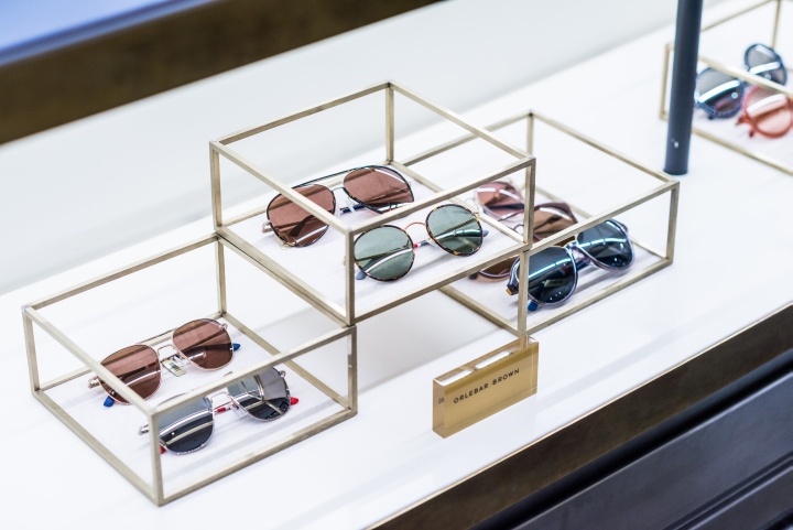
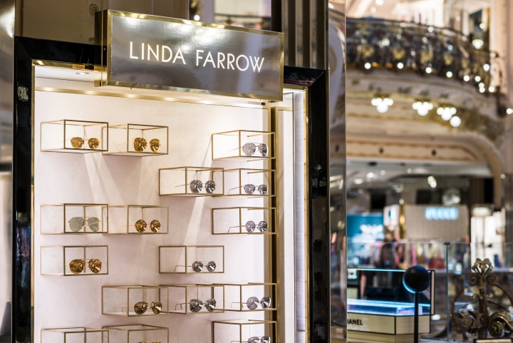
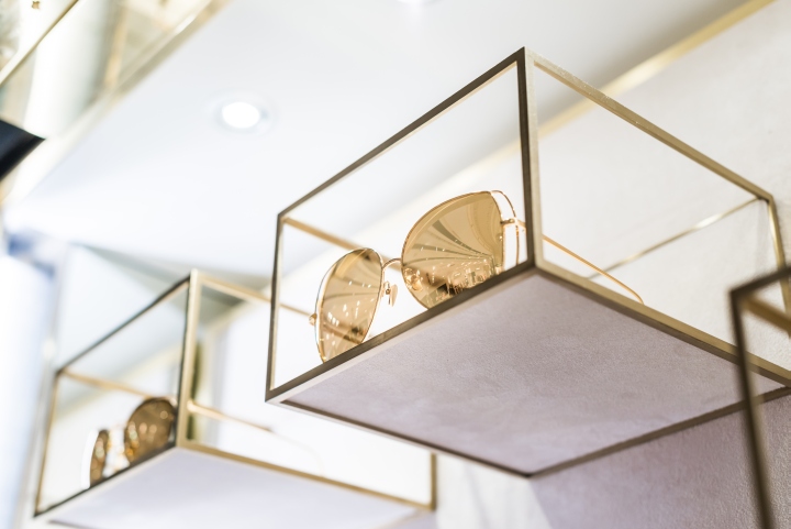
While the interiors’ colour palette is neutral, the play on different material textures – from stone and marbling effect to brushed metallic – amplifies light and space, allowing the eyewear displays to take centre stage. The Linda Farrow logo that crowns a wall display unit on either side of the store is vinyl finished in brushed gold. Display plinths of varying heights arranged to offset textures and finishes (dark marble against stone against brushed gold) create an arresting focal point at the centre of the store, while a longer display unit that curves and stretches the full length of the room mimics the same effect in miniature form, with small gold frame hand mirrors interspersed in the display to break up the monotony.

The overall effect is striking in its visual richness despite the minimalism. “The store aesthetic very much embraces an earthly kind of luxury that explores texture and form in a manner that complements Linda Farrow’s designs,” continued Michael Sheridan. “Molten metallics of liquid, brushed and rose gold offset by subtle hues of frosted oyster, shell and mink are installed in a tactile and glossy environment that beckons sensory and product exploration.”
Design: Sheridan&Co


Add to collection