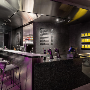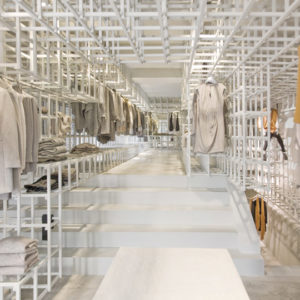
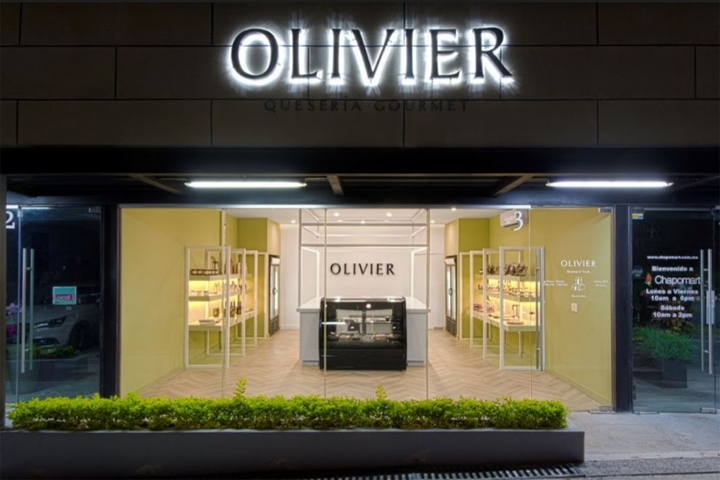

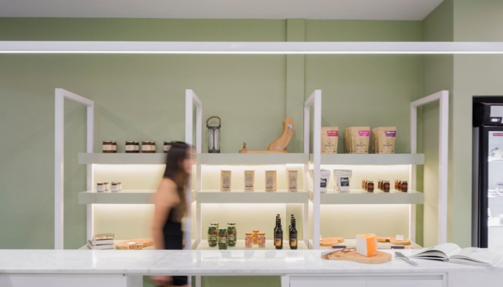
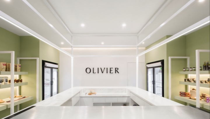
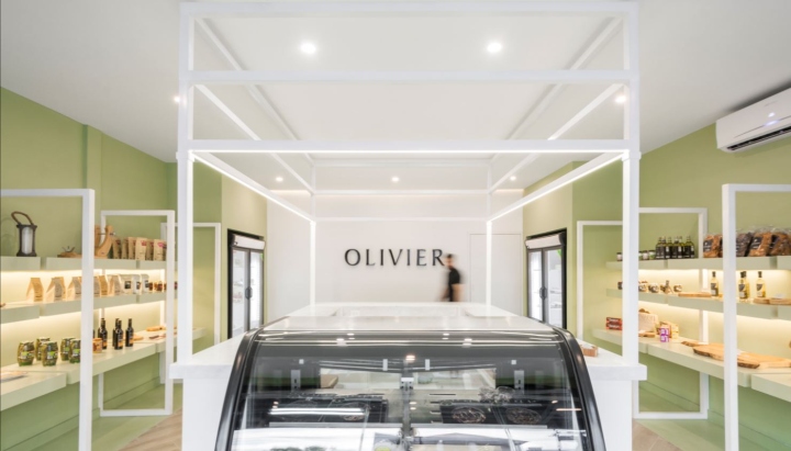
Olivier is a traditional cheese store with a renovated image and branding. The image mutated from a rusty style to a cleaner, elegant and contemporary vibe. We tweak with lighting, shapes, and materials to achieve a renewed ambience. The lighting itself would communicate a cozy place, while the forms remain simple, slick and clean. The island is placed at the center of the room in order to create a visual statement to the costumer this is where the magic happens.
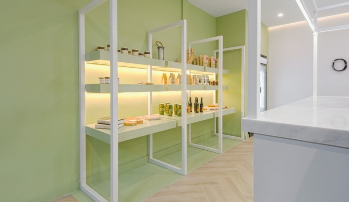
The metallic structure is an abstract resemblance of cheese slices and serves as the main icon of the store besides providing support for the shelves, lighting in the main island. The color palette played also an important role in this project and served as a strong connection between the simple design and the inviting atmosphere elements, while enhancing the products’ features.
Design: Melt Studio
Photography: Jose Antonio Domínguez Posadas


Add to collection
