
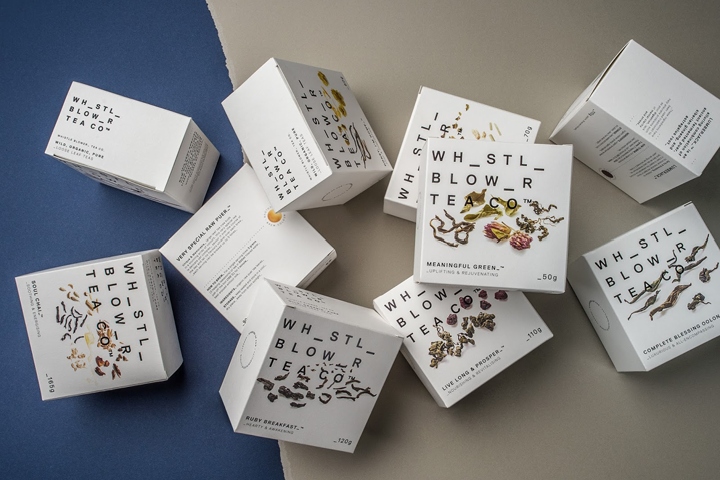

As a growing company in a saturated market, Whistle Blower Tea Co. wanted stand out as the premium tea, with a brand that represented their philosophy of honesty, quality and sustainability. To achieve this the brand had to be repositioned, starting with a more contemporary logo and retail packaging, to share a clearer more targeted message.
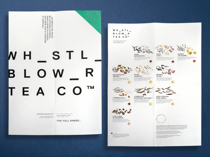
Taking inspiration from whistleblowers, code breaking, redacted documents and data leaks, we trialed many combinations of missing letters to achieve the most readable outcome, with the brain naturally filling in the gaps in the logo.

A clean and minimal approach is employed across the brand and packaging, with a strong, commanding logo and a bold photographic style showing each individual ingredient in detail. In doing this, the brand strives to communicate the voice of the company as being open, honest and direct with the consumer.
Design: Black Squid Design


http://www.packagingoftheworld.com/2017/10/whistle-blower-tea-co.html


Add to collection


