

ProfessioNAIL Hornsby contacted Jason Byrne Design as they wanted to create a new store unique within the ProfessioNAIL family. We were inspired by the simplicity of a nail file while evolving the store concept. Layering, referencing and echoing the nail file throughout the design. The nail file shape softened the straight lines which ordered the stores functionality. We played with the nail file shape to form privacy screens, niches for nail polish displays and a hand wash area.

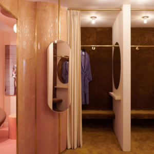
The store embraces greys and pinks as the predominant colours, expressing both the masculine and the feminine. Flashes of green and blue delineate changes in the layering of materials and lines. These greens and blues seek to encourage customers to have fun with colour selection. Reception and hand washing zones are placed at opposing ends of the store, encouraging customers to explore the space, prior to enjoying treatments.

Manicure and pedicure areas were placed again on opposing walls, with a drying table, magazine and a drinks station placed between them to create a central zone. This central zone is the heart of the store and provides direction and privacy for customers. The central zone is focused equally to customers whether they are enjoying a manicure or a pedicure treatment.

The store is designed so each treatment can be individual, yet flow seamlessly if additional treatments are sought. Manicure and pedicure areas are designed so they provide privacy from each other. Joinery elements were incorporated so that eye level was left clear, encouraging customers to converse freely, with treatments discreetly obscured from view, below. The store celebrates femininity, remembers and emphasises the fun and beauty of a visit to a nail salon.
Design: Jason Byrne Design
Photography: Justin Alexander


Add to collection
