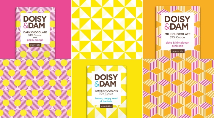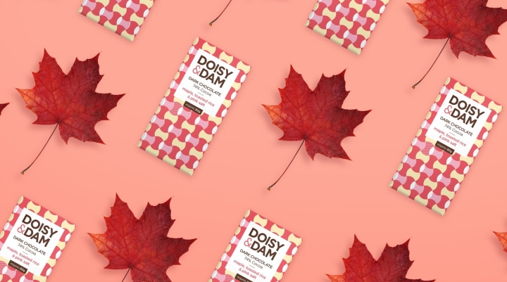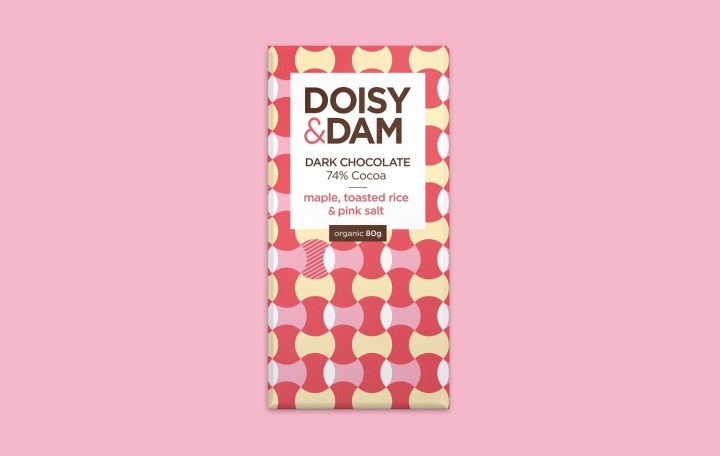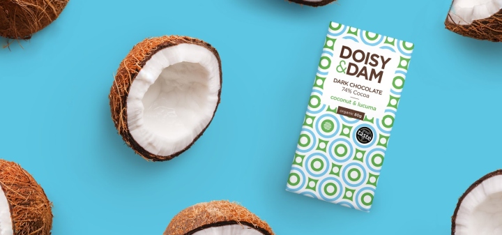
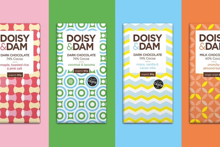

Doisy & Dam are a UK based artisan chocolate manufacturer. They produce original flavours from innovative ingredients that have been ethically sourced from around the world. With a colourful look and an essence of fun, they wanted to excite their customers and offer them a more mindful product. Evolving from an early start-up into a ever-expanding company, meant they needed to update their brand assets for their future needs. We were asked to refine their logo and revamp their patterns and packaging across a variety of different formats.

In it’s original form the logo was being applied inconsistently across packaging and used a generic ampersand which lacked personality. The resulting marque underwent several typographic refinements including the creation of a customised ampersand, reminiscent of a heart shape. We also established a consistent corporate approach for use off-pack. A complete design overhaul of their vibrant chocolate packaging – everything from new wrappers, patterns and colour palettes, label icons and typography. We continue to work with Doisy & Dam as they develop wonderful new flavours for their growing fanbase.
Design: Naked Ideas


http://www.packagingoftheworld.com/2017/11/doisy-dam.html
