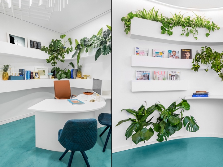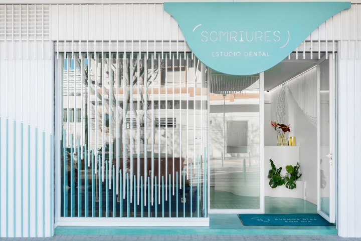
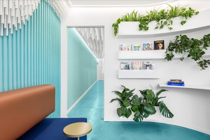

“Although the last years we have been focusing on projects related to hospitality and retail, we also like to face new challenges designing other projects like for an office space or in this case a dental clinic”, per Christophe Penasse, founder of Masquespacio. Alberto and Maite followed the work of Masquespacio since a while through social media and decided to contact them to realize the renovation of their dental clinic Somriures, which is situated in a small town called L’Alcudia, around 30 km away from Valencia.

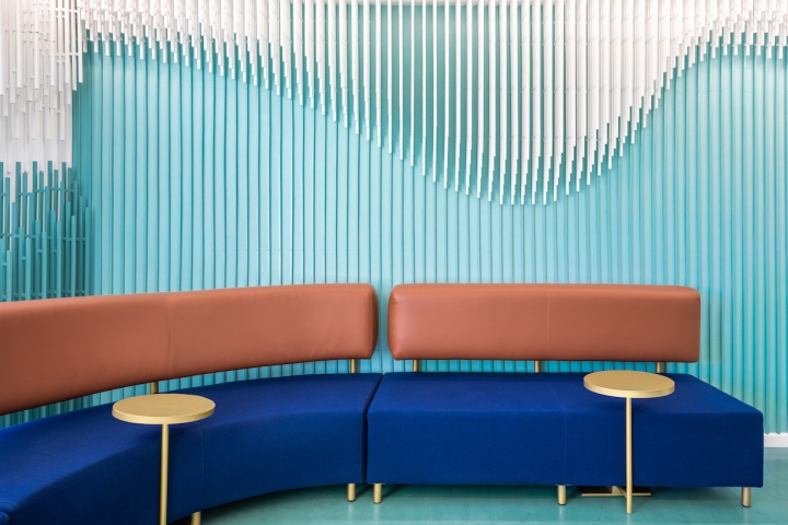
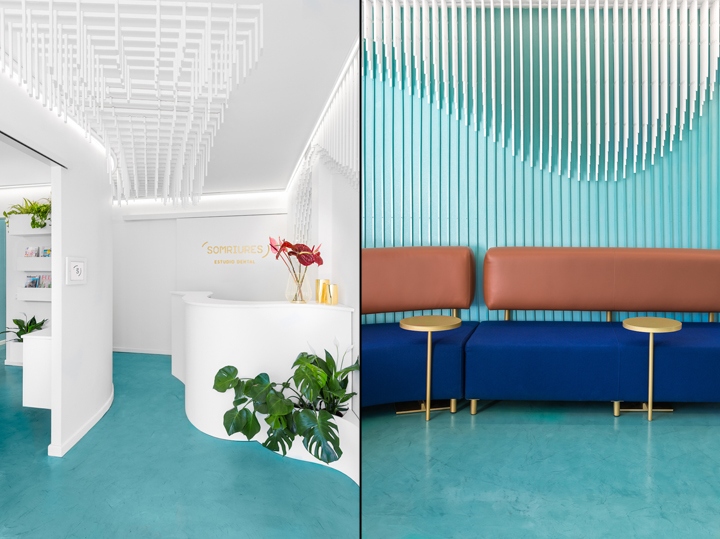
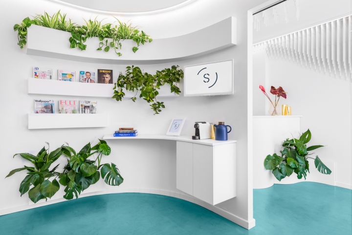
Being the specialty of Somriures the creation of ‘beautiful smiles’, the design from the dental clinic is highlighted through a sculpture of 2884 strips wooden strips that hang from the ceiling and overwhelm some of the main walls with the aim to recreate a smile. The sculpture above is the perfect guide to take the clients from one point to another. On the other hand, the turquoise green and white color combination creates a smooth feeling, while the small touches of gold, brown leather and dark blue establish a sophisticated contrast.

Besides for the custom-made furniture organic forms were used to match perfectly with the concept of a beautiful smile. Ana Hernández, creative director from Masquespacio: “It has been an interesting experience to create the new space of Somriures. It wasn’t a usual project for us in which we could add a lot of small decorative details.

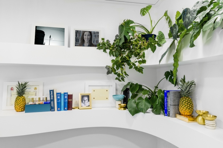
Totally contrary to it due to the type of business we needed to design an overall serious and sophisticated design through the minimum use of materials. Due to this fact, we decided to center our design on 3 elements: a sculpture that recreates a smile; the use of turquoise green in combination with white walls and ceilings to maintain a clean image and the use of organic forms for the furniture.”
Design: Masquespacio
Photography: Luis Beltran
