
Add to collection
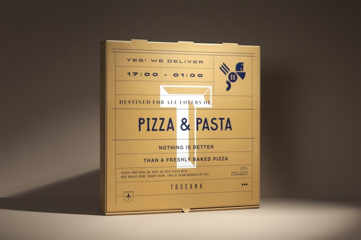

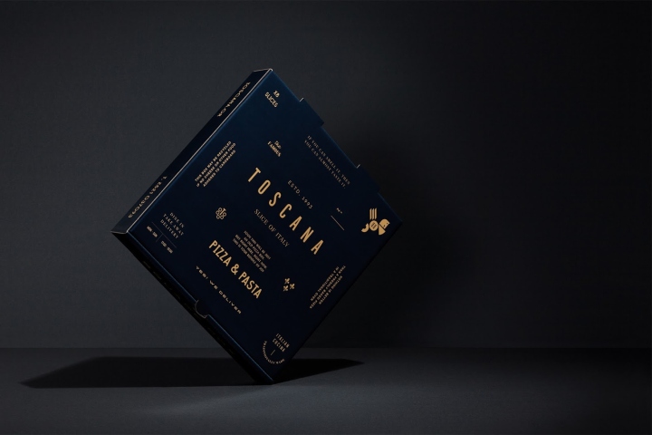
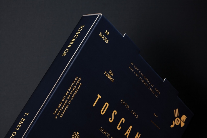
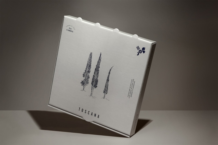
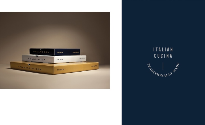
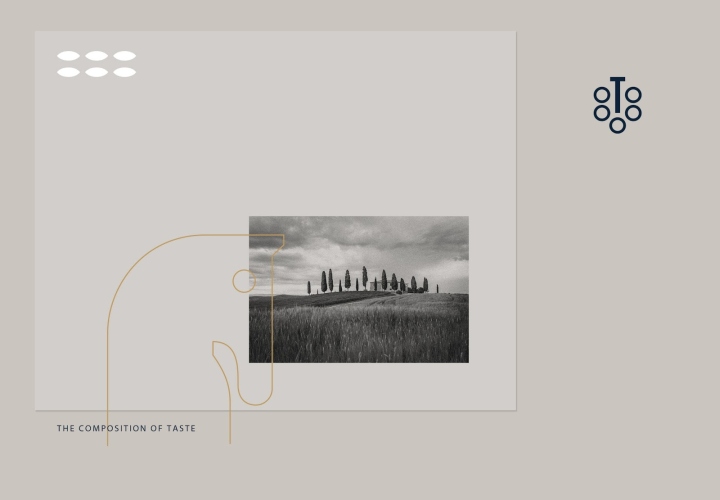
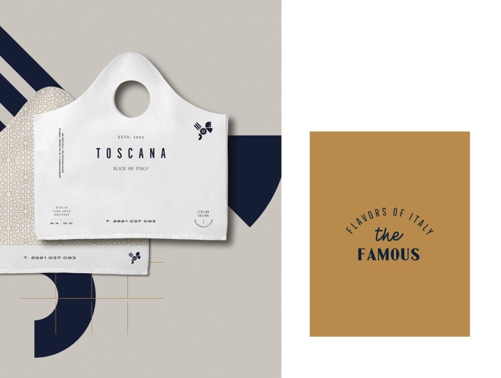
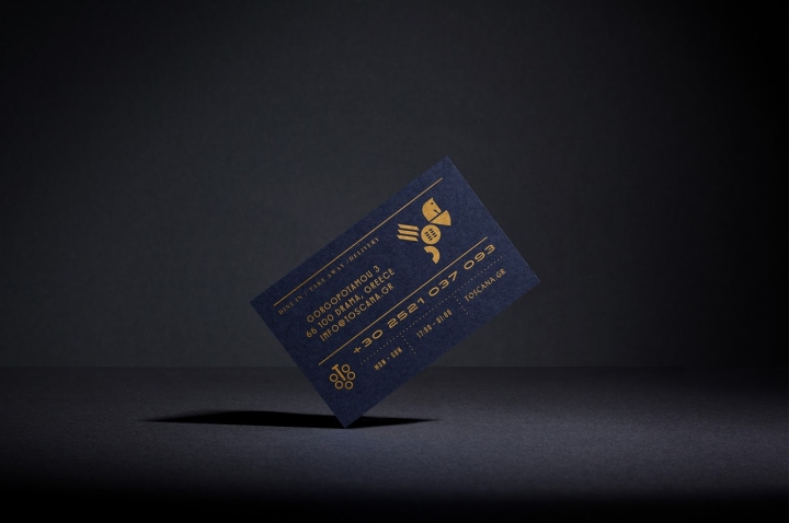
Logo design and take away packaging for the Toscana Italian restaurant. Drawing inspiration from the Italian region itself and in order to emphasise on the authenticity of its traditional flavour, we designed the logo based on the clear geometric forms that the raw materials the restaurant’s kitchen uses, as they’re composed to create the form of a horse with feathers as a reference to the typical Tuscan region’s coat of arms.
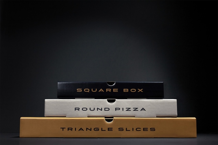
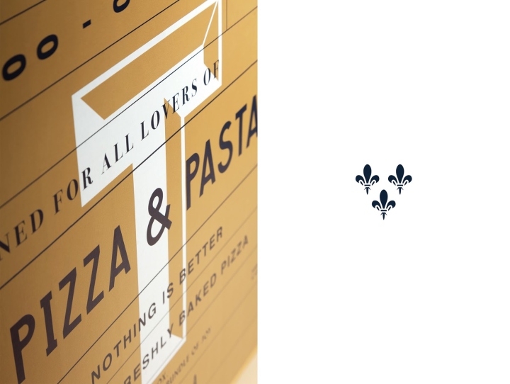
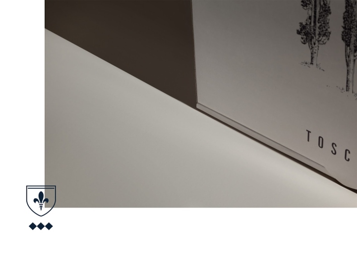
Typography takes a leading role on the packaging while combined with the emblematic elements of the Toscana region, creating a classic but also contemporary aesthetic. The overall result differentiates itself from the common approach of the industry’s competition, communicating direct and powerful messages making an impactful sense of authenticity.
Designed by Luminous Design Group
http://www.packagingoftheworld.com/2018/02/toscana.html


Add to collection