
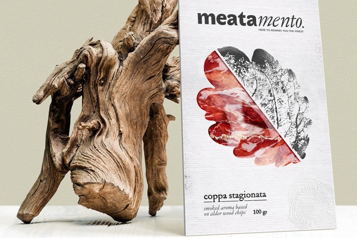

Meatamento is the range of smoked meat, which is based on different smouldering mixes: from elegant cherry tree flavour to spicy oak wooden chips. This way of cooking provides strong taste and remarkable aroma, which is inspired by nature and can melt the heart of a passionate foodie.
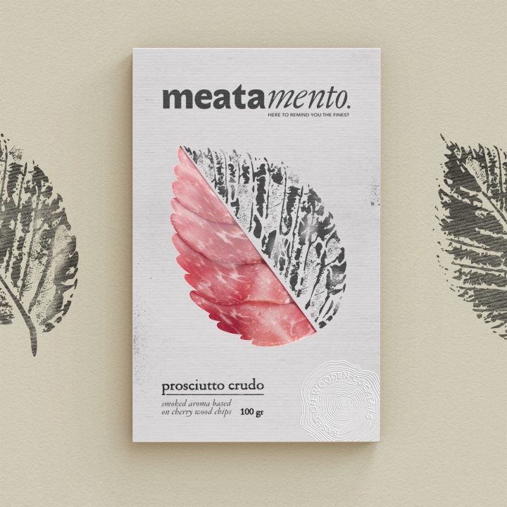
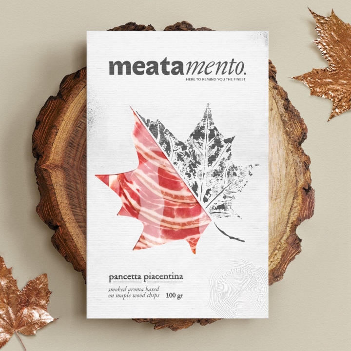
In order to underpin this unique style of smoking, we took a mystique image of an unforgettable memory as a basis for packaging design. We transformed such memorable taste and aroma into a stamp, which reflects products’ characteristics perfectly. The name of the range is also based on the idea of reminding something special. It’s separated onto two parts, where the first is made of slab-serif font and another one from italic.
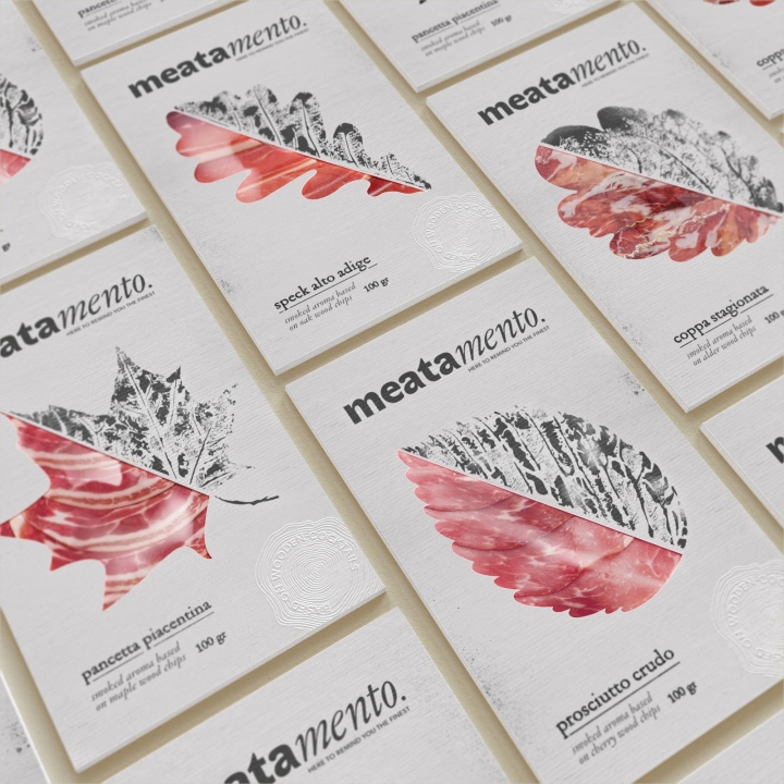
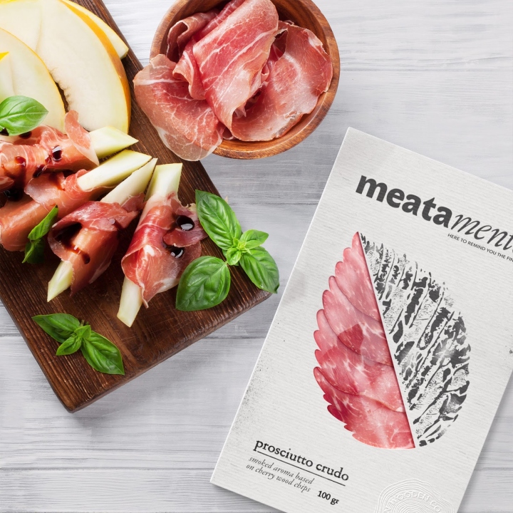
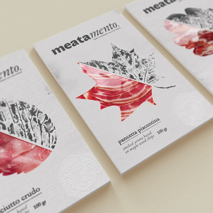
Subline is building up the main idea, making it stronger than ever. Here to remind you the finest — the way of living, when you need no efforts to bring the greatest memories back. Just put the slice of meat on bruschetta and feel the splendid taste of very special snack. The art of flavour varieties inspired the concept as the artists of the smoked meat category, reflected in the stamps and ashes-made graphics across the packaging, creating the image in elegant and premium style. The prints are mirroring the shapes of leaves, which were chosen to create a wooden mix. Black and white style is an homage to ashes and smoking techniques at its own.
Upon a closer view, the pattern of meat fibers reflects the leaves veination, creating a vivid contrast between graphics and real meat (it could be seen from a window part of this package). This simple decision adds weight to the on-shelf packaging, creating vibrant and eye-catching identity. The whole image of package is strengthening with classy typography and embossing-made claim (which imitates growth rings) — an eye candy for those, who have the strongest passion for food and happy to collect the flavour’s inspiration from around the world.
Designed by GORDOST
https://www.packagingoftheworld.com/2018/03/meatamento.html


Add to collection


