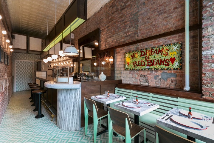

Lowerline, a restaurant and po-boy shop presented two design challenges to Studio Vural: Despite being based on a New Orlean’s staple, chef and owner John Verlander requested “anything but Mardi Gras beads” in the initial design meeting. Measuring just 10 feet wide by 40 feet deep, the entire full service restaurant is also smaller than a subway car (a standard B Division subway car is 9.77 feet wide and 60.21 feet deep). However with a balance of the contemporary and nostalgic, mechanical attention to detail and creative use of space (including cabinets in the ceiling), Studio Vural was able to create a spacious interior with a subtle, yet unmistakable New Orleans style.
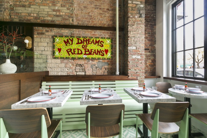
As the signature dish implies, the overall design was inspired by the po-boy dives of New Orleans- high volume sandwich shops popular with working class “poor boys” of the day. The historic neighborhood shops are simple yet elaborate with memorabilia, mahogany wood, cement tiles and long central counters for service. For Lowerline, Studio Vural found inspiration in those historical features to inform a contemporary composition, where origins can be felt but not nostalgically seen.
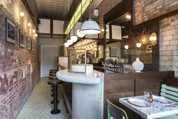
At Lowerline, the dining area has a feeling of New Orleans timelessness with brass fixtures, painted wood and Cuban tile floors, despite being custom built everything down to the fraction of an inch to maximize space. Light fixtures, tables and benches were all designed to provide a full-sized experience while being as slim and space conscious as possible. Unadorned windows also flood the area with natural daylight, increasing its feeling of airiness.
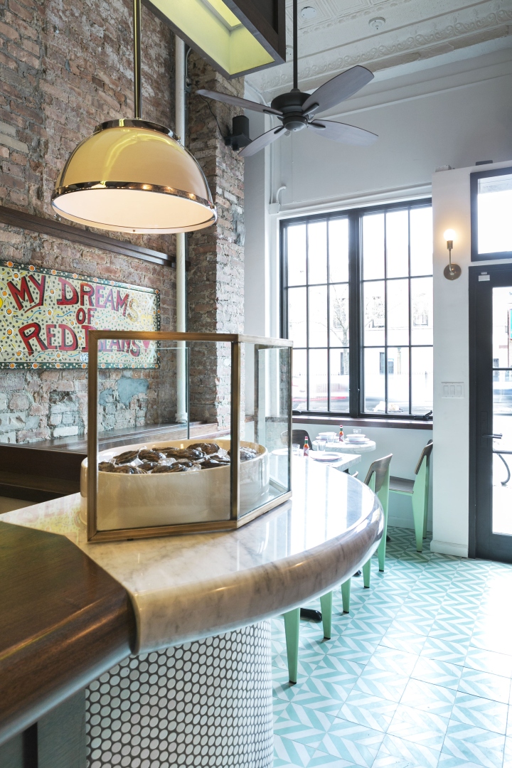
Mirroring the long central lunch counters of the original po-boy shops the Lowerline’s bar not only maximizes the space, its deep mahogany references the wood of choice in the original shops. A sleek marble oval oyster bar inset into the mahogany brings a contemporary flair to the staid wood bar. Space saving precision allowed for a bartop one quarter of an inch larger than code requires – no small feat in a space where every inch matters.
The open kitchen is a demonstration in spatial ingenuity and the blurring of old and new. The space takes advantage of the storey-and-a-half ceilings capped by original tin panels that happened to have a New Orleans feel. Inverted basement storage- four cabinets were custom built into the ceiling to provide storage for bulk dried goods- is masked by replicated tin that matches the existing panels. To accommodate a full menu of gumbo, poboys and oysters and the kitchen machinery they require, an appliance bunk-bed was built to create adequate surface space.
Designed by Selim Vural / Studio Vural
Photography by Kate Glicksberg


Add to collection

