
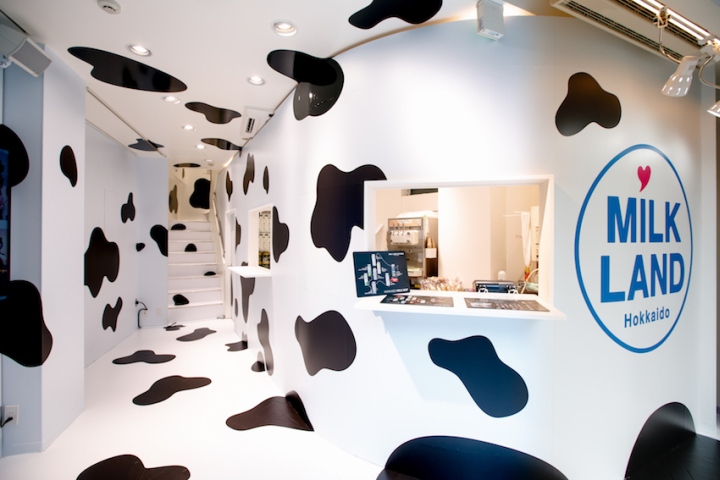
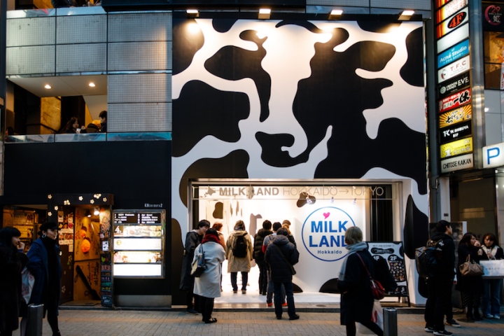
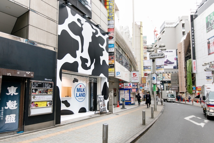
This is a design of a pop up store where people can get a taste of milk products from Hokkaido Prefecture, where more than half of Japan’s dairy products are produced. The place was originally occupied by a huge advertising sign, meaning the indoor space was merely an adjunct to the outdoor advert. We thought of this place as an advertising media where people could walk in to sample the products, and designed the shop space that continues on to the ad.
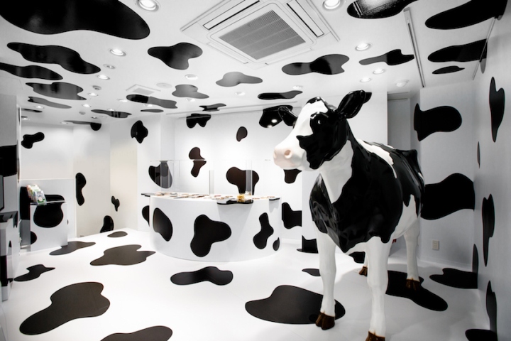
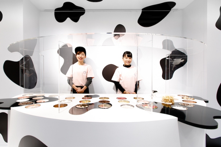
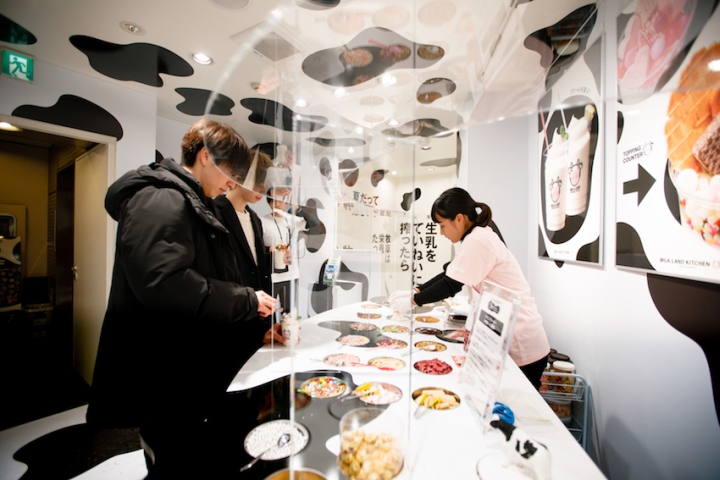
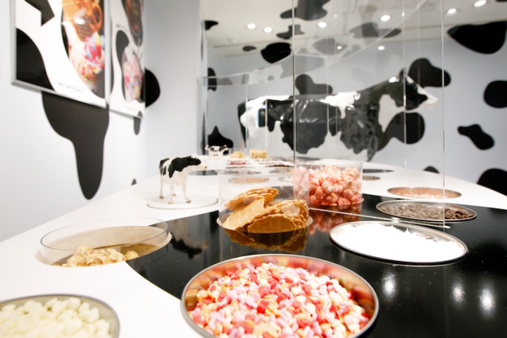
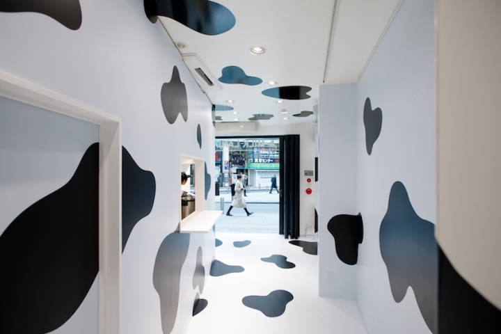
People attracted to the giant sign with cow print walks in through the façade to the shop, also covered from floor to ceiling with the same pattern. At the ice cream counter (also covered in cow print), customers buy soft-served ice cream or sweets made from milk and head to the floor above. The cow pattern continues on to this floor where a life-size model of a cow blends in with the black-and-white pattern. Beside it, a large toppings bar awaits for the customers to choose their own combinations of fixings for their sweets. The semi-elliptical toppings bar seems as if it had rose up from the floor with its familiar cow pattern.
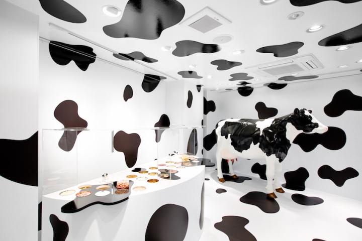
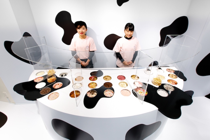
This bar is made from the same materials as the walls and the floor, making the various kinds of colorful toppings in the containers stand out. Some of the toppings’ containers, by using air pressure, pop up like moles in Whack-a-Mole, adding fun and delight to the customers’ experience. This small space was designed to be more than a common pop-up store, but a pop-up advertising experience, offering joy and small surprises for people who step in. By using the small space as one giant advertisement, we succeeded in creating a unique experience-based pop-up store.
Designer’s vision (key words of the design)
• Creating a unique experience-based pop-up store.
• Designing the shop space that continues on to the ad.
• This small space was designed to be more than a common pop-up store, but a pop-up brand experience.
Designed by Ryusuke Nanki
Photography by Yukihide Nakano


Add to collection

