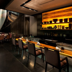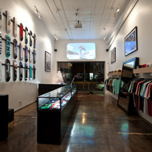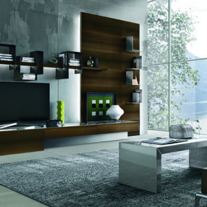
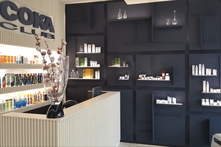

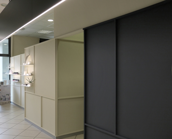
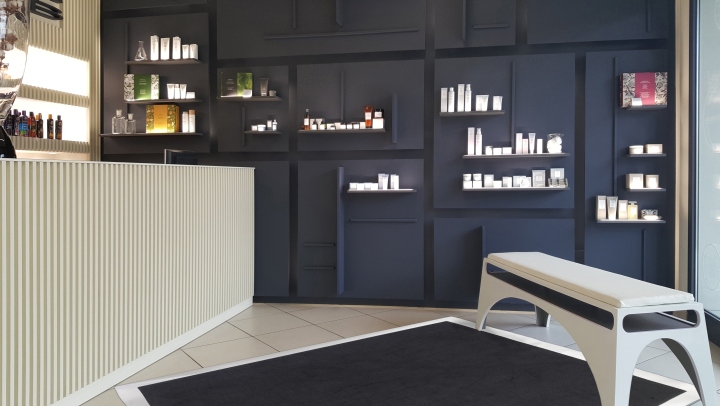
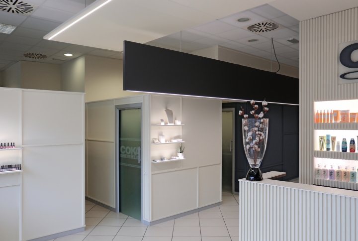
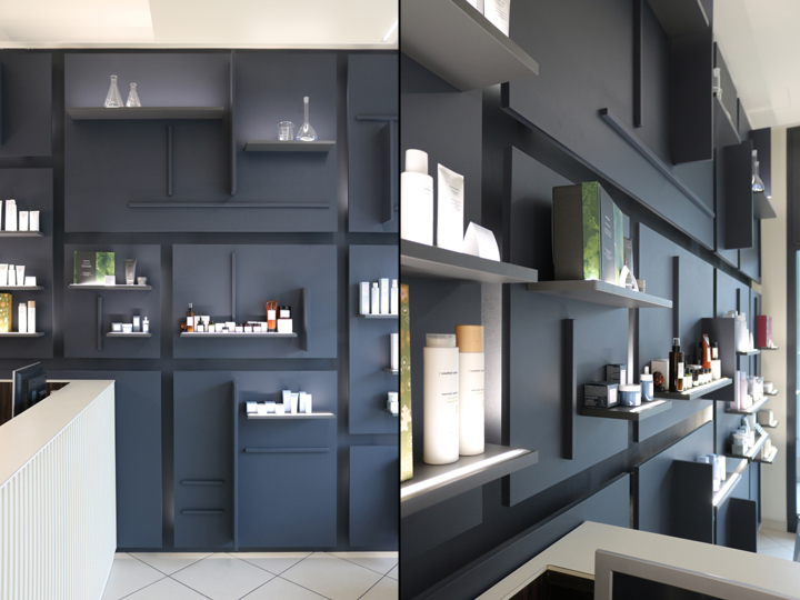
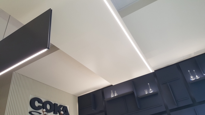
The associated Gariselli Studio is asked for the restyling of a wellness center in Modena, the main request is to recall a sense of environmental and visual comfort. So the studio develops a project that speaks the language of architecture rather than pure set-up, denying the use of decorative and excessive elements, recurring in beauty salons. The furniture and the vertical walls are completely covered with a single material in alternating light / dark, so as to become a unique wraparound container furniture that, thanks to a molding in aurea proportion, is optimized to display the products on sale that take the role of organized stage actors.
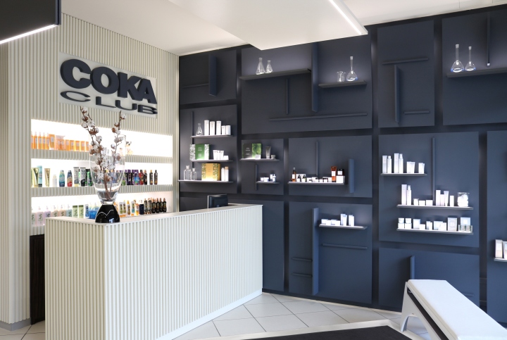
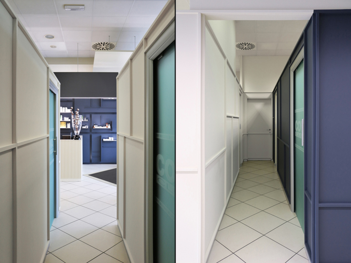
Neutral colors and plays of light are the contrasts to highlight the distribution and diversification of functions, a vertical plane and a net ray to delineate the internal path. The tiles floor and the ceiling were predetermined so the design is not to deny them, but to allow the use of colors and the alternation of carpets and panels. From the outside the same geometric proportions in the interior is graphically recalled on the windows, to differentiate the beauty center from the adjacent shops, and is a reception that is in the foreground, underlined by vertical lists that give depth and volume.
Designed by Gariselli Associati





Add to collection

