
It’s no secret that Flos has distinguished itself with its impactful designs for stands and showrooms. Particularly when it comes to trade fairs, the lighting brand shines at finding deceptively simple ways to innovate the experience of its products within a limited square meterage.

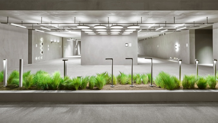
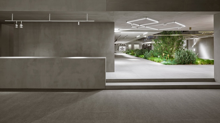
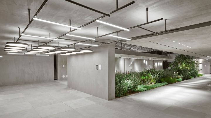
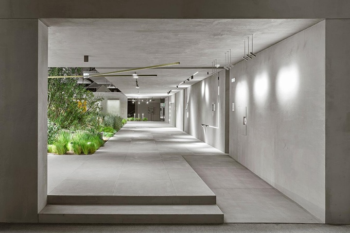
Most recently, at the 2018 Light + Building fair, the Flos Architectural collection was unveiled amidst a reinterpretation of domestic life in the central patio of a Roman villa. The surrounding garden area showcased the brand’s outdoor products while creating a dialogue between indoor and outdoor environments. Designed by Vincent Van Duysen, the installation is inspired by the idea of a secret garden – within the stand, lush greenery is completely enveloped by neutral grey flooring and wall surfaces, allowing the lighting to stand out as the only design element.

Furthermore, Piero Lissoni unveiled his latest design with Flos: Diversion, new suspended and articulated linear light modules that intervene on vertical surfaces with a diffused lighting effect.
Designed by Vincent Van Duysen
Photography by C 41 Studio


https://www.frameweb.com/news/why-flos-is-greying-out-all-surfaces-in-its-stand

