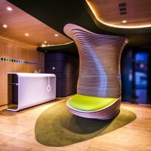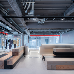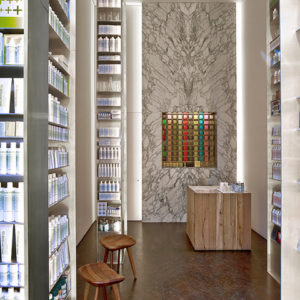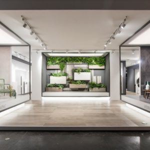

TRAZO designed the offices for an insurance company located in Mexico City, Mexico. The company is one of the top 10 insurance firms worldwide, having been founded in 1872 and serving customers in over 170 countries. Present in Mexico City since 1984, their offices had been seeing significant growth for two years and finally decided to expand its operations team into a mixed-use building recently finished in the northwest part of the megalopolis.

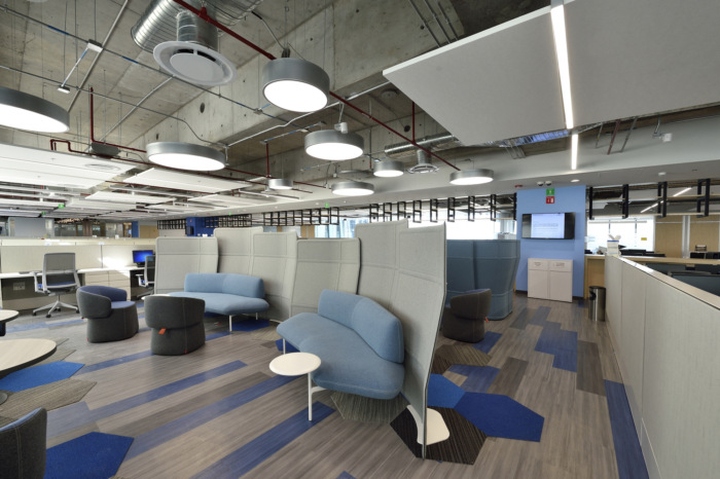
Trazo’s philosophy is to intimately get to know their clients across all of the company’s levels as to get a clear x-ray of its inner workings and overall well-being inside the offices. Hence, employees ranging from the staff to the company’s regional directors were interviewed in order to really understand the needs of everyone involved in the business’s day to day operation. The interviews outlined four main goals: To facilitate inter-department work, to take advantage of natural light and ergonomics, to create casual collision and collaborative areas to promote teamwork and to provide the necessary technology for telecommunications with the company’s main and global offices.

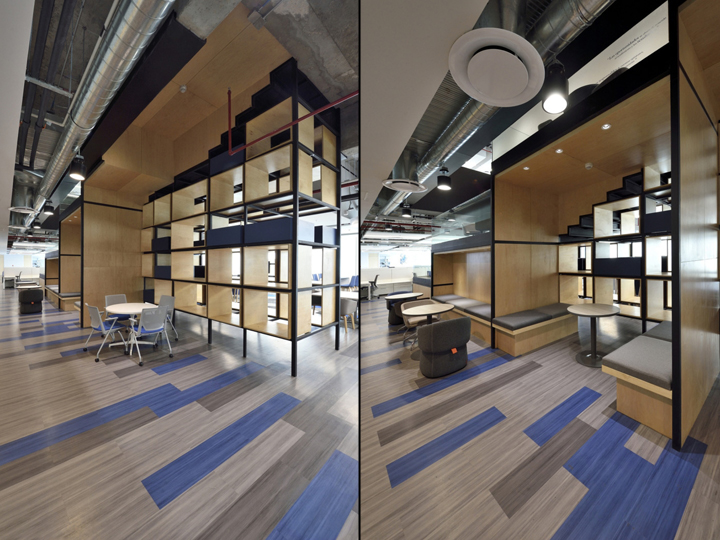
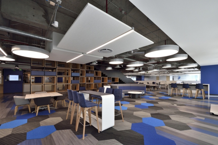
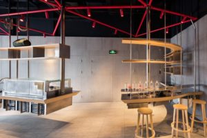
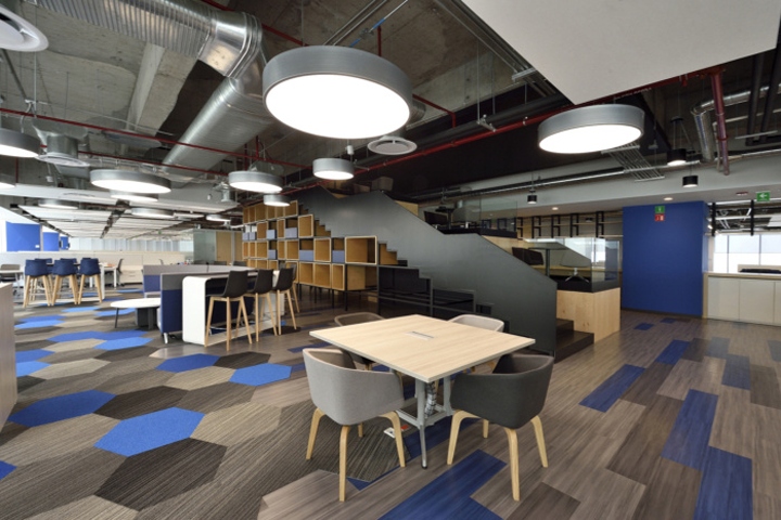
The main challenge, in terms of architecture, was that the building had a very long and extensive floor plan which Trazo thought would feel overwhelming for the people working in these offices. In order to minimize these “infinite views” and sense of endless space, the architects had the idea to break the whole space into three and two spaces in the upper and lower floor respectively. This was achieved with a two-prong strategy. The first one: using boxes which would limit the views the side and concentrating them to the outside. This allowed for a more human scale and the use of natural light from the very long façade. The second one: to make use of the necessary staircase to use it not only as a storage and casual meeting space but as a multipurpose element intended to be used as a point of reference in both floors.

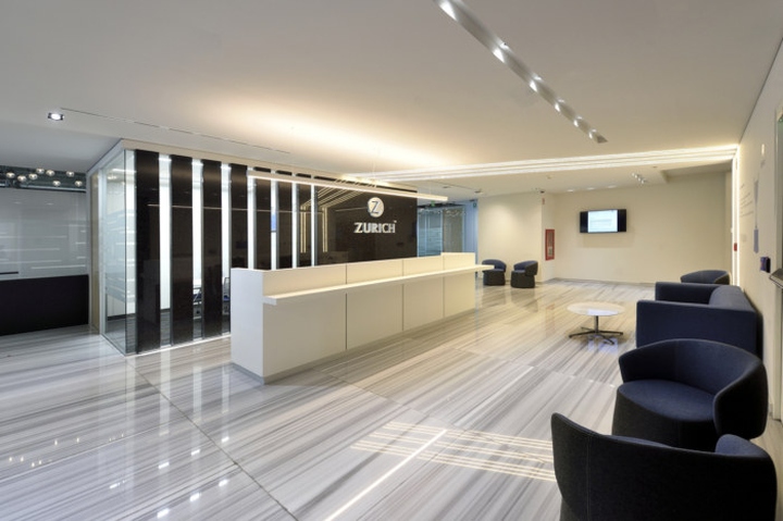
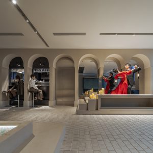
Indeed, the staircase makes for an introduction to the offices, located behind the front desk and clearly marking where one is located. Clients can be serviced in the meeting rooms adjacent to the reception and waiting area. Beyond, local employees and visitors can move into the large open spaces intermixed with collaborative areas and meeting rooms, having the services relegated into the back of the building where views and natural lighting are scarce.

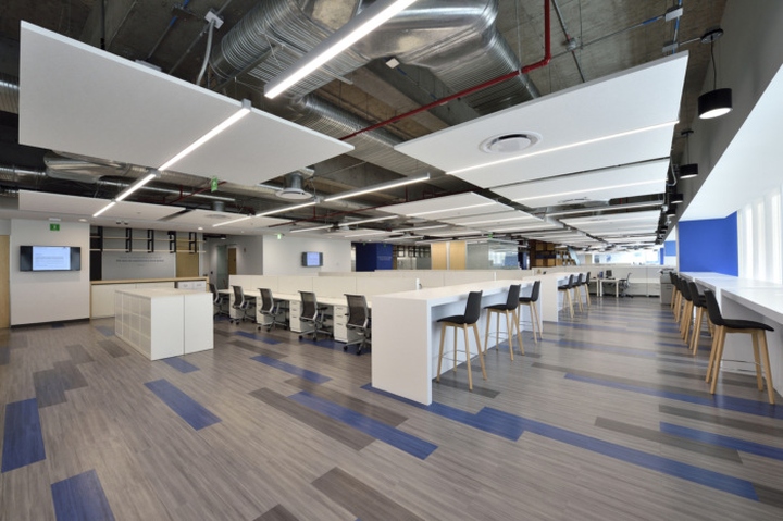
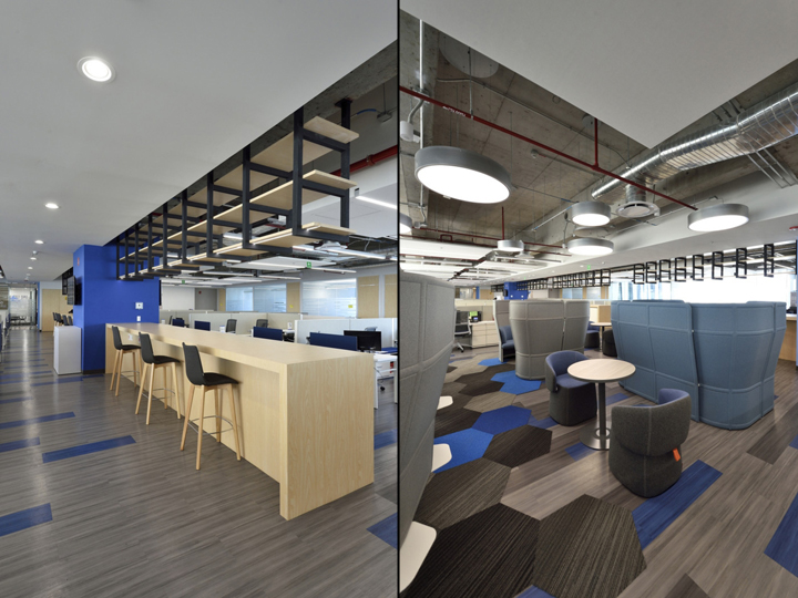
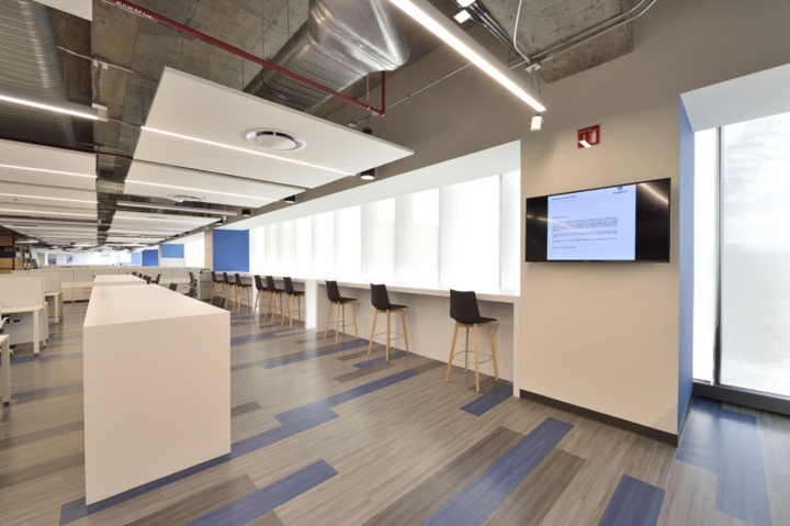
An industrial concept reigns over the office. No drywall or modular ceiling was used in most of the floorplan, keeping any services (air conditioning, lighting, fire protection) exposed for easy maintenance. Similarly, luxury vinyl tiles (LVT) were used which allowed for a hard floor that the client appreciated for its aesthetic and maintenance characteristics. However, this created the need to use a suspended ceiling that helped in matters acoustic absorption which delivered a clean and appealing final look.

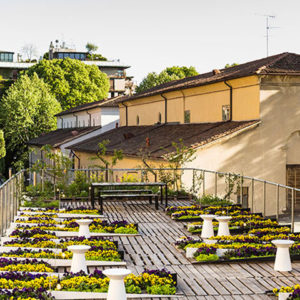
The dining hall is located at one of the ends of the building, taking advantage of the floor’s terraces. This presents the employees with the unique opportunity to enjoy a meal in the outside. Furthermore, this was conceived as a flexible space with the necessary amenities like connectivity and power to work should the need arise or the be used as a large multipurpose room.

Storage, being a prime concern for the client, came at odds with the amount of space the client needed in order to accommodate the project’s program. So as to solve this, Trazo realized they had to take advantage of everything in their power to maximize archiving space. This resulted in a steel structure that runs from one end of the building to the other at a height easily accessible with the use of stools (readily available). This element acts as the backbone of the offices, which mirrors the backbone of the Company’s business: its clients.
Designer: TRAZO
Design Team: Pablo González, Melissa Maya, Sergio Zermeño, Nelly Vera
Contractor: T4 Construcciones, Cesar Real, Alejandro Medellin
Photography: Federico de Jesus


https://officesnapshots.com/2018/07/20/insurance-company-offices-mexico-city/


