Conduit Interior designed the offices of software development company Korbicom, located in Cape Town, South Africa. The brief – Attracting and retaining top talent in this highly competitive sector is a constant challenge. Korbicom identified the need for a complete office redesign in order to improve their employee value proposition. They wanted an office that would realise the full potential of their company culture, and be a space that employees wanted to fully immerse themselves in.
Timeline & approach – Full turnkey service. 16 weeks from brief to handover: conceptualising; detailed design; pricing and construction. This project was all about creating a space that would resonate with Korbicom’s employees, so naturally, that was the starting point. Grant Johnson, Founder and Head Designer of Conduit Interior, spent time with the employees of Korbicom to better understand who they are as a company and the brand values they embody. He asked staff about what inspired them, what they enjoyed doing in their free time, and what their ideal working environment would look like. These answers formed the foundation of Conduit’s approach.

“It was clear from the start that we were designing something for a highly talented, highly creative group of people,” says Grant. “They work on the cutting edge of technology, and their daydreams are about finding solutions for the future. The kind of design that might pass in a big corporate simply wouldn’t be enough to inspire them.” The space needed to reflect the company’s culture, enable innovation and go above and beyond the limits of what their employees might have envisaged. The design would become a catalyst for future physical and virtual employee and client interactions.
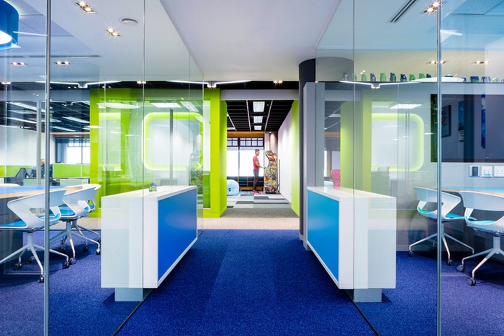
Design theme – Korbicom’s corporate brand identity was the starting point for the design in terms of colours, textures, and shapes. This was interpreted literally in the front client-facing areas, but it evolves to become more playful in the employee facing areas. The reception area offers a slick, digital screen, where guests can check themselves in, replacing the need for a receptionist, and setting the tone for the high-tech, forward-thinking world they’re about to enter.
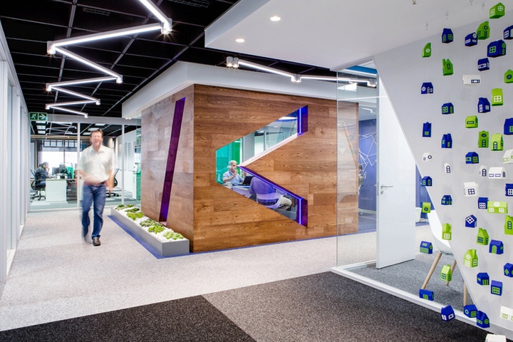
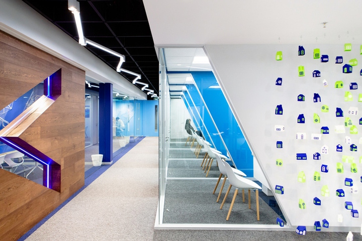
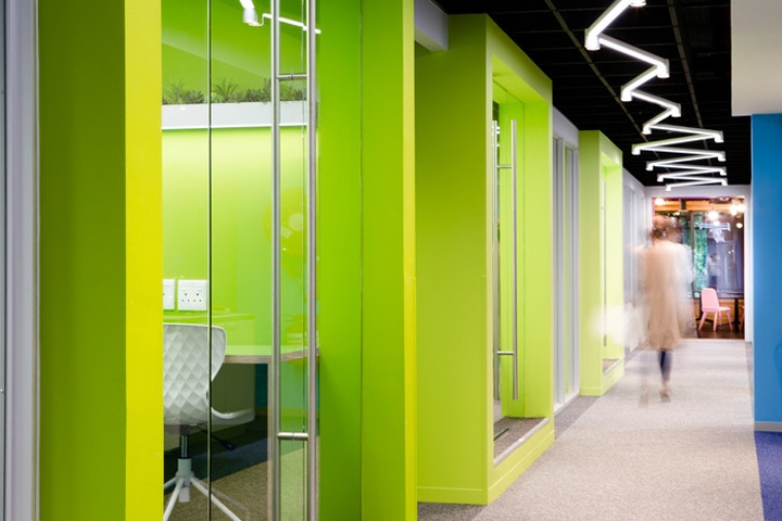
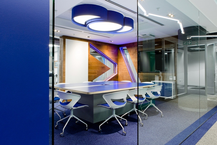
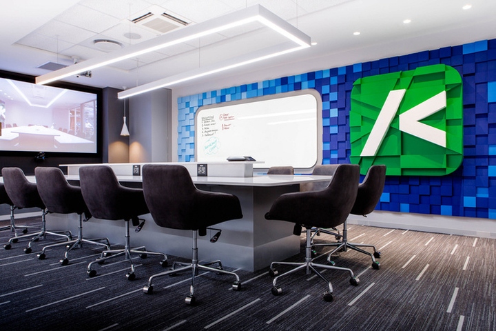
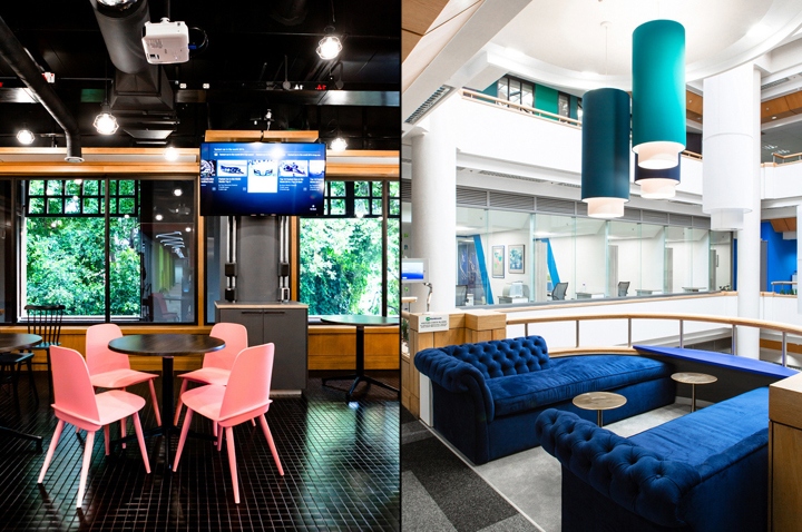
There are two plush blue velvet sofas where guests can wait, offering a slightly more formal feel, but as they walk through the rest of the office, the more playful design elements become apparent, such as colourful padded focus rooms, angular lighting and the quirky use of plants. The main meeting room is the centrepiece of the office. This room is where the magic happens, and it was designed as a showpiece, reflecting the company culture. Engineered flooring has been used to clad the walls, adding warmth and texture, while the use of stones and plants creates a sense of calm. A subtle use of neon lighting gives the room a modern edge and helps the logo to pop. It was fitted with high-end acoustic design and the latest video conferencing technology, which comes to life at the touch of a button.
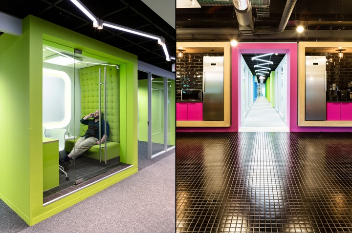
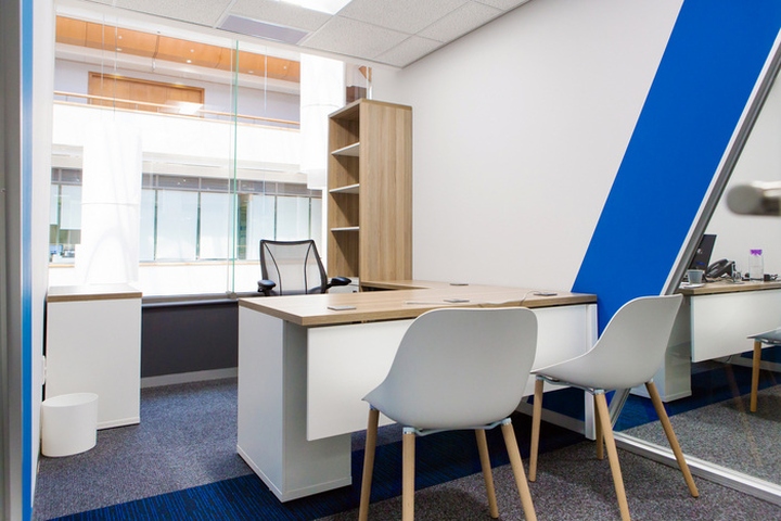
Rooms – “Our discussions with employees revealed that teams didn’t want to be cut off from each other in small offices, but they didn’t want a large open-plan layout, either,” says Grant. To work around this, Conduit designed four main team rooms, each with floor-to-ceiling glass panels. Positioned next to the windows, these rooms have incredible mountain views and receive amazing natural light, which filters through to the rest of the office too. To satisfy the staff’s need for privacy, soundproof booths in shades of green were created.
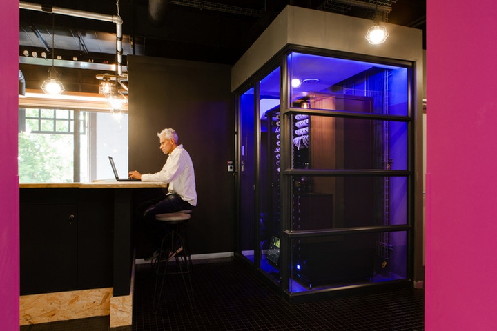
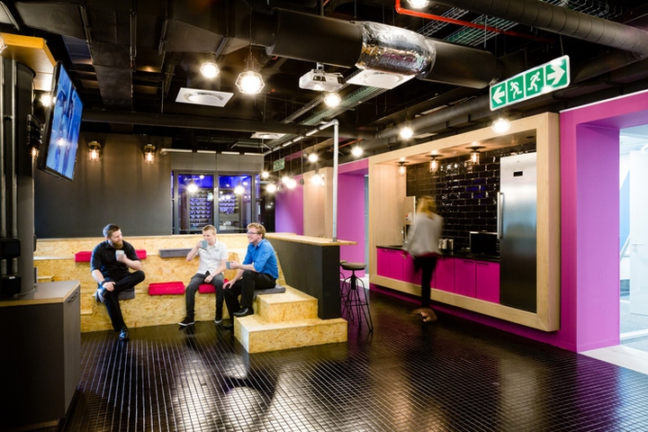
The space is ideal for individuals or small groups to meet away from the team while remaining connected. It also serves as a private place to take a personal phone call and a quiet space to be alone to focus on a specific task. The work café is another unique space where employees can go to interact over a cup of coffee, or to just get away from their desk. It also provides a space for bringing the teams together and encourages cross-pollination. Here, the corporate colours were ditched in favour of bright pink and black. Korbicom is a big believer in having fun and being social, so this space was specially designed to emphasise the balance and cross over between personal and work life, thus further promoting the company culture and lifestyle.
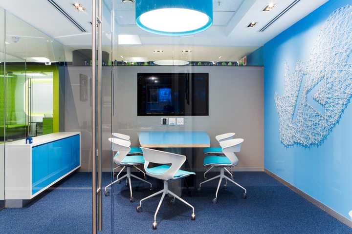
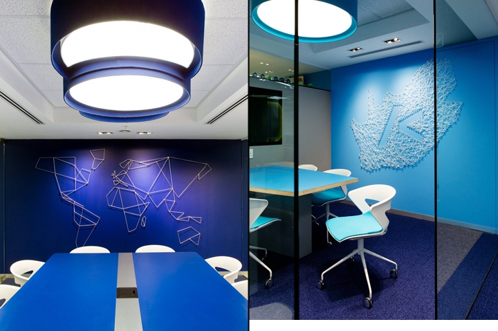
Colour – Colour was used in carefully selected proportions to add energy and excitement to key collaboration areas without overwhelming the space. This extends to the client facing boardroom where one wall has been covered in tessellated blocks in shades of the corporate blue, arranged to resemble the pixels of a front-end software environment.
Art – All the artwork used was custom-made for the space. Conduit created a hanging mobile of tiny blue, white and green houses, representing part of Korbicom’s legacy. Grant also created a world map made of nylon cord (strung by hand himself), representing the company’s connectivity with the rest of the world.
Floors – Commercial grade carpets in neutral tones of black, grey and charcoal were arranged in giant Tetris patterns across the working areas. “This creates visual interest and distracts from the monotony of a typical 2D floor covering,” says Grant. It’s also a bit playful, as most people here are into computer games. Logo-matching blue carpets were used in the corridors, drawing the eye along and creating an illusion of greater space.
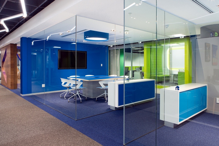
Lighting – All the team rooms run along the windows, allowing in natural light and projecting it inwards through the glass walls. Creative use of light fittings and neon bulbs exude a sense of innovation.
Ceilings – The base build metal baffle ceilings were retained to save cost but painted black to make them recede and create a greater sense of space, as well as to highlight the lighting features. New acoustic ceilings were added to key collaboration areas to prevent noise transmission and enhance concentration.
Design: Conduit Interior
Photography: Grant Johnson
https://officesnapshots.com/2017/09/27/korbicom-offices-cape-town/


Add to collection

