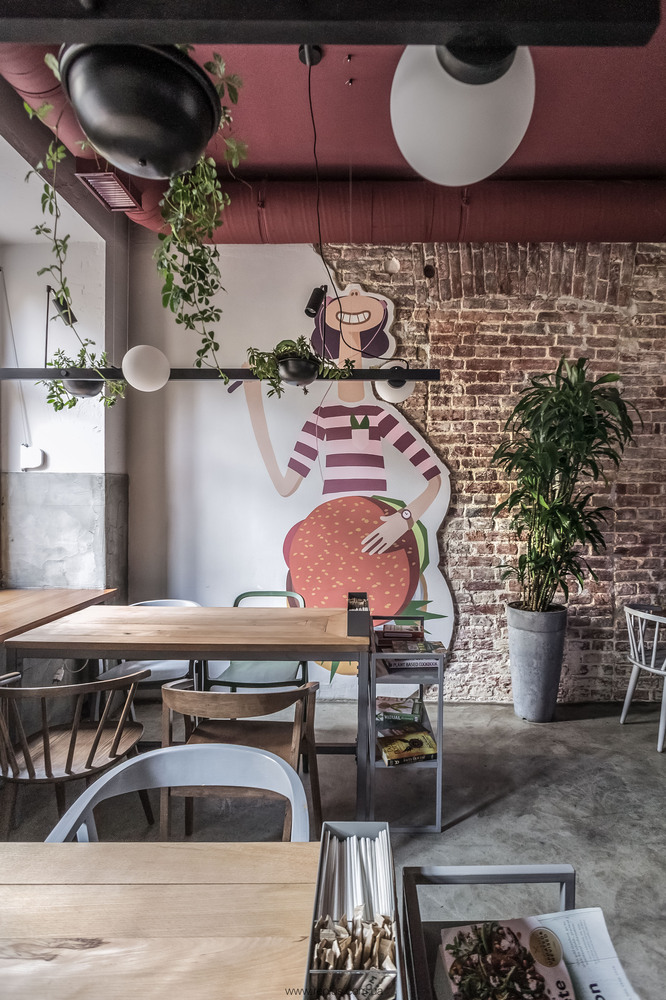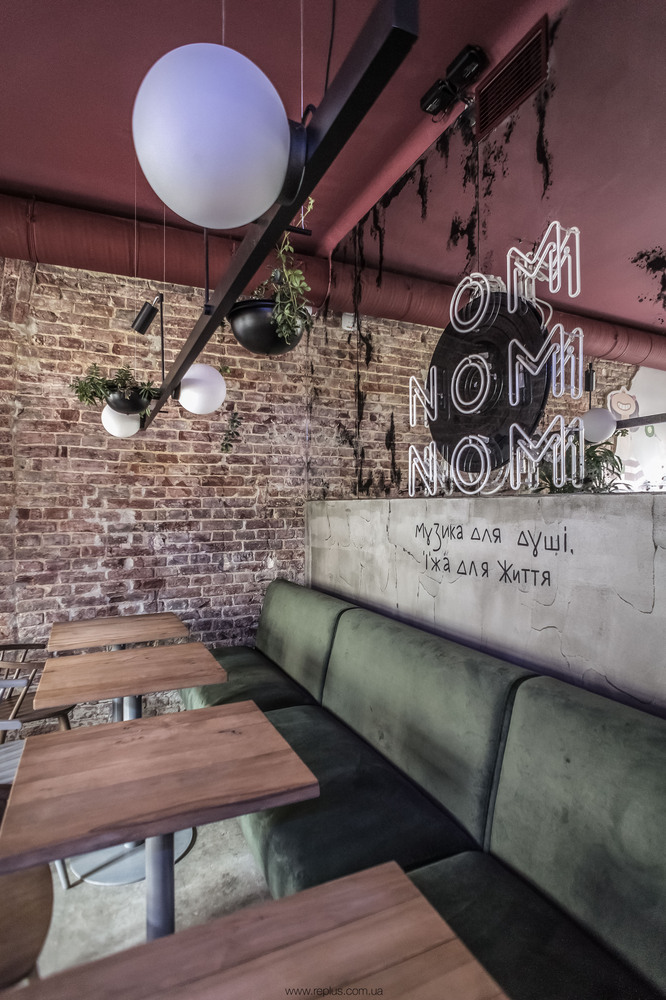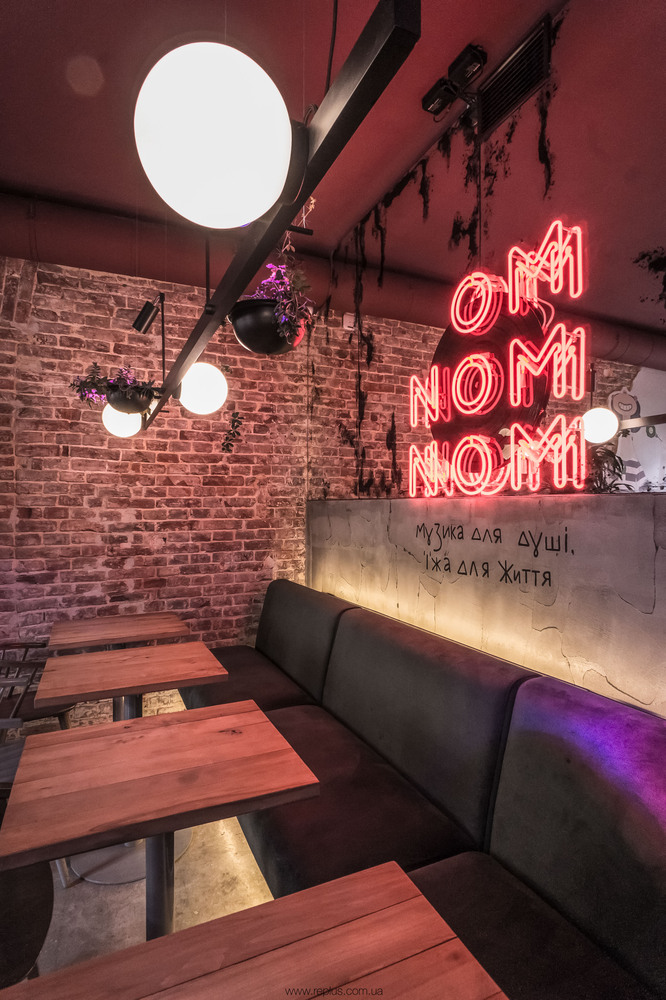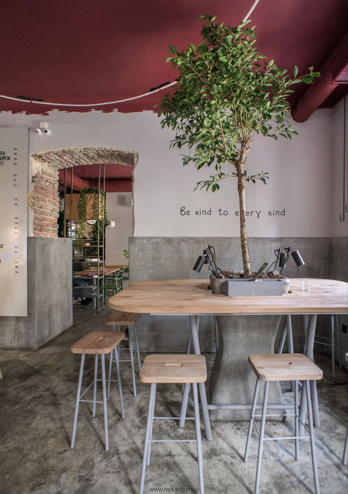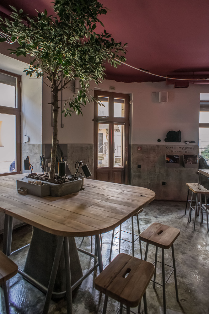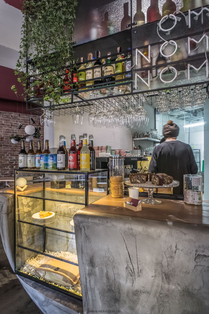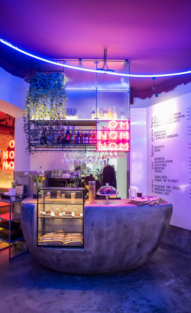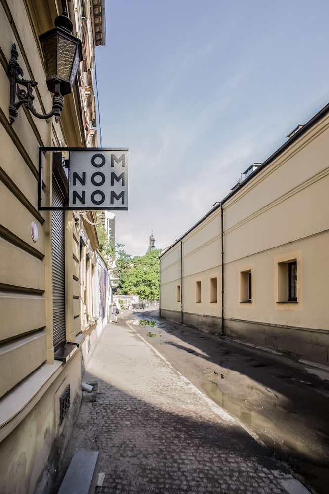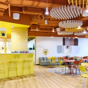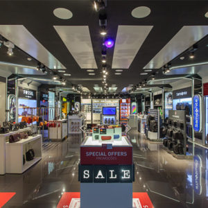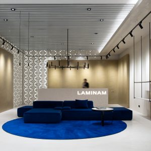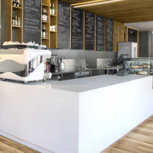
Main idea of the project: To design a fast food restaurant without emphasizing its vegan specialization. The house is located at an intersection, which dictated a corner layout of the café. In the middle, there is a cash register, with a kitchen area hidden behind it.
Our clients’ request for designers was to break a stereotype that a vegan café should be done in an eco-style, complemented with meditation-style music. Everything is quite the opposite here. Half of the guests don’t even know they are eating vegan food, thanks to the creativity of preparation and the taste of food, with the accent on food’s quality rather than labeling. There are parties going on at night, and during the day there is music played from a turntable. Our clients gave their charisma to the customer service and the image of the café.
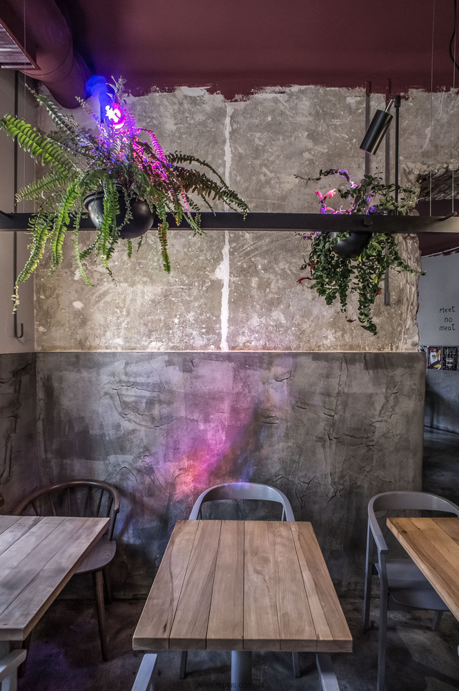
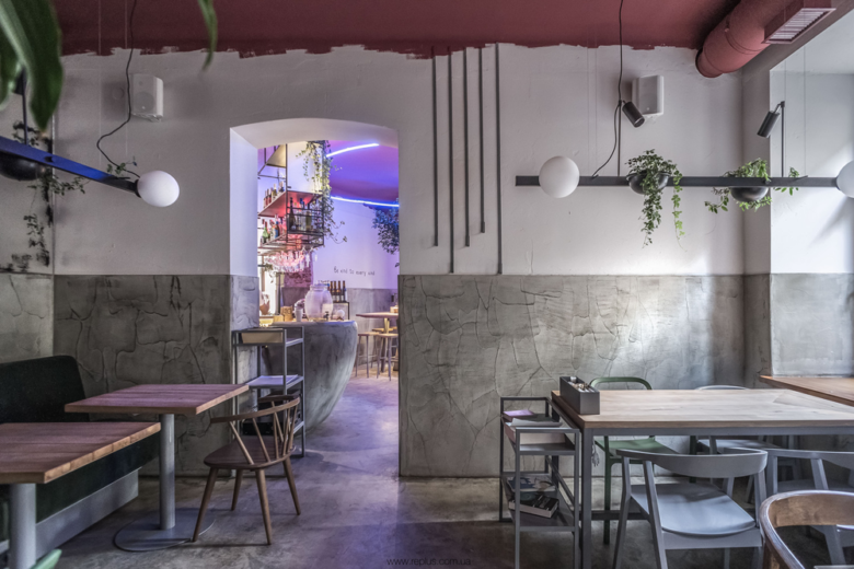
This is not the first project where we consciously and completely rejected ceramic tile on surfaces, except for the kitchen area where special rules apply. This became our brand style. Instead of tile we use special surfaces that can sustain the same stress. For this project we used poured-in-place concrete that we also applied to walls up to a certain level. Above this level the walls remained raw, with just a coat of paint.
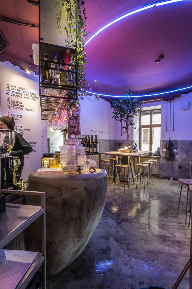
The most unusual and interesting object in this interior is definitely the order placing counter made in a wonderful shape. It draws everyone’s attention. At the bartender’s side, it is quite practical, the entire space is used for storage or personnel use.
We really wanted to create a place where people don’t just eat. We made every effort in order to create a space and an atmosphere where guests can comfortably enjoy each other’s company, and we are happy to have managed just that. The place is never empty, communal tables are always popular regardless of the time of day. The place is comfortable not only for eating, but also for work, meetings and relaxation.
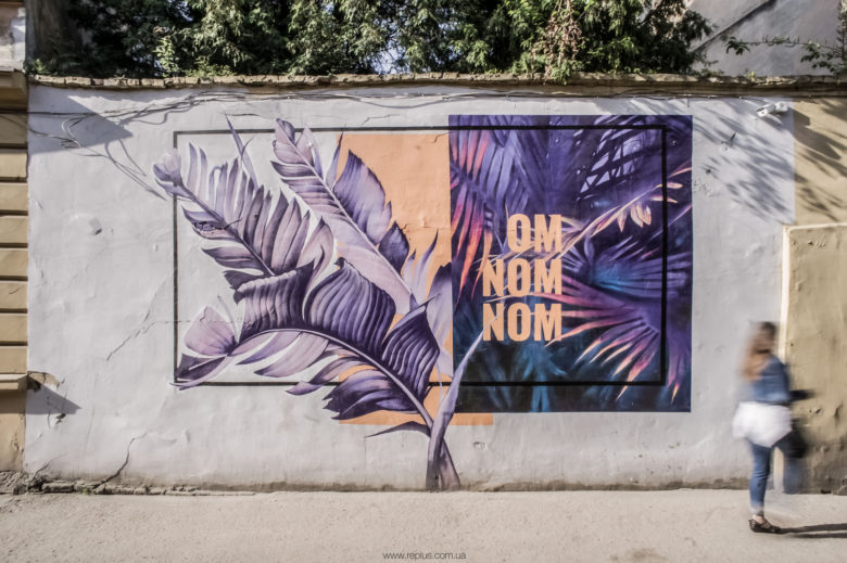
There are some old murals here and there, remaining from the times when the place was built by the Poles. All elements of the interior, except for the chairs and light fixtures, were custom-made.
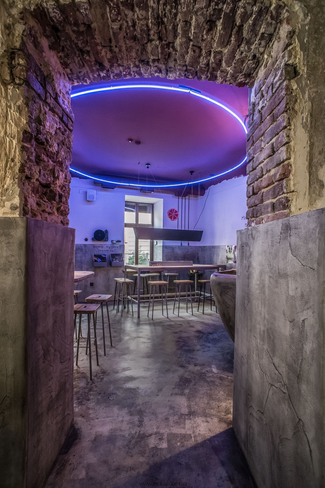
Initially, the room with the bar should have had two round neon light fixtures suspended from the ceiling: one in blue, the other – in red hue. We had not have a chance to test how they would work together in situ, so we decided to take a chance and, as it happened, did not like the results. Put together, the neon fixtures were not a good match, they created some unrealistic color combinations. That’s why we decided to take down the second neon fixture and gave it to the designers as a keepsake.
Architects: replus design bureau
Lead Architects: Khrystyna Badzyan, Vitalii Kulchytskyy
Photographs: Dmytro Sorokevych
