
Add to collection
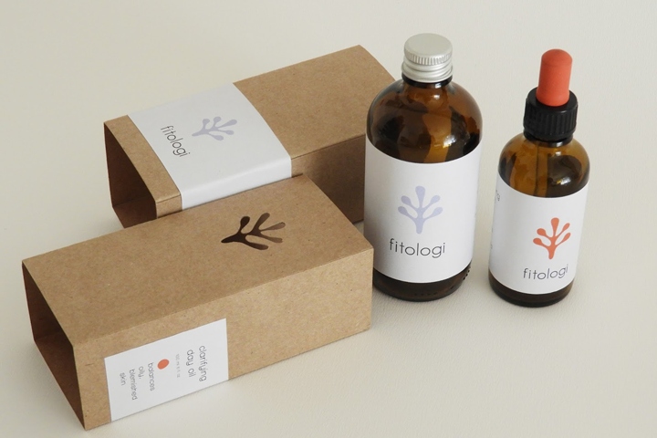

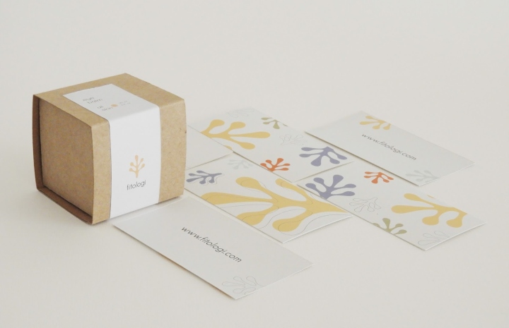
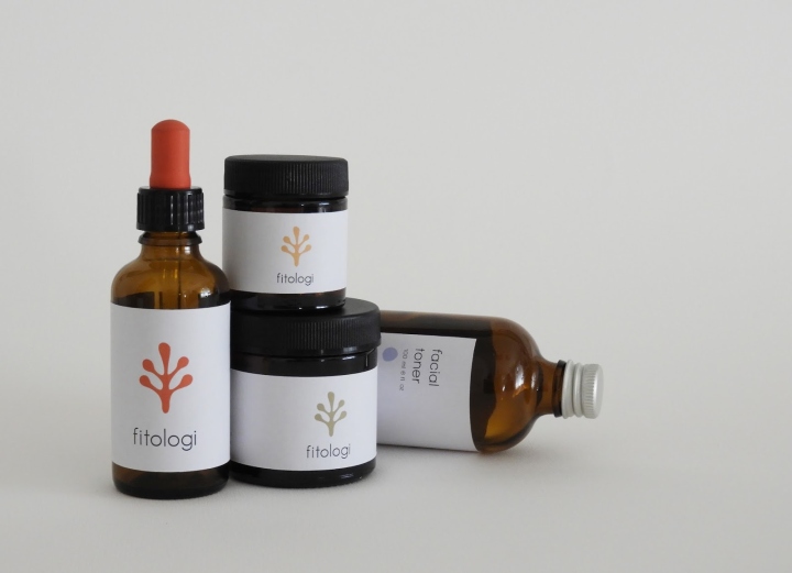
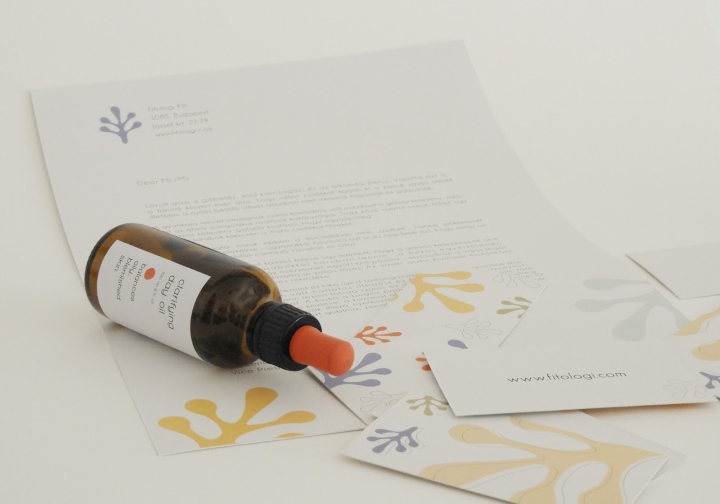
I have designed and implemented the packaging of FITOLOGI, a fictional, organic skin care product line. The organic skin care products I use on a daily basis have a very moderate design, so I imagined a simple and clear yet playful layout for FITOLOGI. My aim with the design was to create something that is interesting just by looking at it and I wanted the customers to feel happy when choosing this product. One other aspect I kept in mind was to be able to fit the product into the customer area in many different ways.
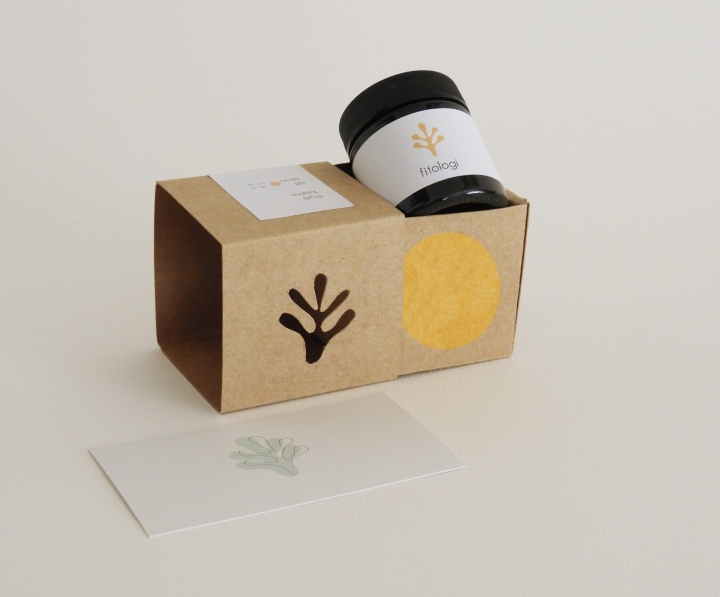
Brown craft paper is a clear indication to the organic components of the product. I consciously avoided using a large print and I chose a white label to symbolize the clear nature of FITOLOGI. To create the playful layout I wanted I used cut outs. The shape of the window is also the logo of the product. The colourful patterns help to identify and distinguish between the products, as well as break the sullen surface of the colours brown and white.
Designed by Andrea Nácsa
https://www.packagingoftheworld.com/2018/03/fitologi.html


Add to collection