
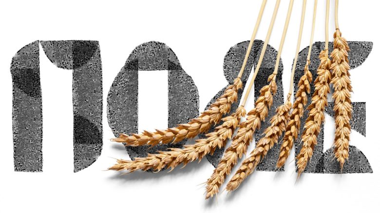
Zhatva by Olga Prokhorova
posted by retail design blog on 2019-02-22
Add to collection
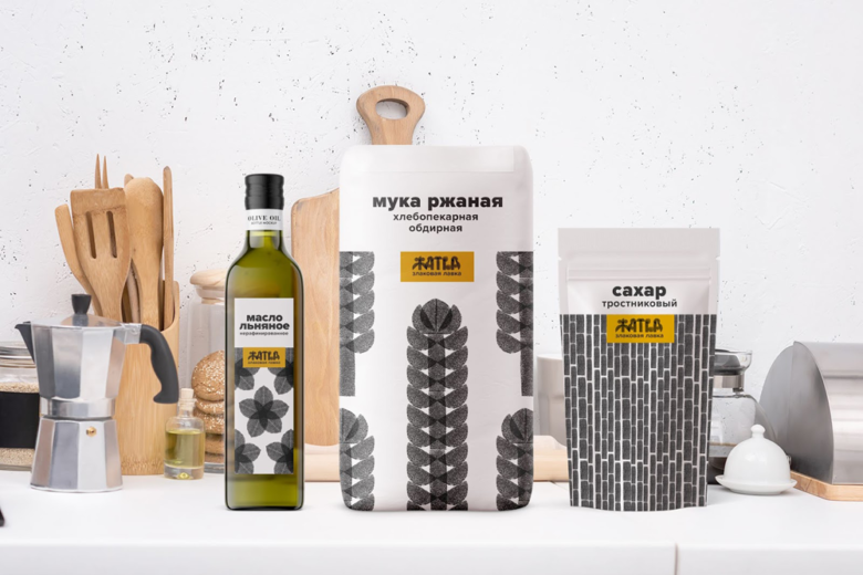
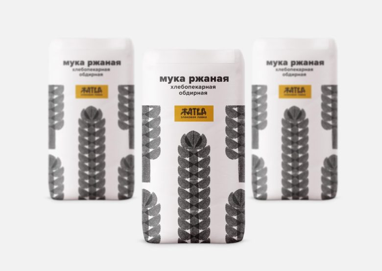
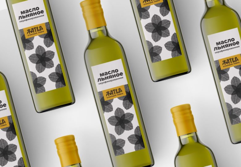
«Zhatva» (“Harvest”) is a store where you can buy products from the farm. These are a quality products without chemical additives. I wanted to create a feeling of handmade and traditional design, but at the same time stylish enough for urban consumers. The main corporate colour is yellow — the colour of the field in the harvest season. The target consumer: healthy conscious people.
What’s Unique?
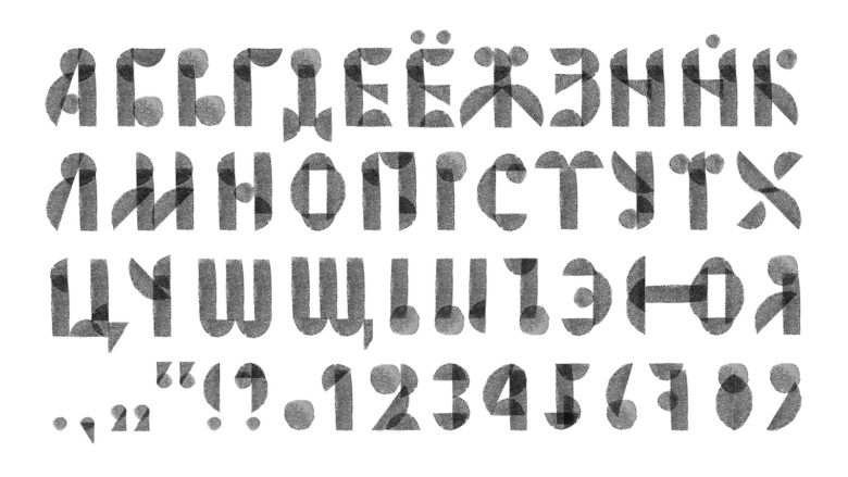
I cut out a modules from the potato to convey the handmade character of products in the store. Then I made an alphabet and pattern from this modules. It can be used for packaging and branded printing materials.
Designed by Olga Prokhorova

Add to collection