
Located near Gulou (the Drum Tower) in central Beijing, the renovated café Oh! retains the historic style of its original building and is modified with modern materials for functional and aesthetic purposes.
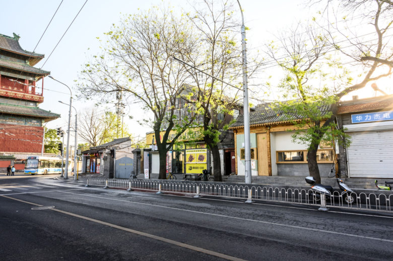
The hybrid design philosophy is best embodied in its façade, with half decorated with traditional Chinese grey bricks and wood, and the other half, an ice-cream hut, with light green terrazzo. Such contrast is harmonized under the same tile roof and wood beam, refreshing but not obtrusive in the surrounding historic quarter.
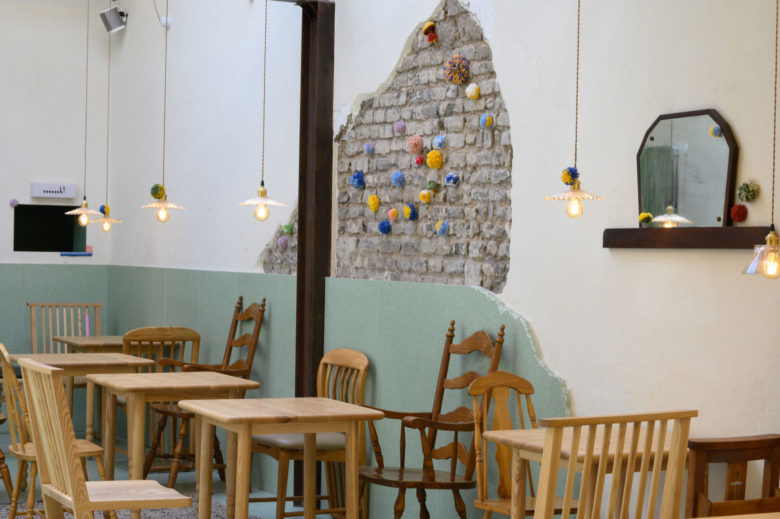
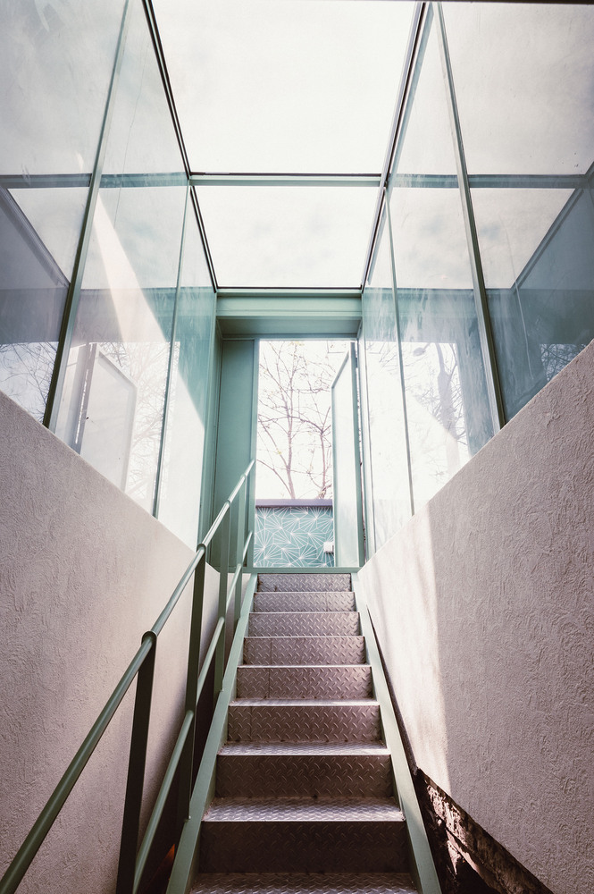
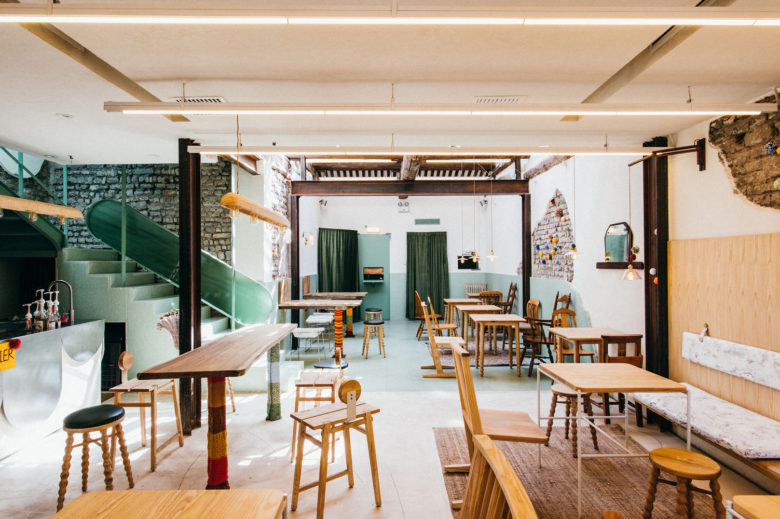
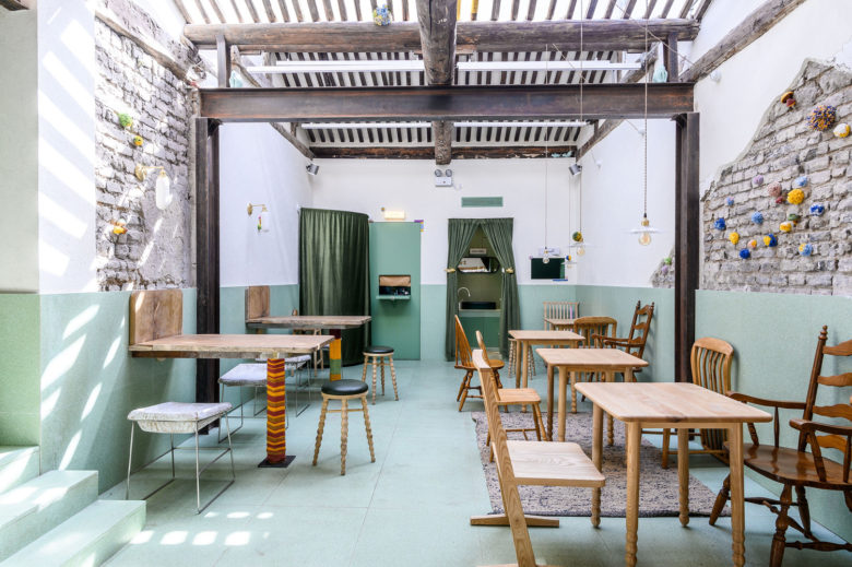
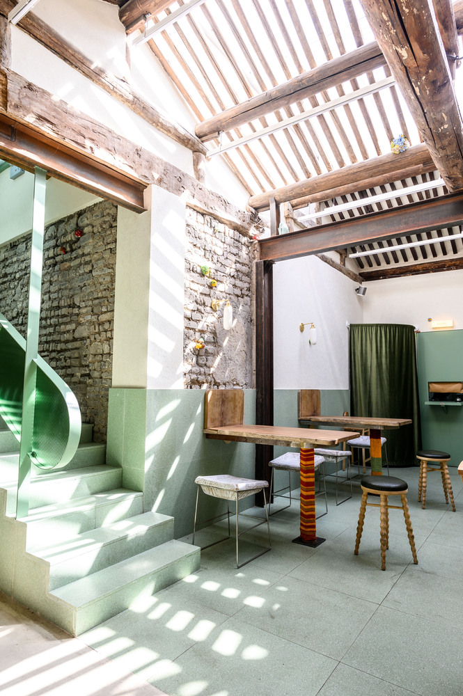
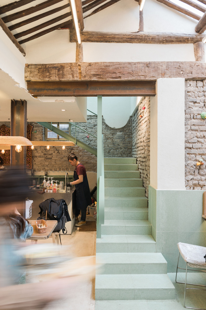
The wood framing of the original residence is kept and reinforced by I-beams. Yet they are not concealed, for the designer intends to bring a rustic and real feeling. The tiles on the middle of the them-shaped roof were taken away, and a glass ceiling has been installed on top to add natural light and expose the beautiful wood purlins.
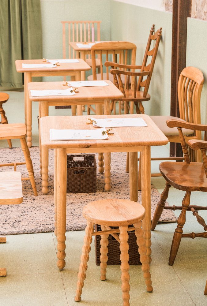
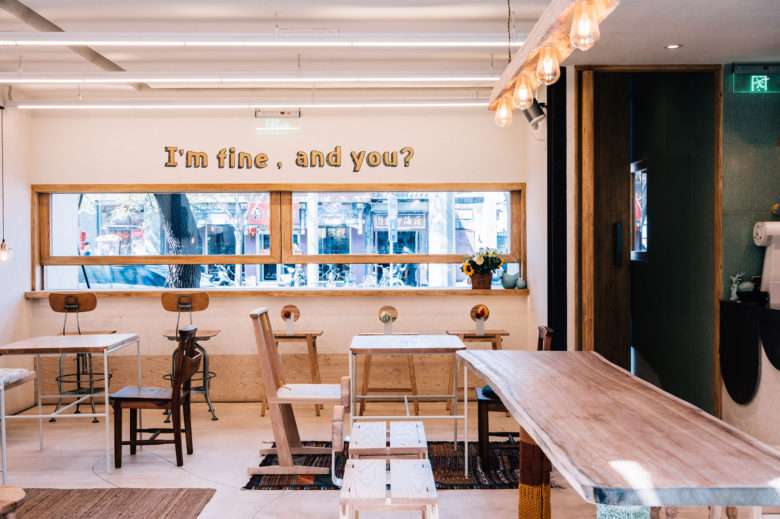
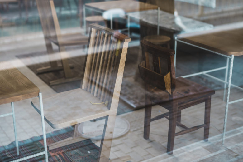
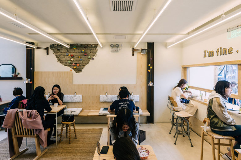
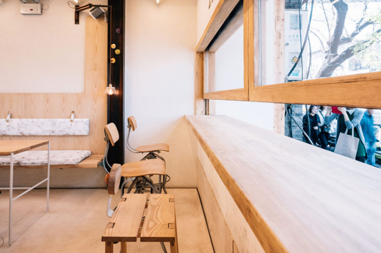
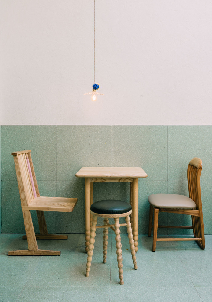
For the sake of safety, the flat roof at the entrance has been rebuilt to increase load-bearing capability, and the walls are partially painted with stucco, while some of the original grey bricks are still visible. The café is furnished with wooden tables and chairs. The big table tops are all made from solid old logs. The floor and part of the walls are paved with terrazzo of quiet green and simple texture, in tune with the wood structure of the whole building.
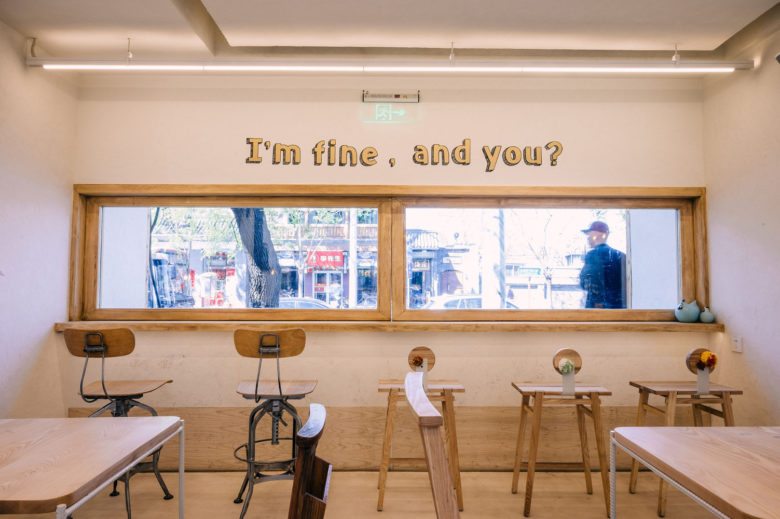
The original one-story residence has been transformed into a multi-leveled and complex space. The customers go through a narrow entrance, a short passage enclosed by double doors, and a low-ceilinged foyer before they step into the spacious rear area under the high m-shaped roof. The ceiling of the fore part of the café has been deliberately made low when being rebuilt in order to hide air-conditioners and pipes as well as to contrast with the expansive rear space. Long light bars have been installed to echo the purlins and increase a sense of depth. The window on the façade is made in the shape of a slender horizontal rectangle so that if one looks into the café from outside, they experience the same narrow-to-broad transition.
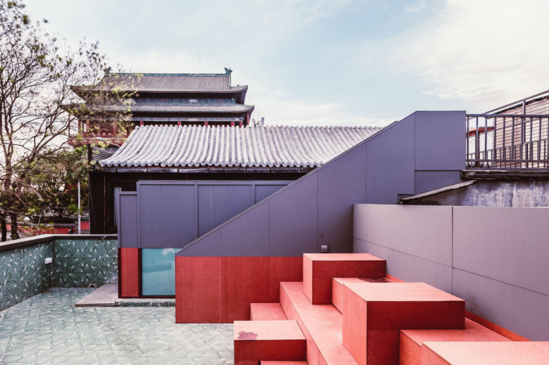
Renovations have also been made on the roof area in order to increase space, including the flat roof converted to a terrace, a set of steps as seating places installed against the sloping roof, standing tables placed on the higher-level neighboring roof, which is the best spot to admire the ancient Drum Tower at sunset.
Architects: Atelier A
Lead Architects: Lily Zhu
Design Team: Binming Tian, Rachal Wang
Photographs: Byungmin Jeon

Add to collection
