
Add to collection
Hermès first landed in Amsterdam in 2006 – its first location was on P.C. Hooftstraat, where many a luxury-shopping tourist know well to congregate in the Dutch capital.
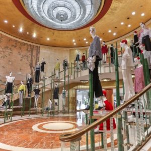
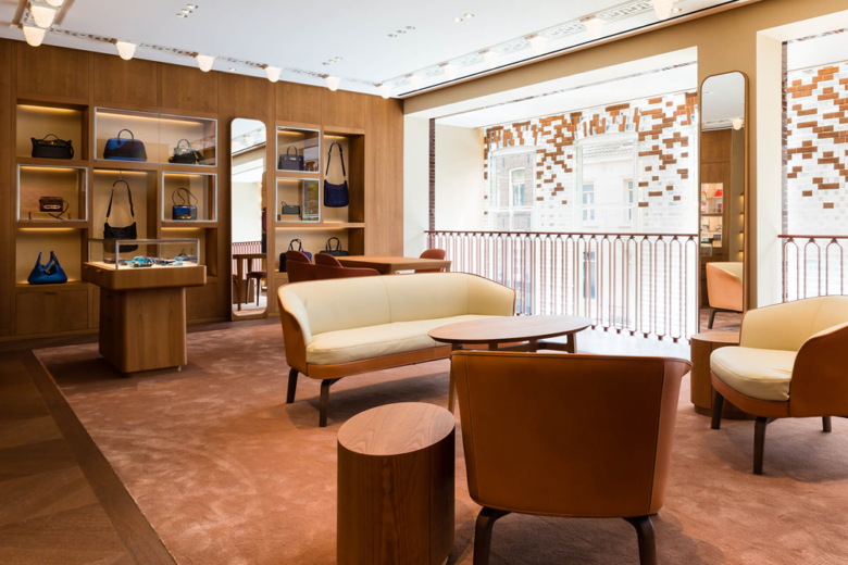
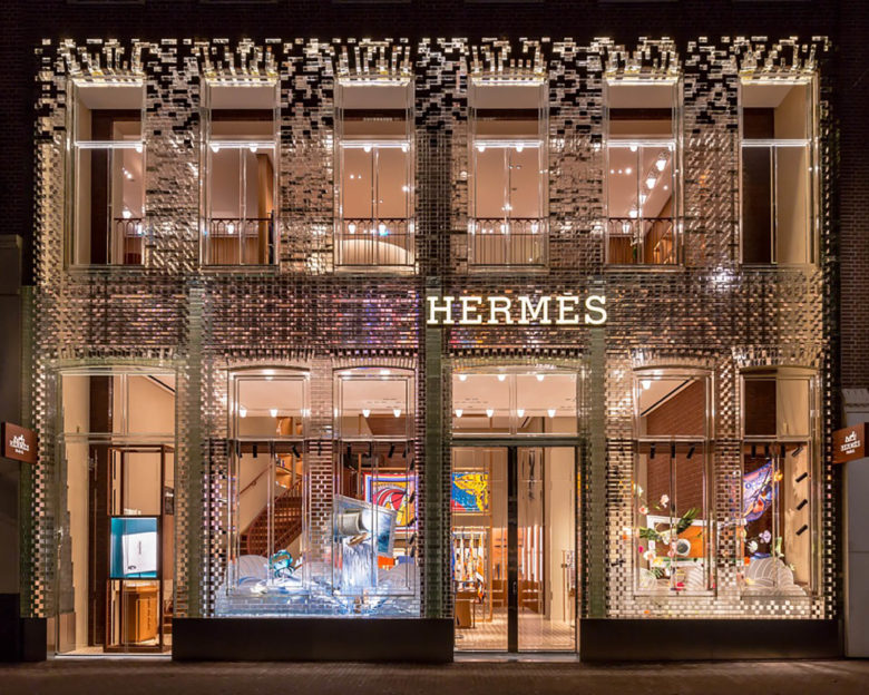
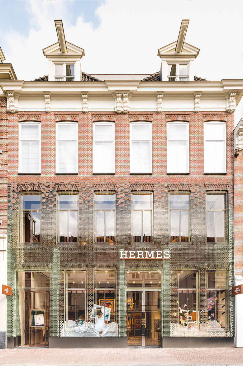
The French house’s reopened space is just steps away from its predecessor, albeit, it’s a touch more magnificent: Hermès shot for the stars with its new location, moving into number 94 – also known as Crystal Houses because of the well-beloved MVRDV-designed glass-brick façade it boasts.
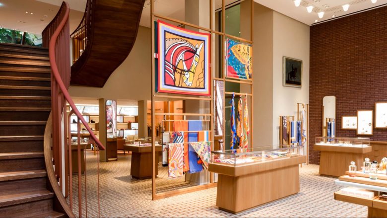
Parking my bike outside before the opening preview of the store, I couldn’t help but wonder if Hermès had somehow willed the grey day. Against the dreary backdrop, the colours breaking through the façade seemed impossibly resplendent, leaving a visual impact unparalleled by its neighbours. The interiors were completed by Paris-based interior architecture firm RDAI, who’s been responsible for all Hermès stores erected globally since 1976.
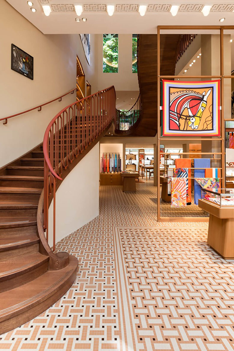
Inside the store, I ascended its pristine staircase with RDAI’s managing and artistic director Denis Montel and let my hands linger on the stair railings cloaked in buttery leather. ‘Is it the same that’s used for the handbags and the saddles?’ I asked, referring to the brand’s iconic leather goods. ‘Yes, it was done by Hermès – it’s one of the elegant signatures of the space, but it isn’t too obvious’ replied Montel. Pointing to the balusters, he said, ‘And here, if you look below, there is another Hermès code – it’s shaped as a horse bit.’
Sinking into leather chairs not yet sat in, Montel and I made ourselves comfortable upstairs in the fine jewellery section of the store and joked, ‘We’re the first clients.’ Then he began to tell me about his history with the French house, and the design of its Amsterdam space…
How has your work for Hermès changed from the beginning?
DENIS MONTEL: Maison Hermès Ginza was the first store I personally worked on, in Tokyo. [The location was completed in 2001]
The interesting thing about RDAI’s relationship with Hermès is that they’ve been working together for a very long time. It can be challenging, because you always have to be good! [Laughs] But there’s a lot of understanding between us: we have much knowledge about the house, and we know each other pretty well. From the very beginning to today, there’s no break in the concept – there’s evolution. Which is exactly what Hermès is all about: permanent evolution.
Working toward service and comfort was a big movement
The biggest change I’d say is that even compared to four or five years ago, we really focus more and more on creating intimate and comfortable spaces. We try to invite people to join in and be in a nice environment. Working toward service and comfort was a big movement.
What were the major considerations when figuring out how this new store would come to life?
Hermès stores are always different – there’s no archetypal concept that we’re applying. From the beginning, what we try and do is learn about the existing premises, to look at its qualities and details. We try to understand where we are and the buildings surrounding the location, so that we can catch the feeling of an environment. That’s how we begin to play with context – we want to make it belong to the neighbourhood.
When we start with a project, it’s always very open. We always want to arrive at new ideas, but it’s really related to the existing conditions. In Western countries, we’re usually working with existing buildings or we actually build the building. In Asia, for example, many projects are in department stores and the ‘environment’ doesn’t really exist yet.
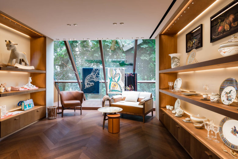
Here, we were pretty lucky. The building is amazing – the light coming through the façade was really a material that we tried to capture indoors. And while the other side is much less spectacular, there are large windows.
It is quite beautiful, when you walk in, that you can see a peek of the greenery that exists behind.
Exactly. We wanted to join both sides of the building to create a double exposure space.
Were there any challenges?
There was some difficulty with the sectioning, as the façade creates double height. The first floor is very high, so the staircase is an integral feature. Looking at the proportion of the space, we realized that the staircase might prove too ‘big’ – it’s really high. So, we played with scales and integrated a mezzanine that didn’t exist before, to create a feeling like it wasn’t too massive.
What would you say the most prominent local elements in this space are?
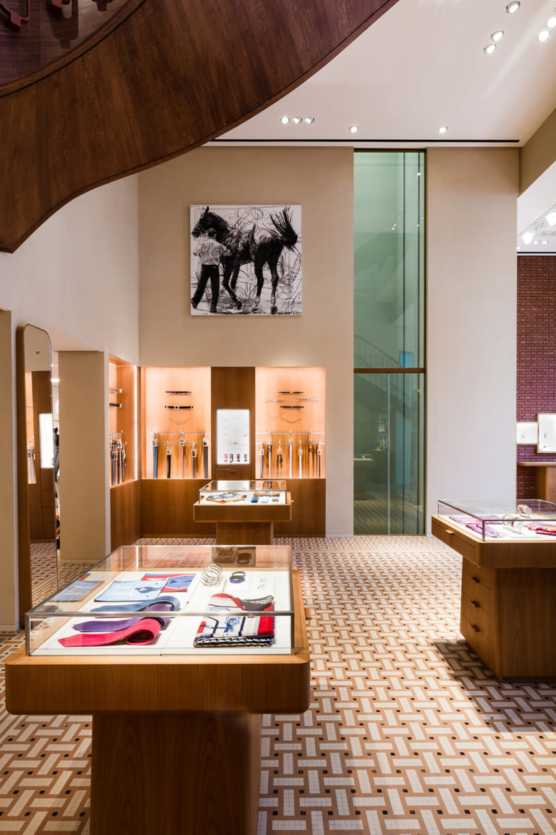
We try to invite the city to ‘get into’ the space: there’s not much brick, but there is brick as soon as you enter. [Laughs] We took existing brick from the top half of the exterior and brought it inside the ground floor. Then, we covered the internal façade with the same brick, but in enamel – the reflectiveness of which creates a visual dialogue with the glass façade.
We played with the typical colours and existing materials in the area. The interior palette is quite monochromatic, but it’s entirely based on what was already here – we created it in harmony with the façade. At the same time, Hermès ‘codes’ are quite predominant. There’s a balance between those identifiable motifs – like the lighting fixtures and the mosaic flooring that you can see from the street – and the respect for the environment.
How will the interiors play on the iconic vitrine design?
Of course, in most of the Hermès stores there are the shop windows – but they are quite often half-closed to provide a background. Sometimes, the settings mean they are completely closed. At the beginning of the project, we said to Hermès that it was better to not have any windows. But they said windows were needed, so, we constructed a technical metal structure that is completely flexible. There’s no backing, so your eyes will always go through to the inside.
We wanted to play with the glass façade, not just have it
So the interiors and the windows are more married here than in any other store?
Yes. This reflects the key concept of the project: transparency. We always say that we want to play on the local context, but the glass façade is a feature in itself – we wanted to play with it, not just have it.
Add to collection