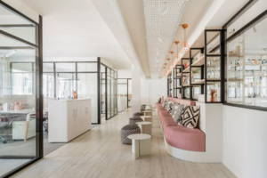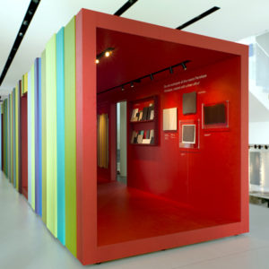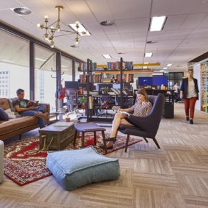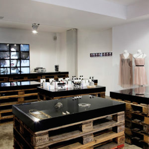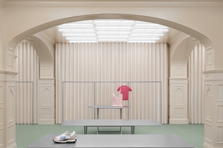
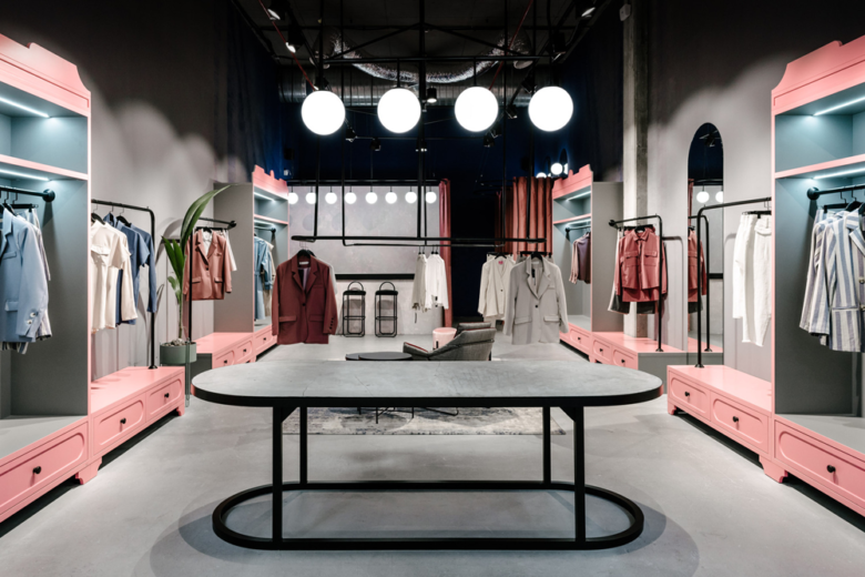
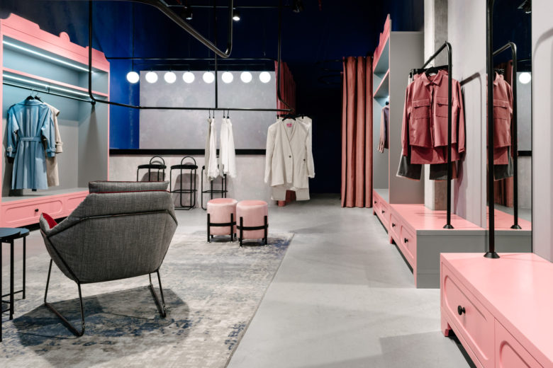
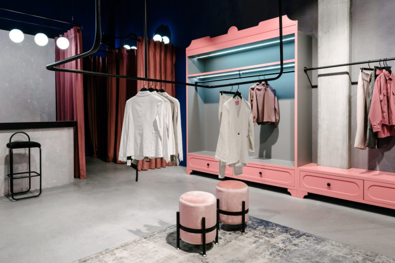
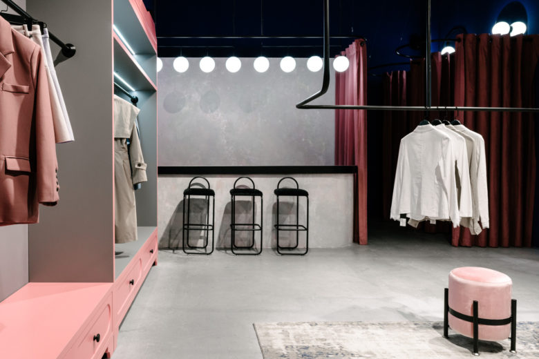
When designing this object, there was not an easy task – to create not a mass-market, to get away from the usual look of a women’s store. Gray but the warm minimalistic interior has become our choice. Concrete floor and ceiling decided to leave the builders. Some walls were left in concrete, and decorative plaster was applied to the rest. Accent colors are gray, pink and dark blue.
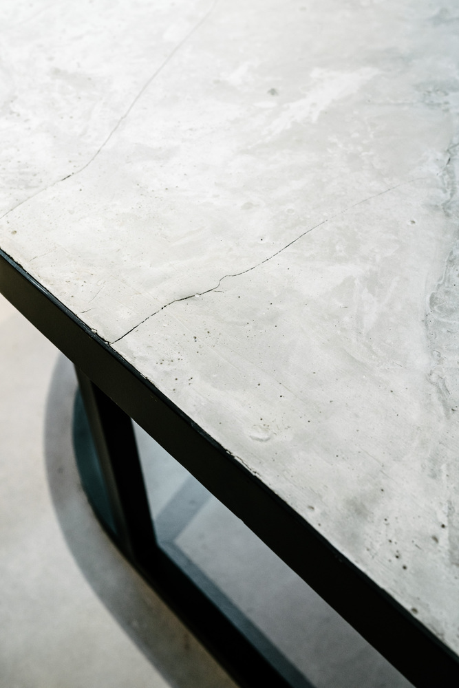
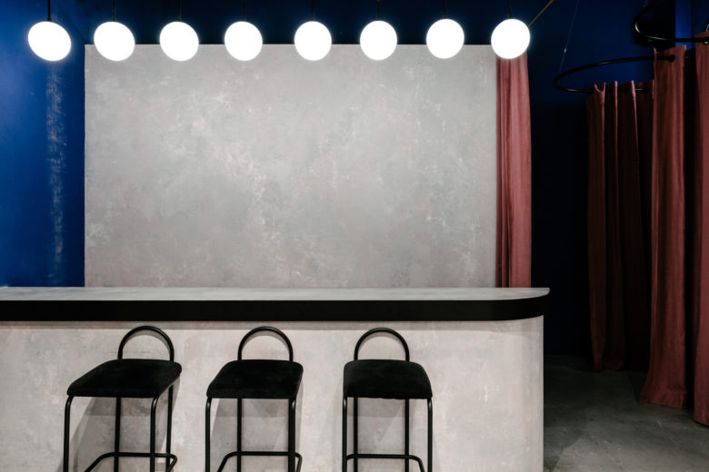
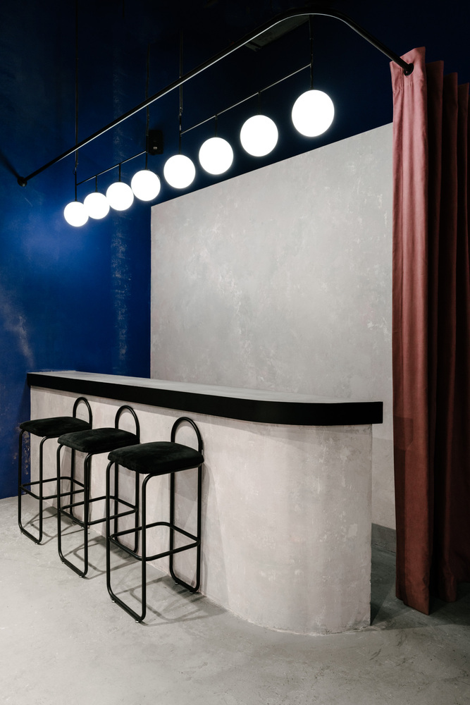
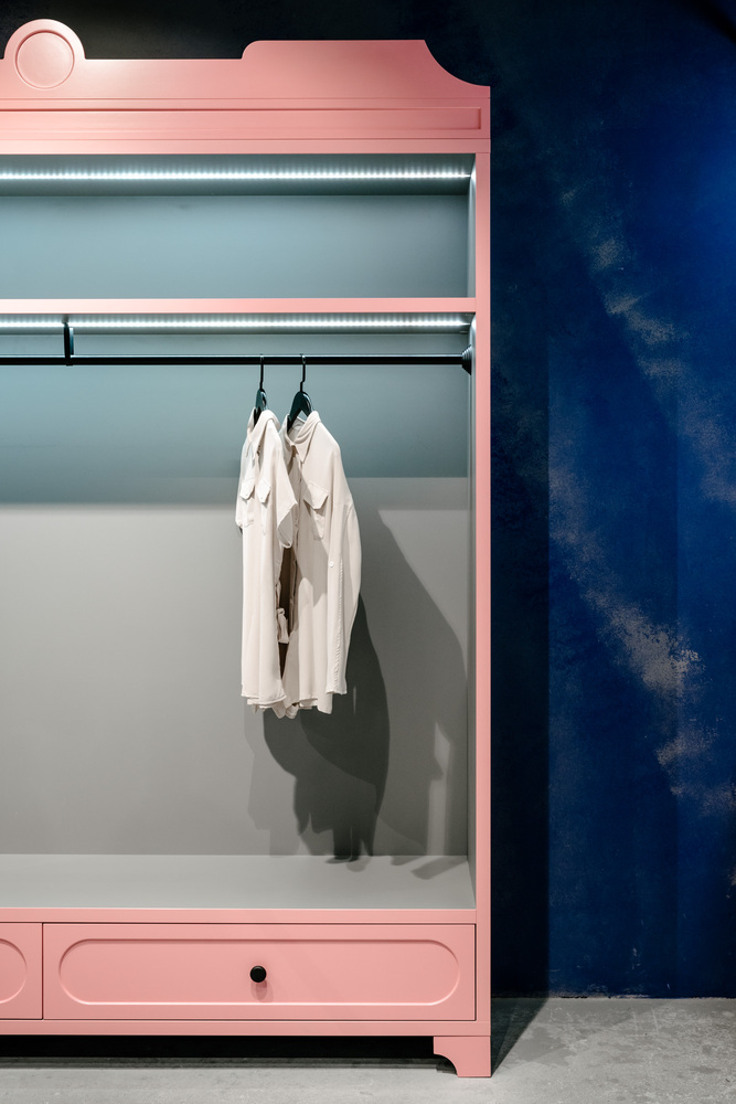
The heaviest element of the interior, in the truest sense of the word, was the table. Rough-in texture, but laconic in form, it meets and unites those who came to the showroom. The table is made of metal and concrete. Display cabinets are a bright and attractive accent in the showroom. Their appearance adds romanticism to the interior.
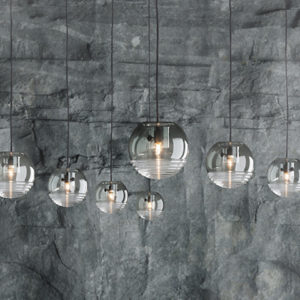
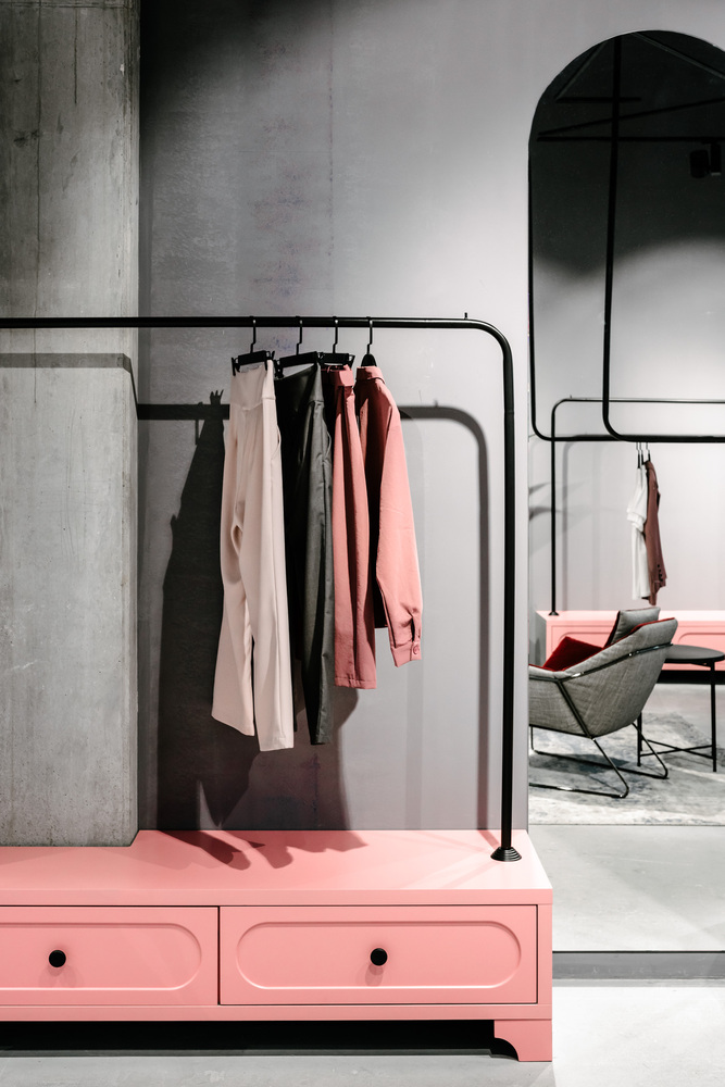
Hangers, in the center of the room, divide the showroom into several zones: a display area, a waiting area, and a cashier area. The lack of natural sources of lighting, forced to use the usual for the mass market, track lighting systems. The pendant lights above the table and the cash zone – Menu TR Bulb, Suspension Frame.
Architects: Angelina Malysheva
Photographs: Nikolay Bulavsky

Add to collection
