
Blurring Boundaries between the traditional and the modern
posted by Architects on 2020-01-17
Hyderabad
Add to collection

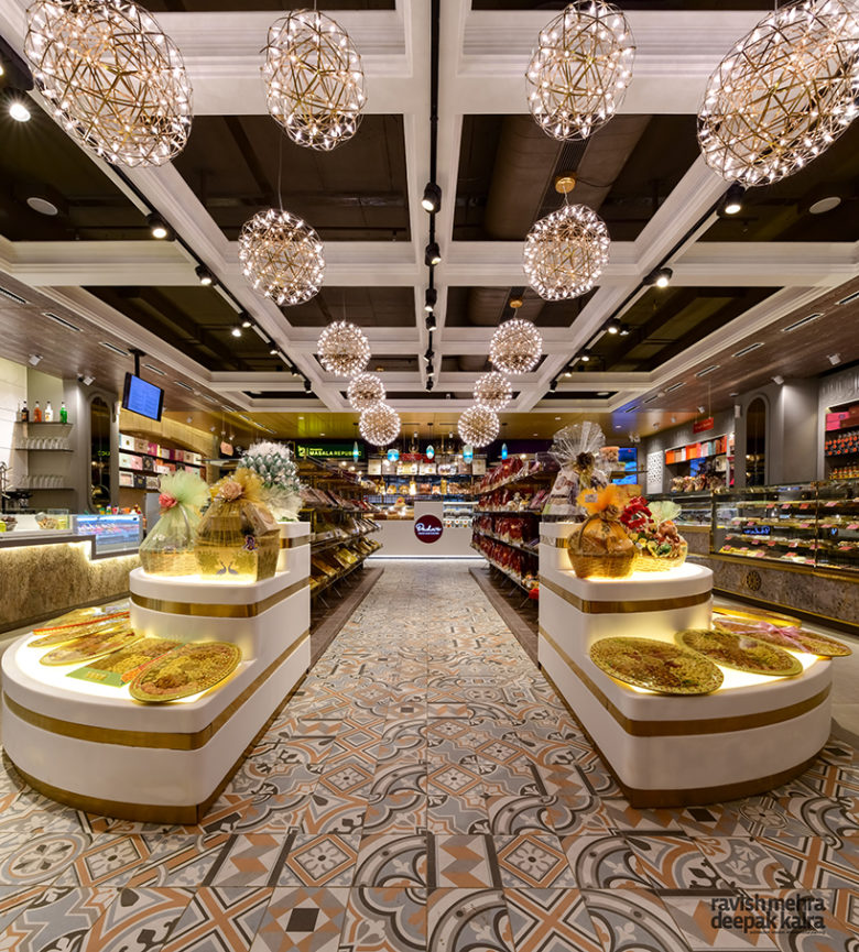
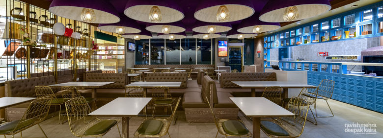
As arty patterned tiles visually guide the customer to a smaller feature display and cash counter behind, which forms the entrance to the restaurant, the subtlety and narrative is sustained as a lush jewel-toned color palette of purple, blue, green and gold is well balanced with neutral white and brown shades.
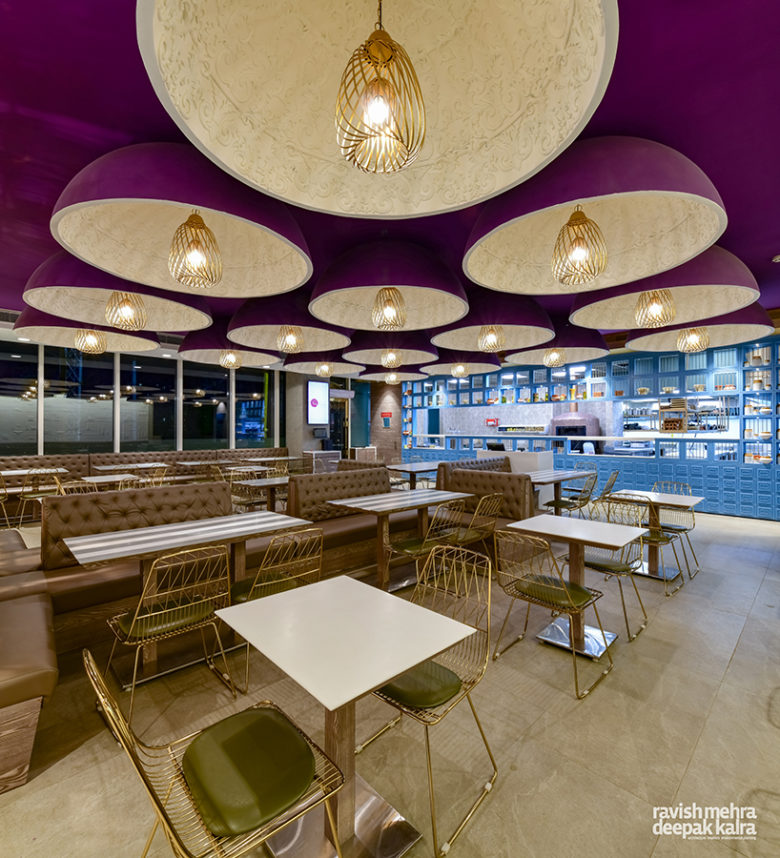
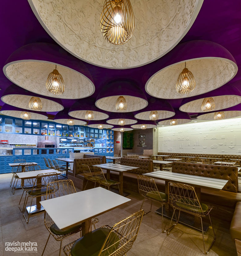
The restaurant’s ceiling is a showstopper as each purple toned dome with delicate relief work in white encloses a household-lantern-inspired pendant light, creating a uniquely indulgent ambiance. A curated pattern of window openings and solid surfaces in the vivid blue service counter defines a stark contrast; creating an inside-outside flow and a live kitchen art exhibit.
Project Head: Dhruva Kalra
Team Members: Preeti Negi, Rhea Bordoloi
Photographer: Provided by client
Words: Arunima Agarwal


Add to collection